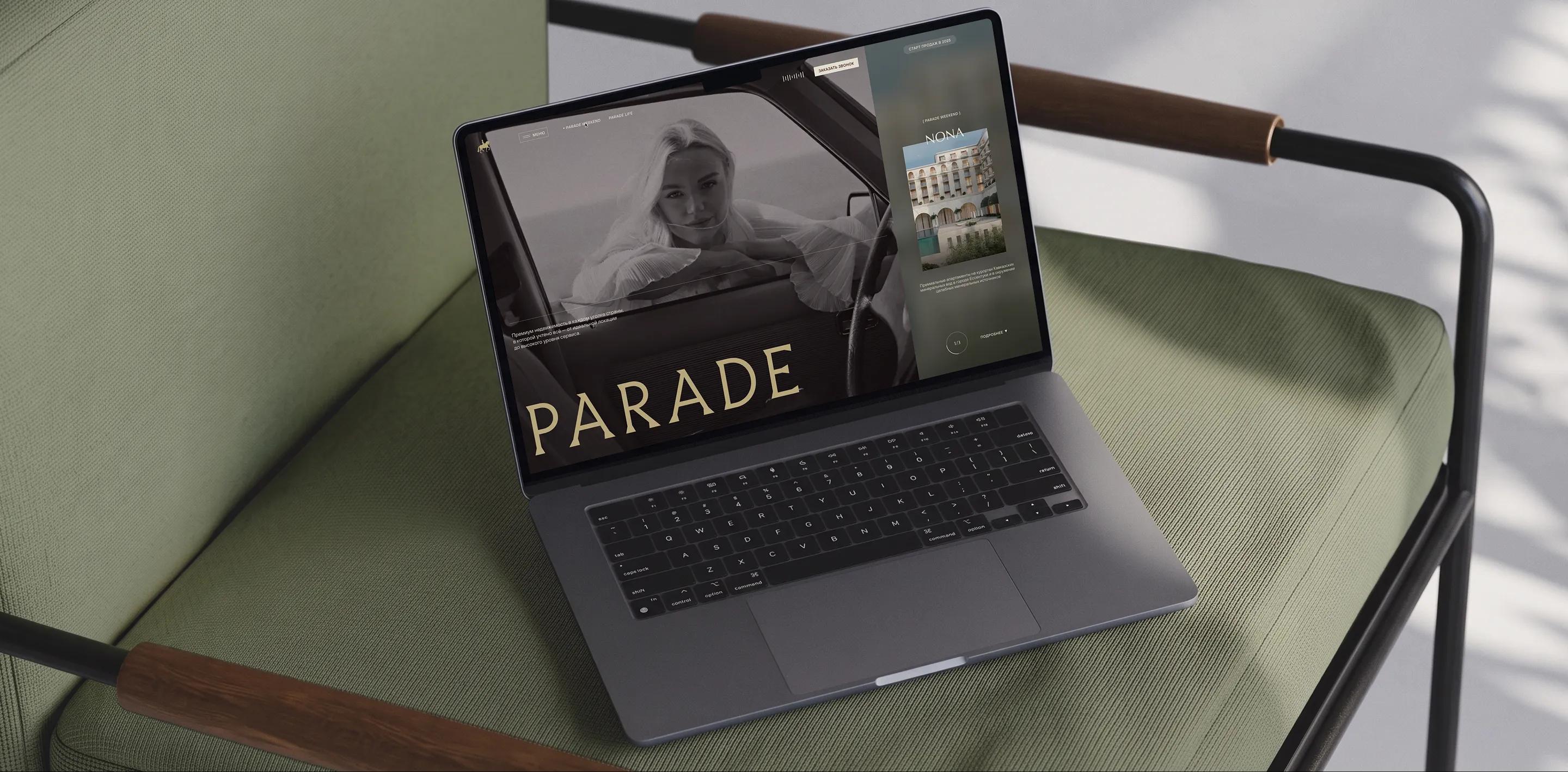
Website of PARADE, a federal developer of luxury real estate
A.G. Samovich
director
We would like to thank the Only team for their creative approach, high level of engagement, adherence to deadlines, and commitment to results.
Development and design of a brand website with a modular architecture to allow for expansion into a property directory
A.G. Samovich
director
We would like to thank the Only team for their creative approach, high level of engagement, adherence to deadlines, and commitment to results.
PARADE Development is a federal developer of premium resort real estate
To showcase the brand and its first projects, a digital platform was needed that would convey PARADE’s philosophy, foster an emotional connection to the locations, and lay the groundwork for future expansion.
Website of the Day 2026 CSS Design Awards
Objectives
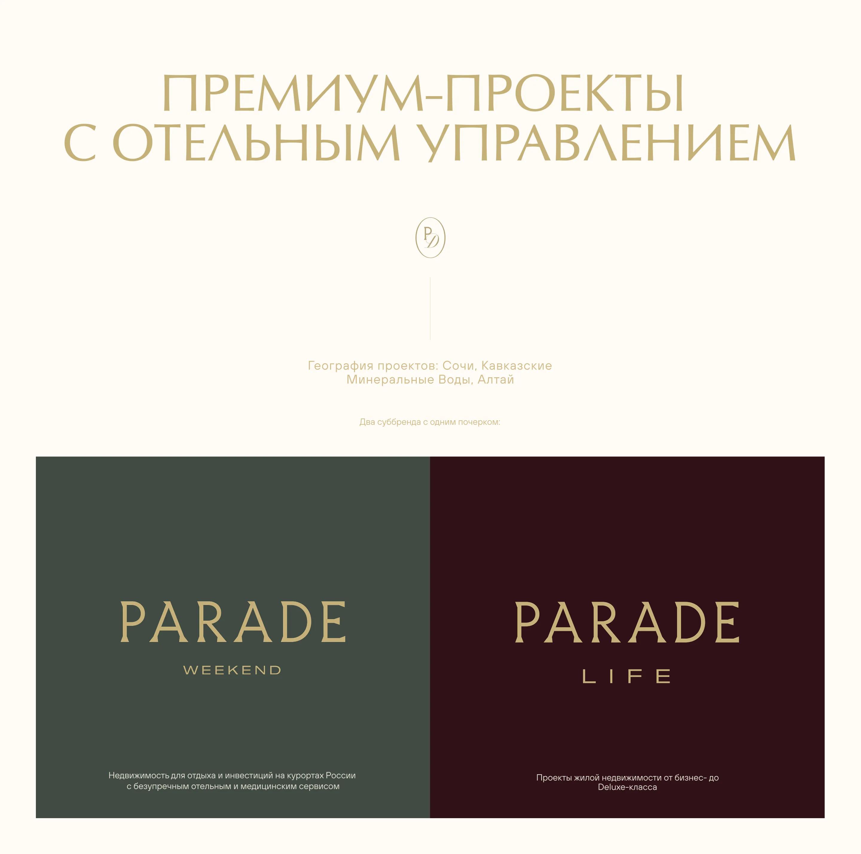
1. Positioning: Differentiate ourselves from regional players and establish the brand’s image as a unique national developer. Each of the company’s projects is not just a building, but a heritage site and a destination for connoisseurs of the exceptional.
2. Communication: Present PARADE in the digital space and reinforce its status through a restrained visual identity, high-quality content, and a well-thought-out UX.
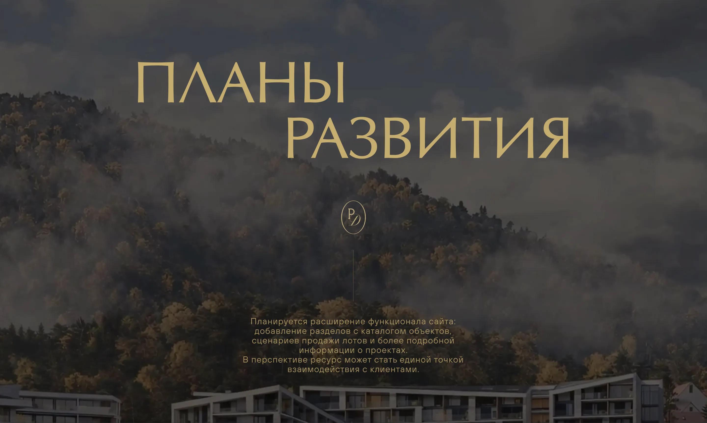
3. Scalability: Lay the technical foundation for the further transformation of the branding platform into a multi-page website featuring a catalog of properties and listings, a user-friendly apartment selector, and comprehensive sales scenarios.
Research and analytics
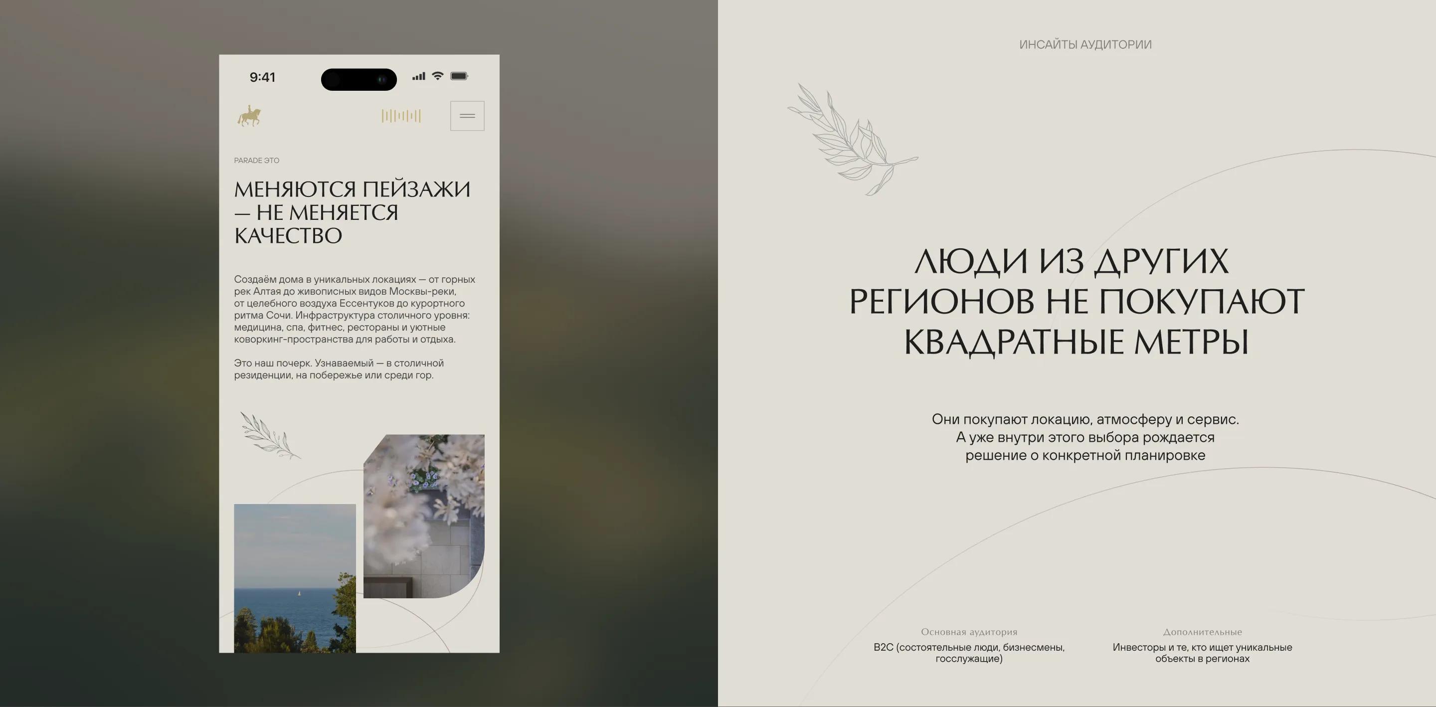
The study began with competitive benchmarking. The resort and luxury real estate market is fragmented among local developers and isolated projects, so one of the objectives was to establish a distinct identity for the national brand.
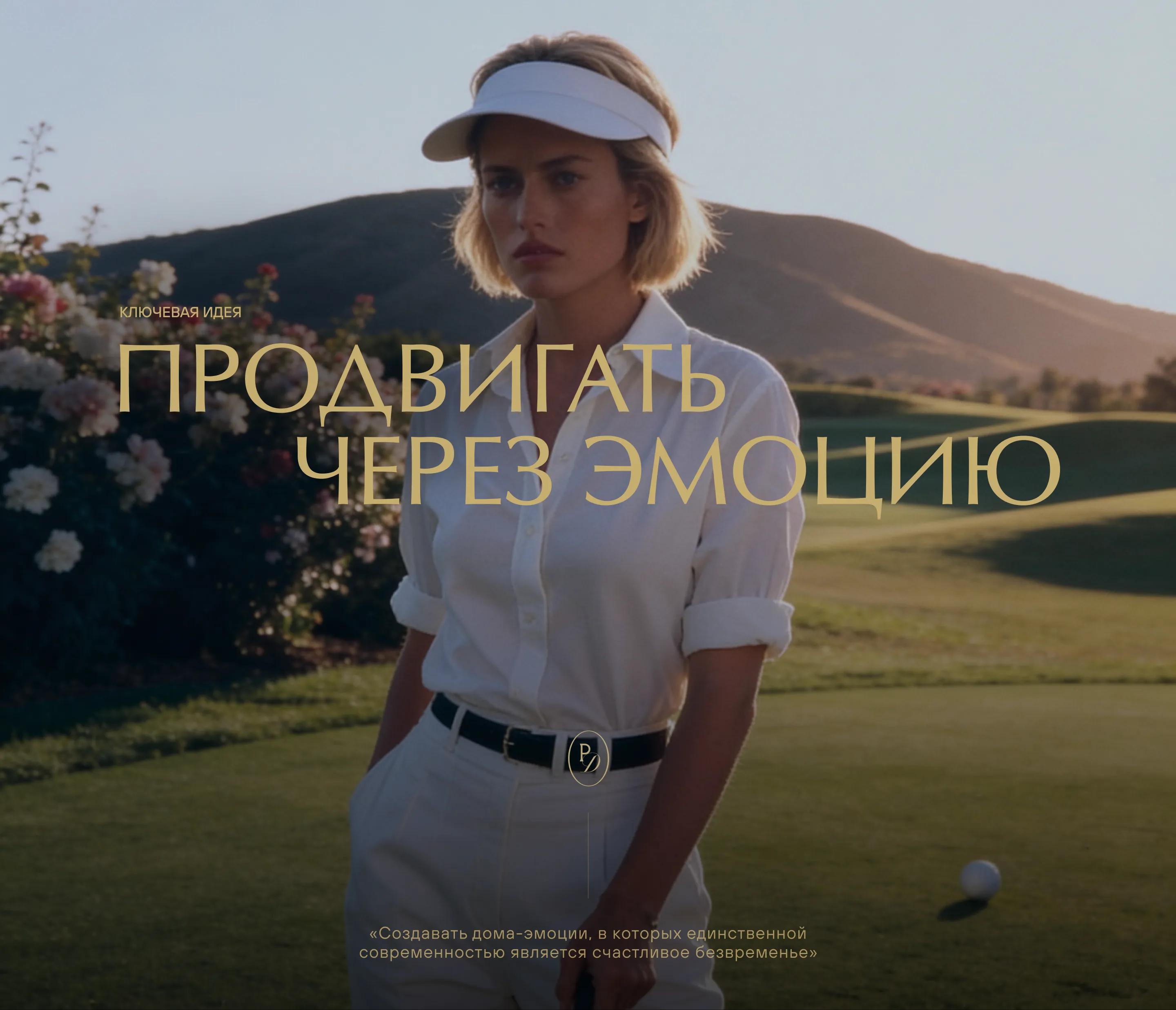
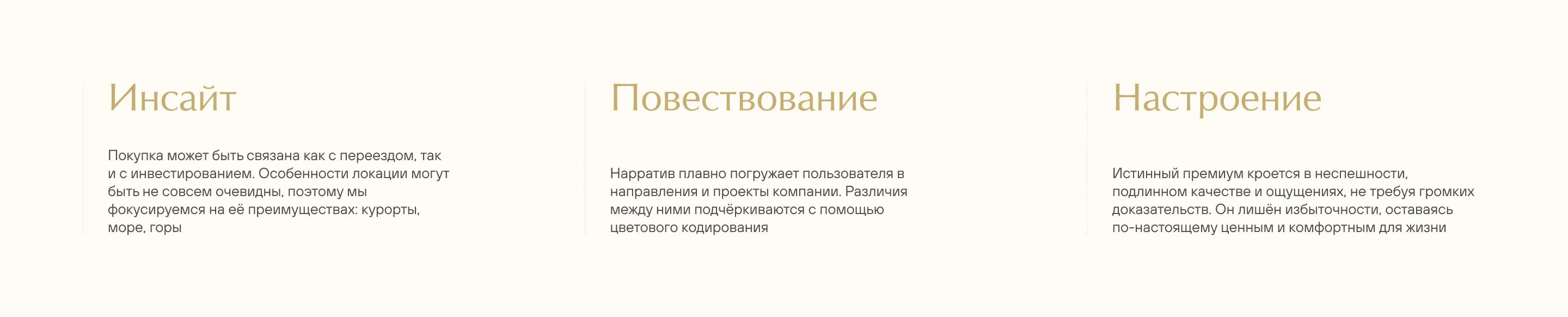
The communication strategy is based on the idea of selling the location through emotion. This approach shaped the website’s information architecture and visual presentation: concise and uncluttered, with a strong emphasis on atmospheric video content.
From the Brand Book
to Digital Identity
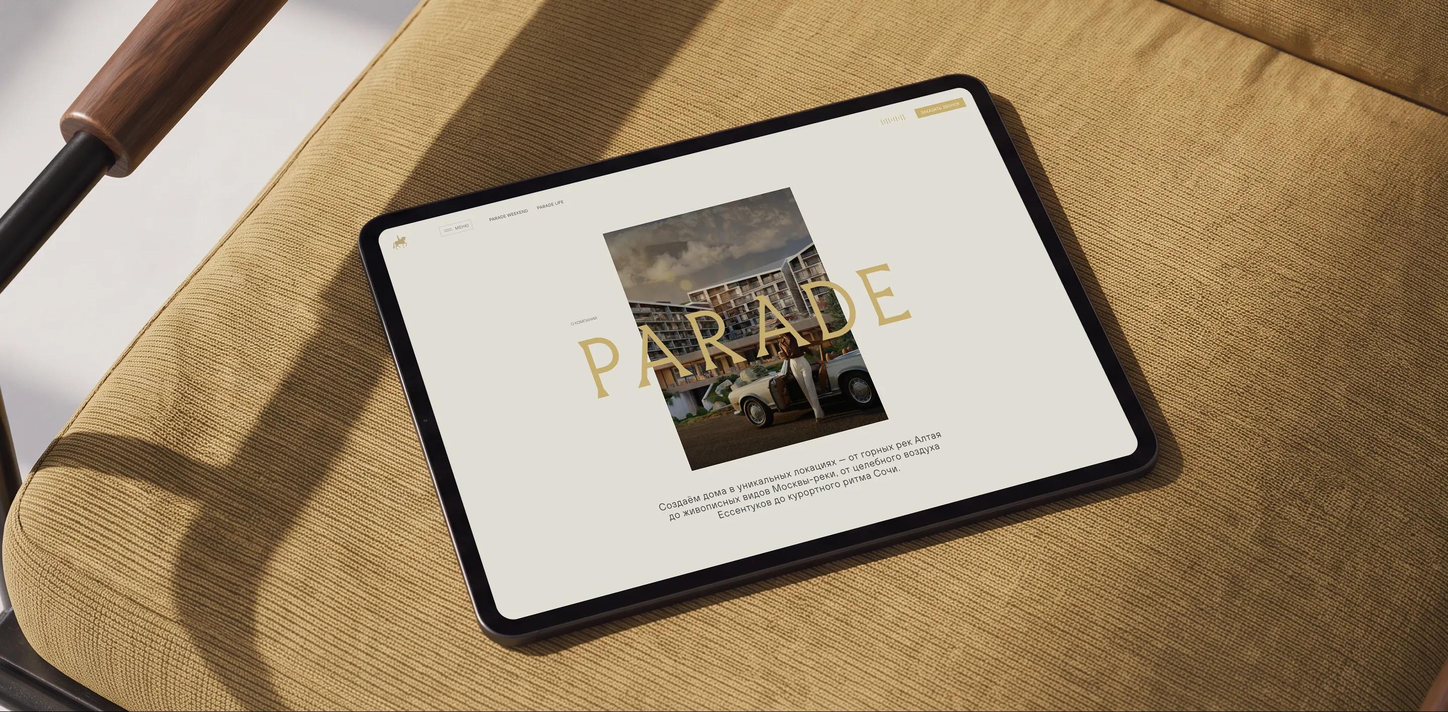
The guiding principle is an atmosphere of peaceful relaxation and a tactile experience. The website serves as a functional framework where the content takes center stage. The interface delicately frames the content, creating an atmosphere of comfort and tranquility
Typography
and Color Palette
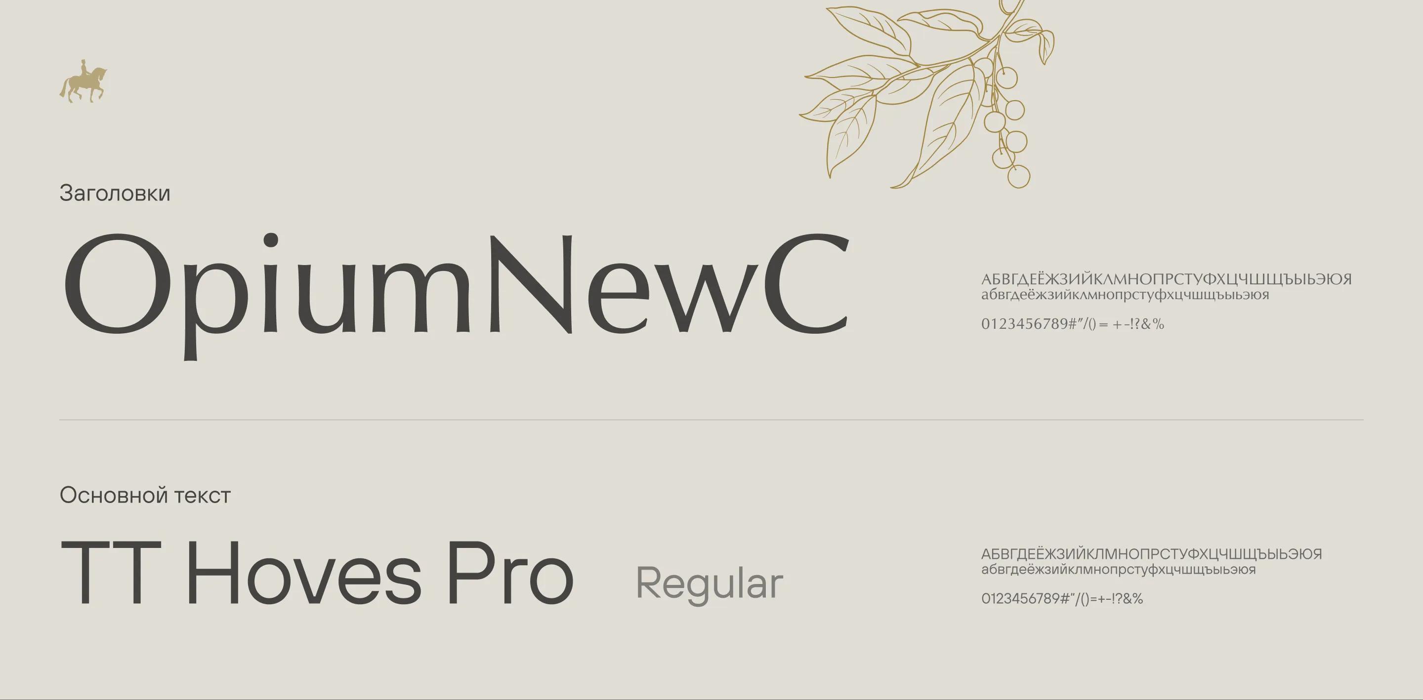
A New Antiqua-style display font is used for headings. Distinctive, vintage, and refined, with no obvious serifs—it preserves the brand’s character while adding a modern touch.
For body text, we chose a neutral sans-serif font that’s easy to read at any size and features multiple weights for better contrast.
The brand’s signature colors were complemented with a soft gradient featuring color highlights. This makes the website’s color palette appear less monochromatic and better conveys the idea of happiness and coziness embedded in the platform.
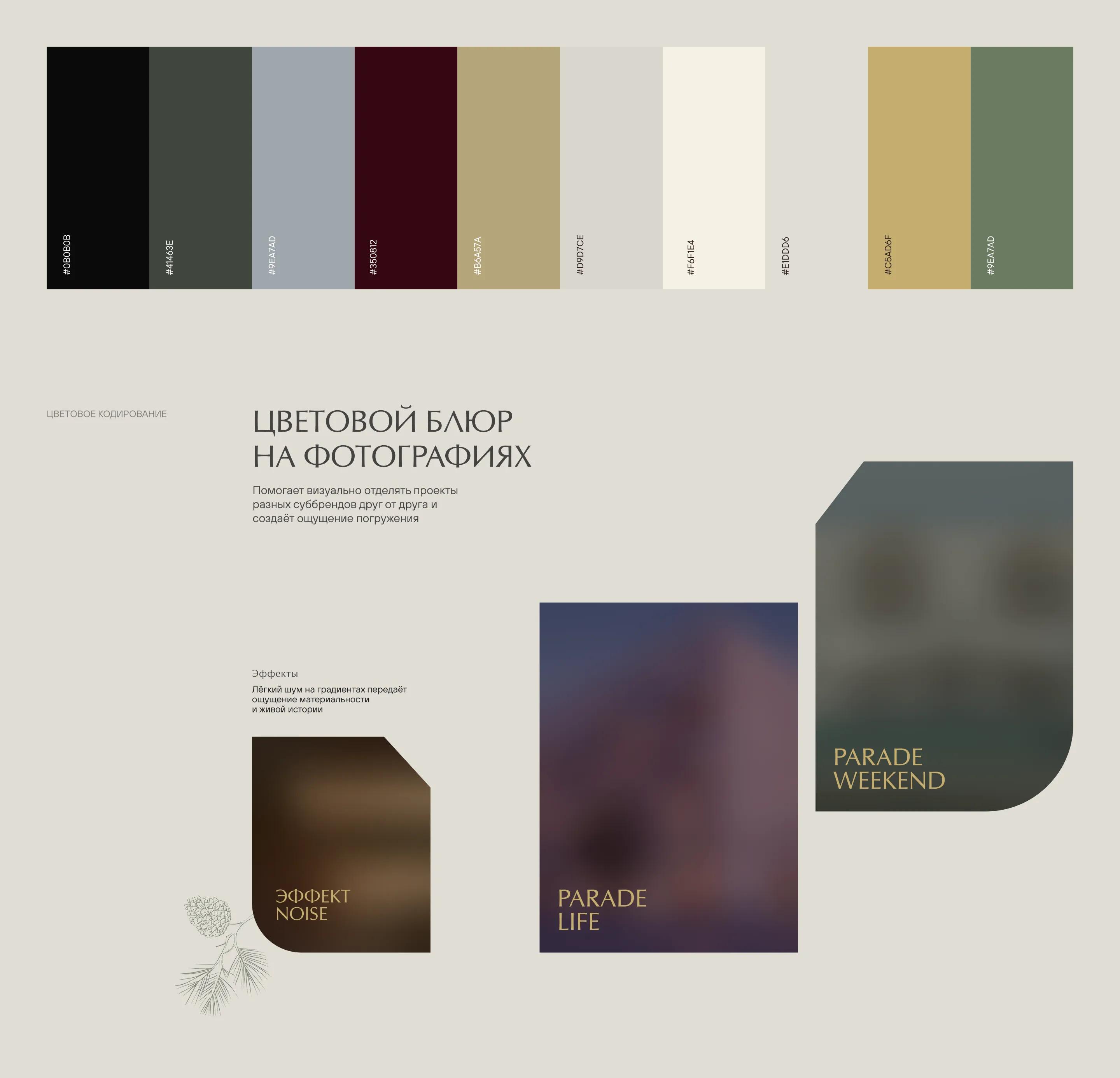
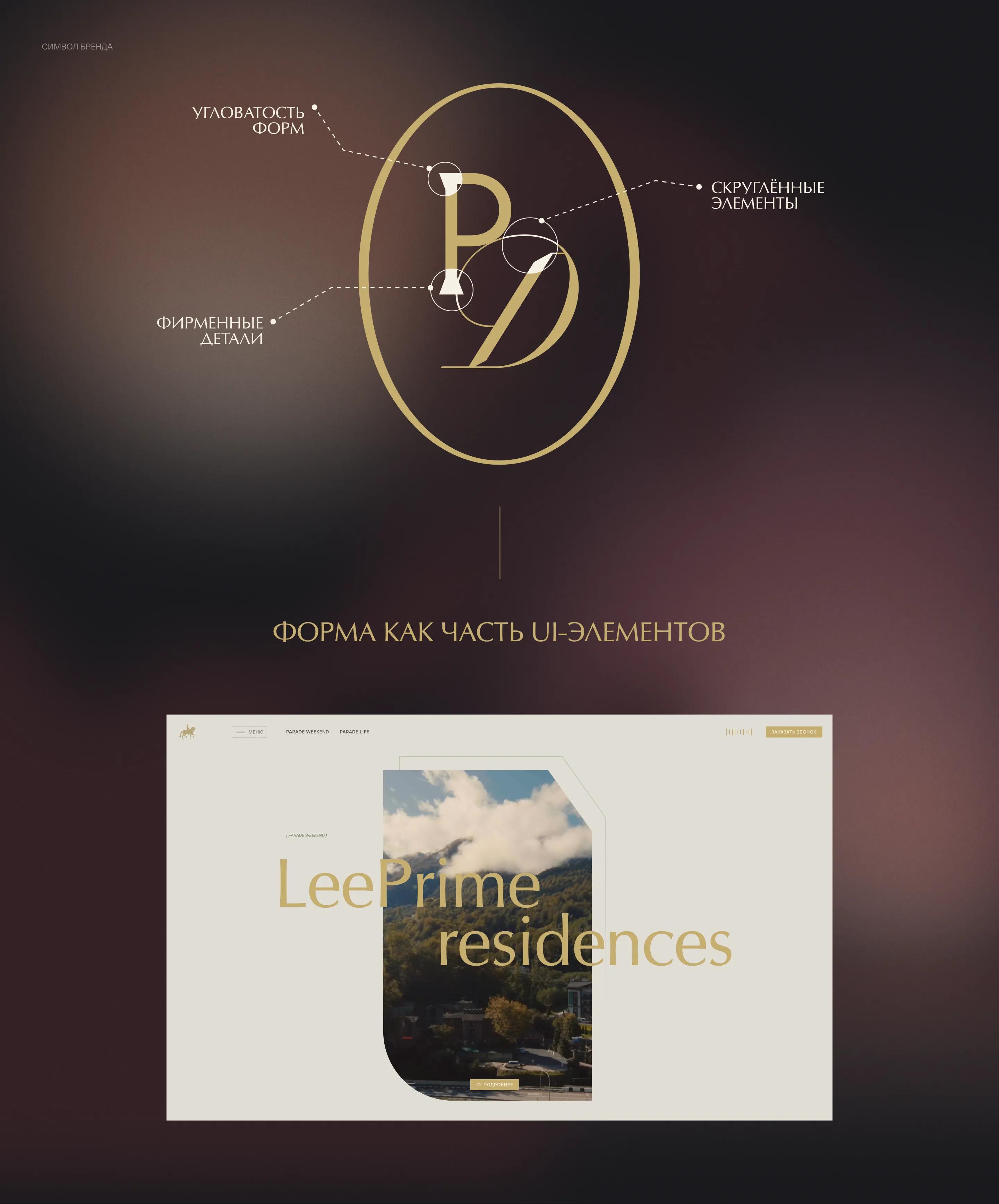
Attributes of Brand Identity
We reused the geometric elements of the brand’s logo. We created various UI elements that add identity and character to the website while maintaining consistency across digital platforms.
Additional Identity Attributes
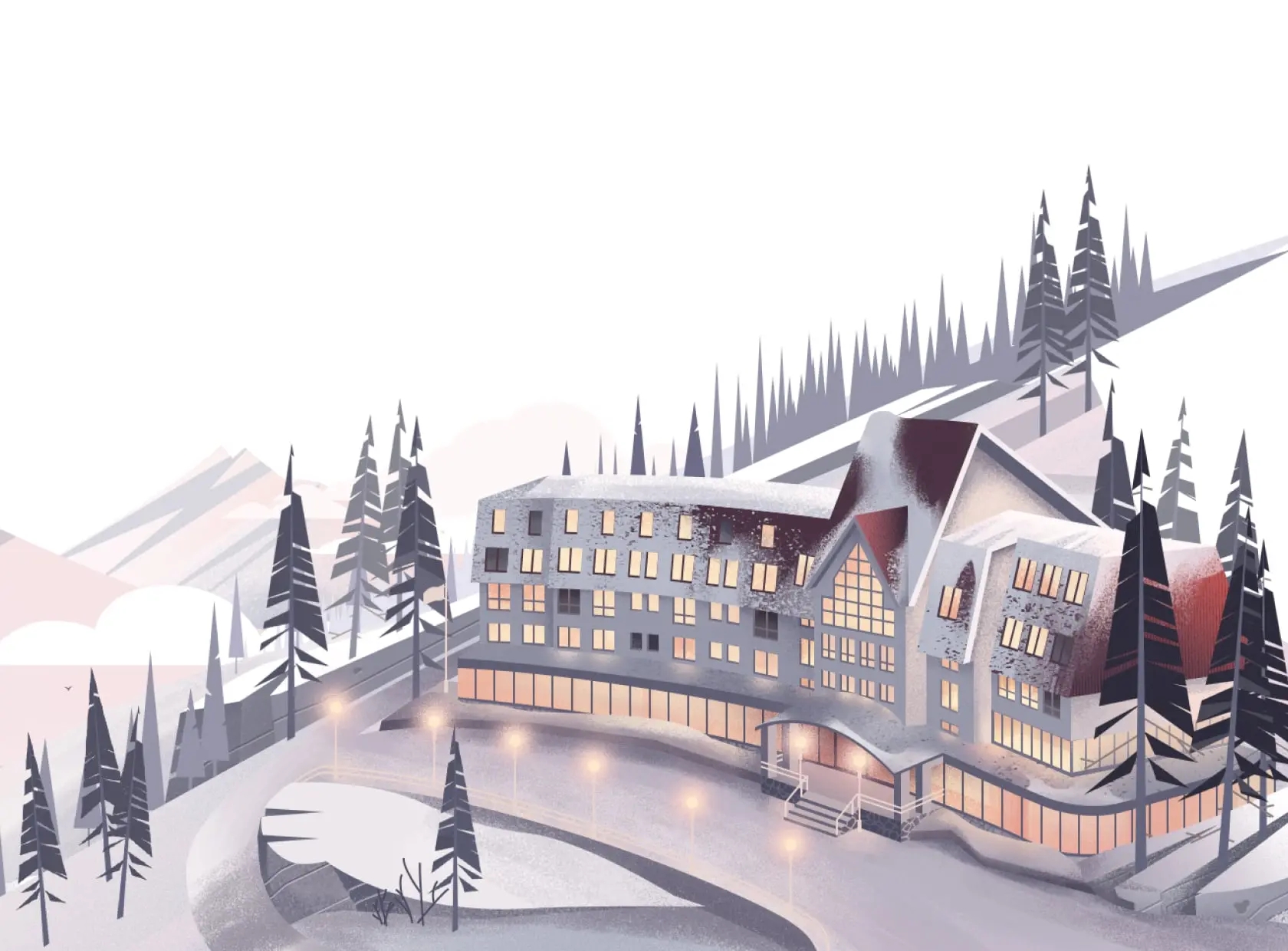
The illustrations build on the logo’s sketchy style, add elegance and vibrancy to the site, and don’t distract from the content.
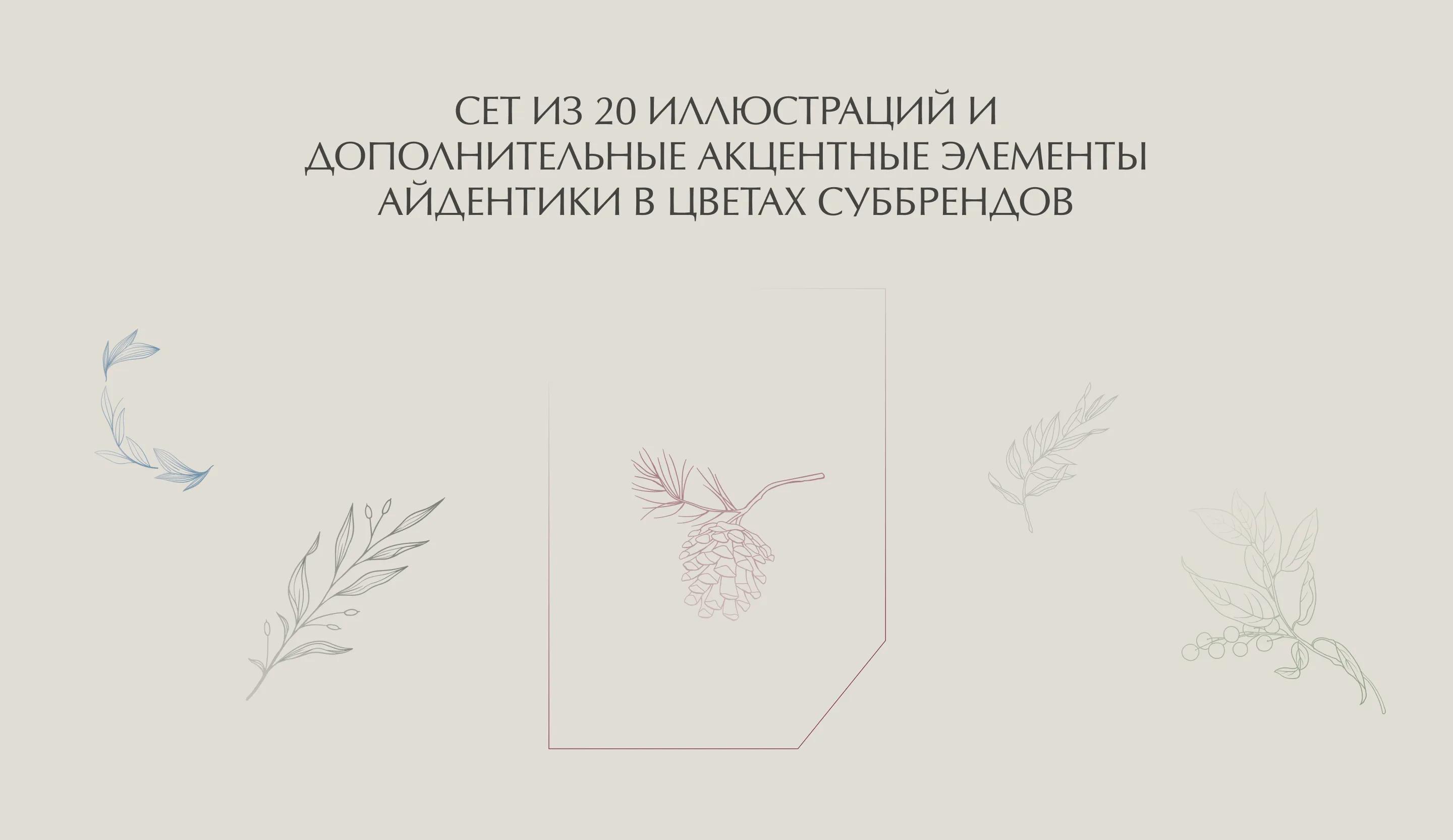
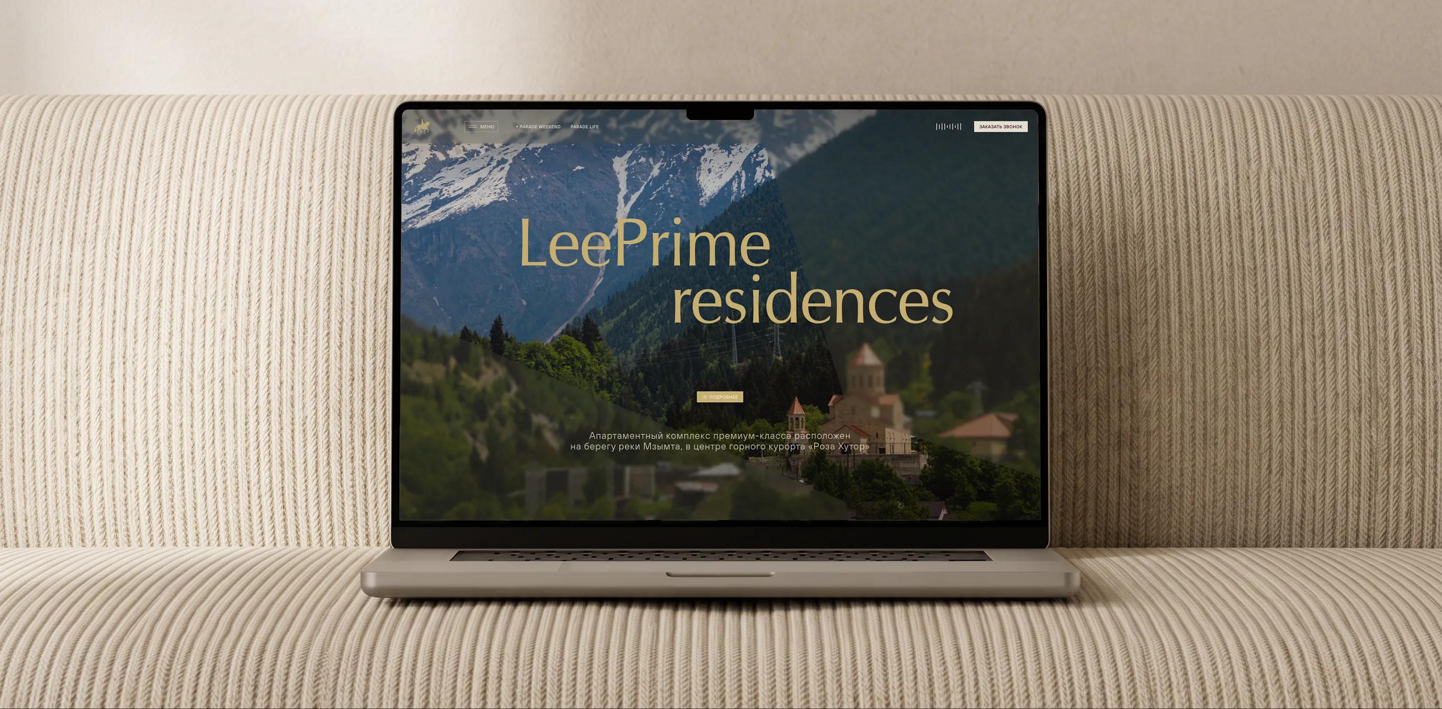
Photo and Video
The foundation of communication on the website is branded content: rich photographs and videos in neutral, warm tones, with an emphasis on emotions, atmosphere, sensuality, and the play of light.
Results
In its first release, the website brought together key user scenarios—getting to know the developer, browsing projects and news, and quickly contacting the team—and became a convenient entry point to the brand.
A premium presentation, a focus on projects, and emotional communication have shaped a distinctive brand image: PARADE is perceived as a new-generation national developer, distinct from local and niche competitors.