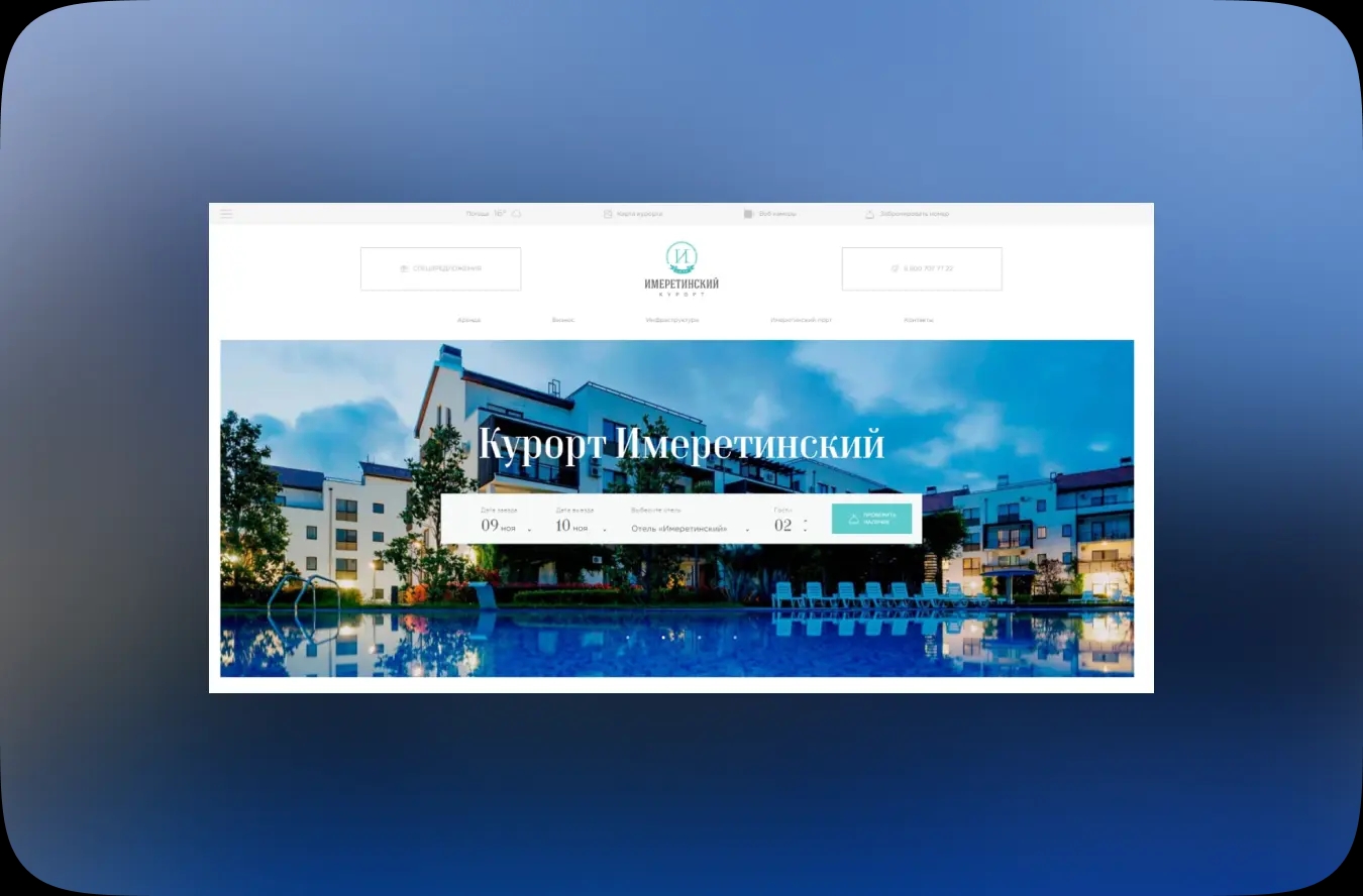
From Premium Integration to Website Transformation: The “Strana Development” Project
Development and redesign of a federal developer’s corporate platform, including integration of the premium segment
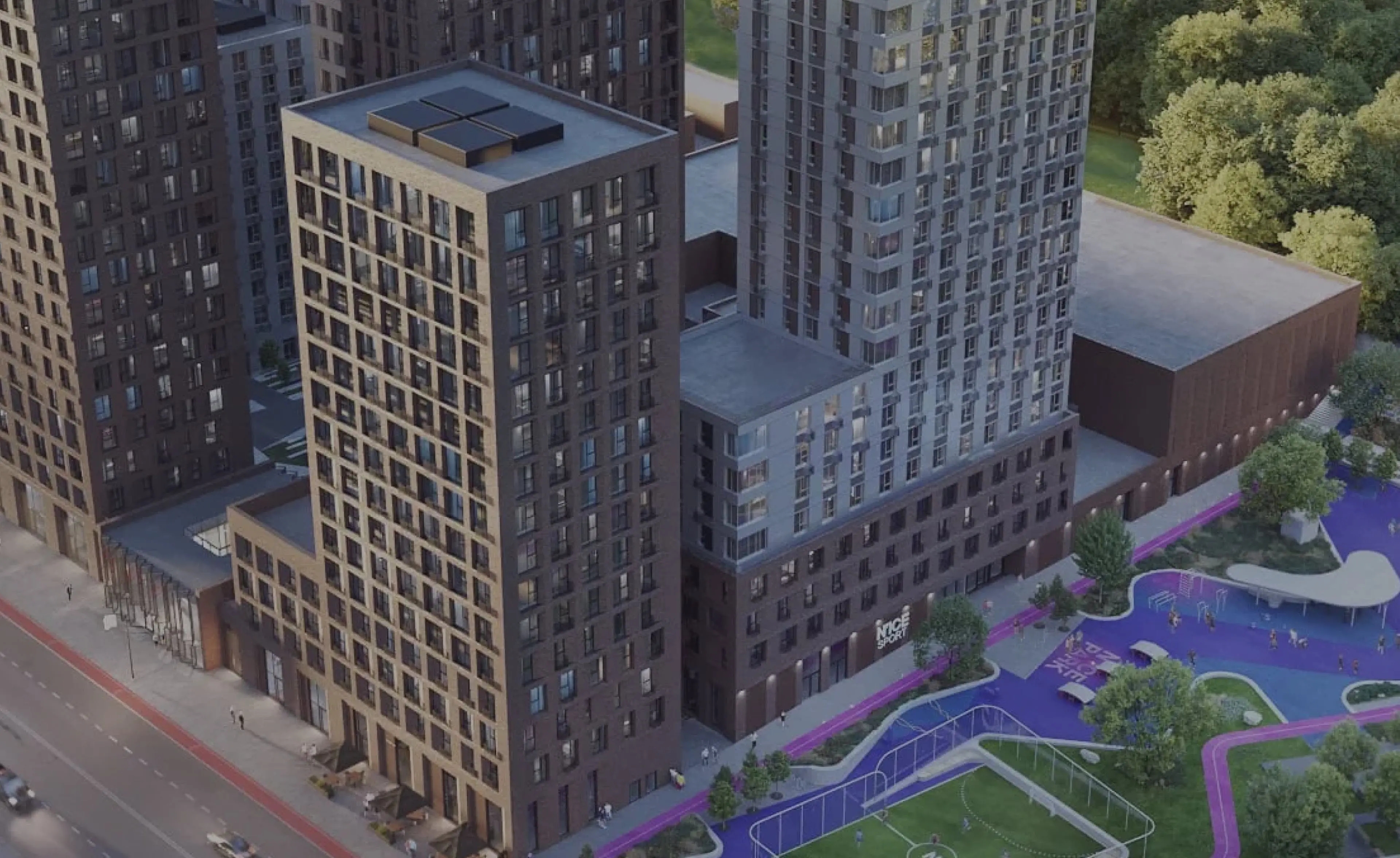
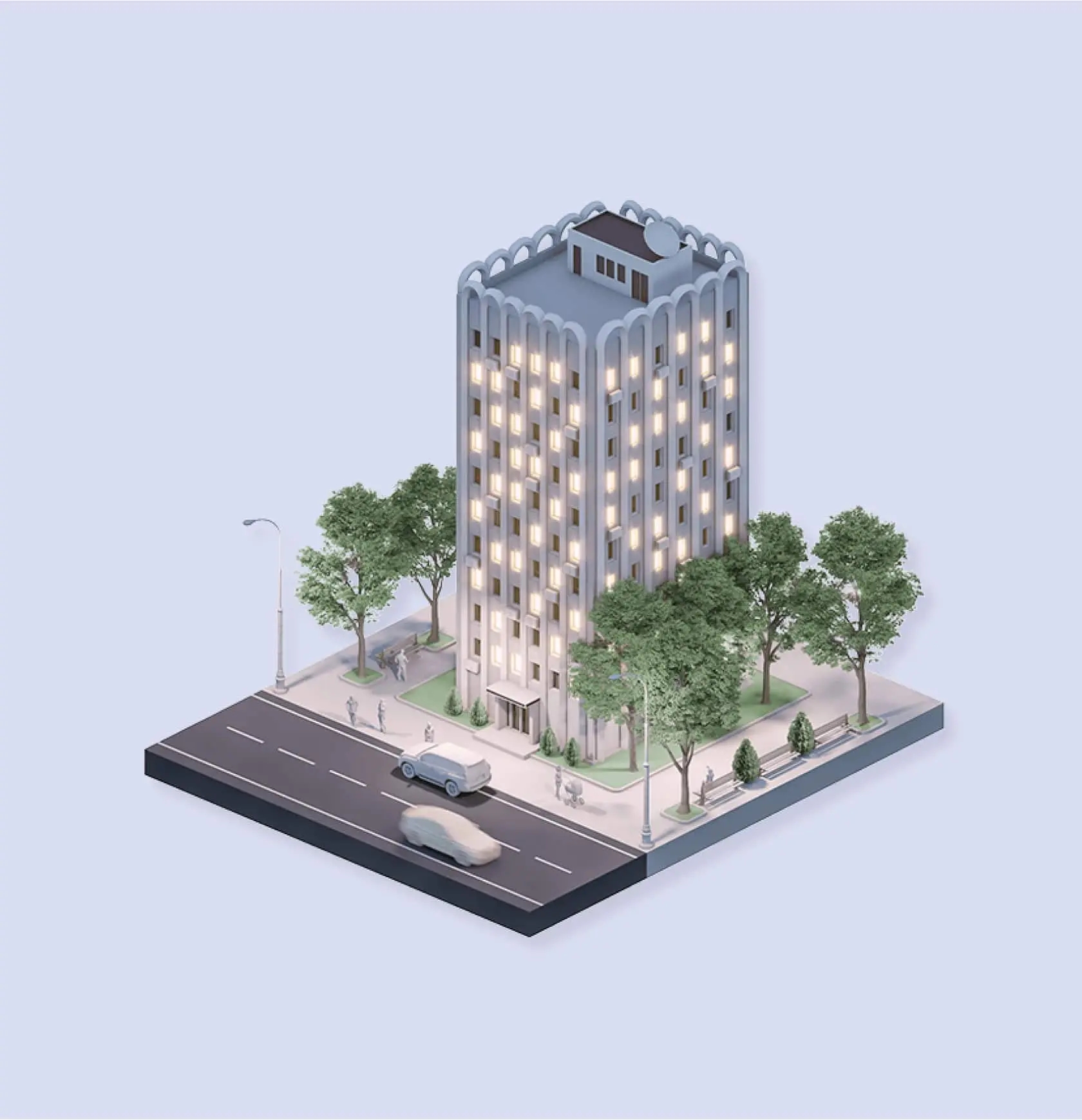
Strana is a federal developer of residential and commercial real estate in Russia
Initially, the team was tasked with announcing and establishing the premium segment as a separate section featuring projects and integrating it into the existing website, while maintaining service functionality and a focus on the mobile version (≈70% of mobile traffic).
In the course of the work, this task evolved into a comprehensive redesign of the entire website.
Context and Solution
We joined the project as a digital product enhancement team: handling analytics, design, and with a focus on UX. Our approach is based on treating the website as a classifieds platform, where property categories are distinguished visually, emotionally, and functionally, while remaining part of a unified ecosystem.
From the specific to the general: premium as a starting point for brand renewal
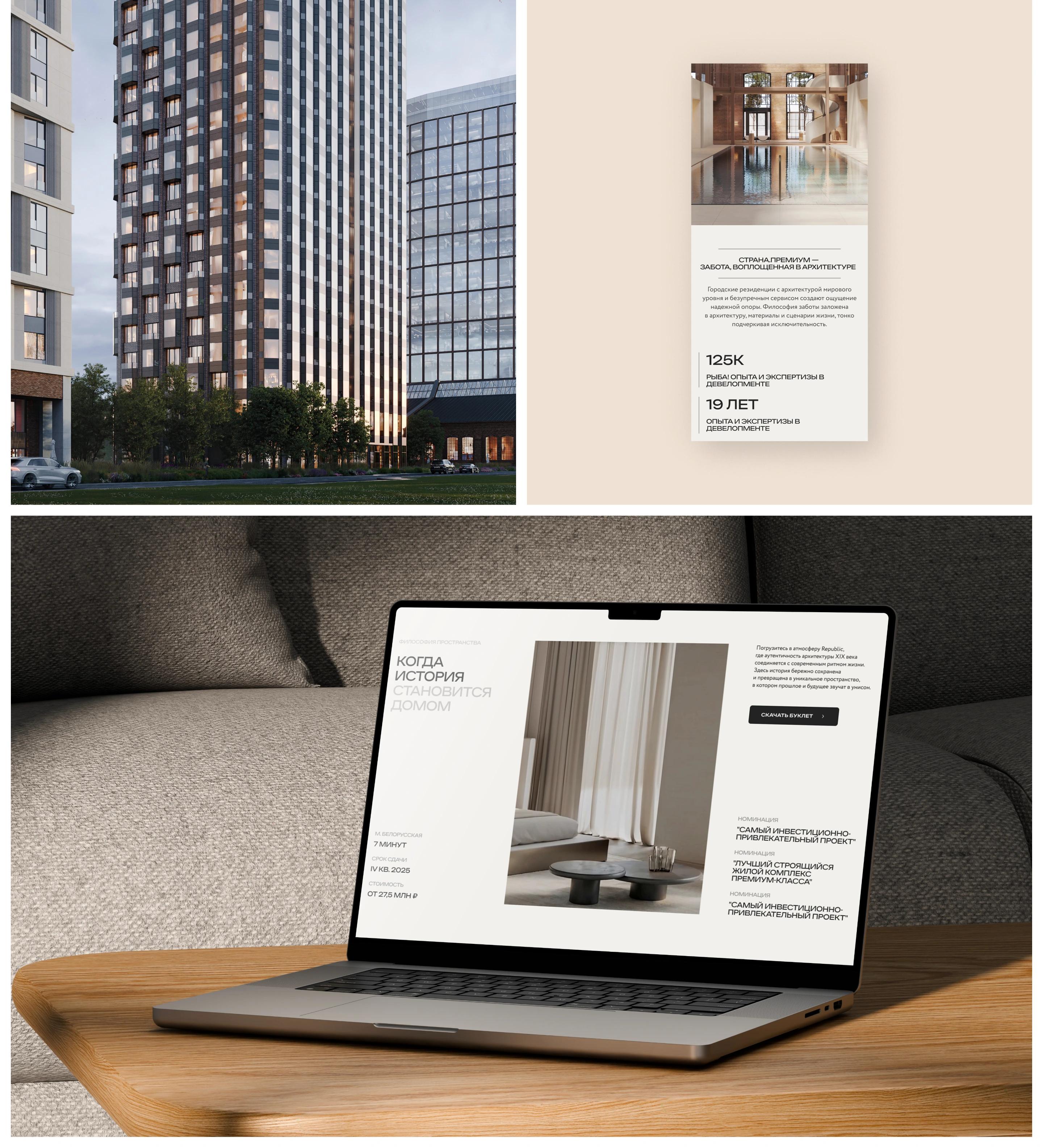
We began by updating the premium section and the project page as part of a comprehensive website refresh
Based on the client’s requirements, which were formulated following the research findings, we structured the process as a phased update—page by page. This allowed us to implement solutions quickly while maintaining the product’s integrity.
As a result, the integration of the premium section became the starting point for the brand’s digital refresh:
• updating the homepage,
• restructuring the color schemes for the comfort and business segments and redesigning them to reflect the new segmentation,
• creation of universal templates for projects of different classes,
• development of a unified design system,
• restructuring of the site architecture and navigation, and building a scalable UX architecture.
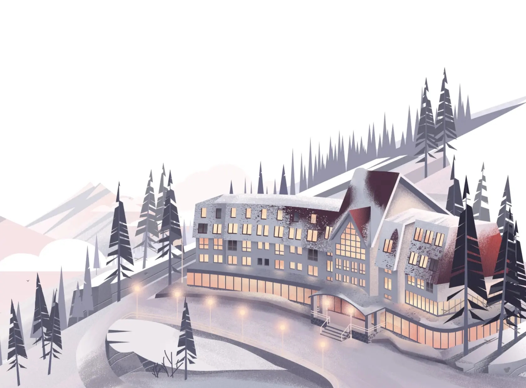
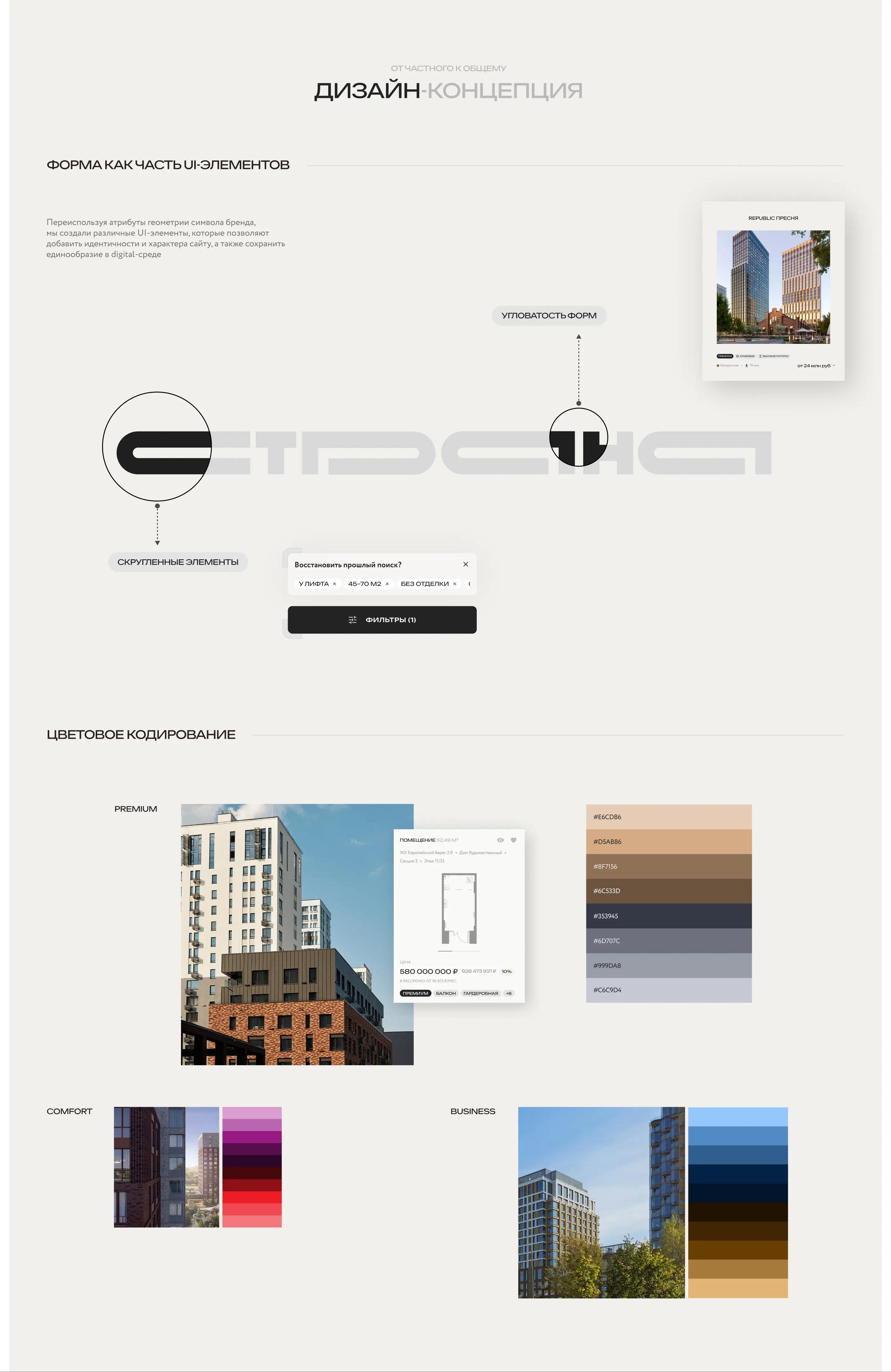
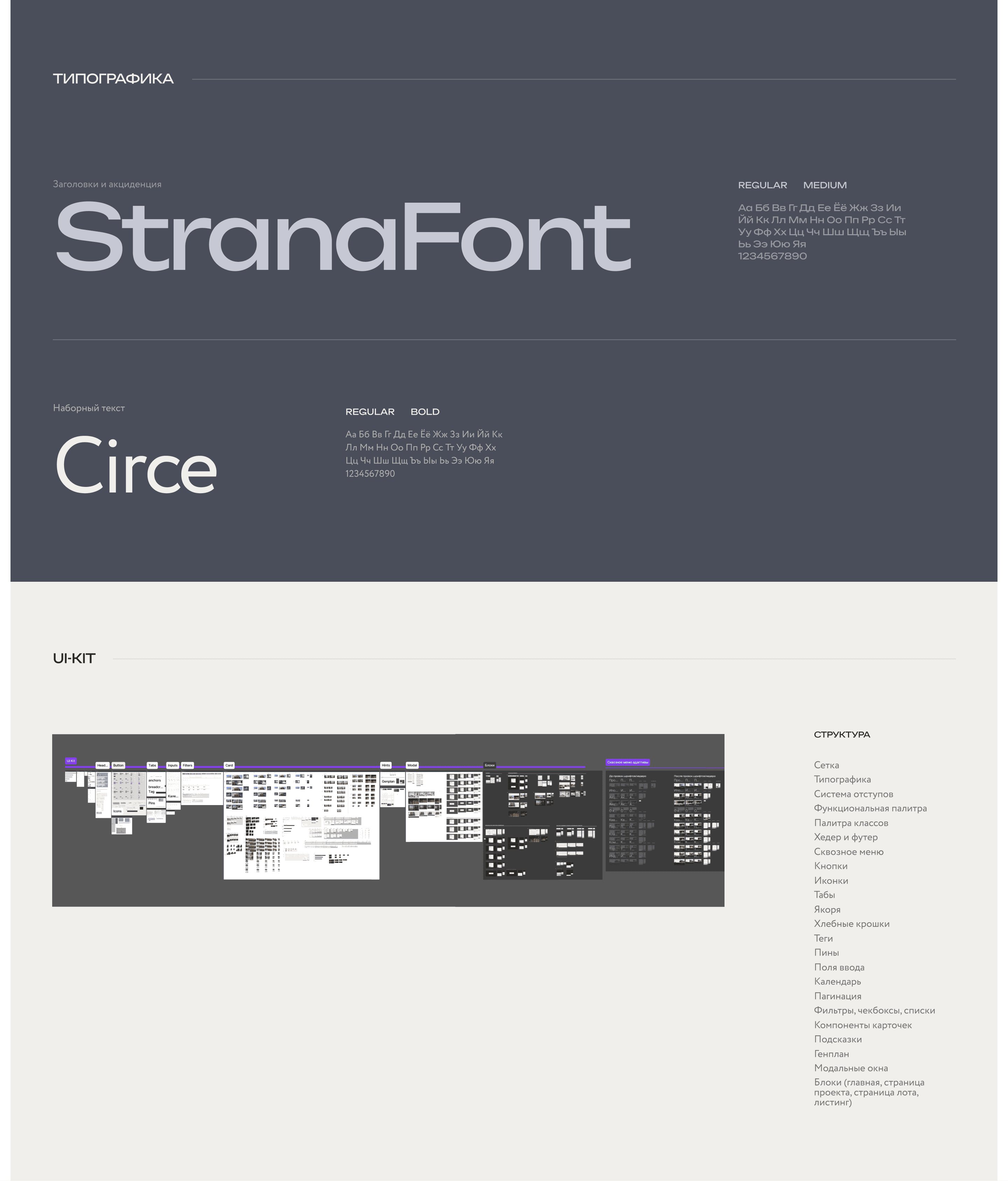
Within the design system, three real estate segments were identified: premium, comfort, and business. The premium segment received its own visual language, distinguished by composition, typography, and color palette, while the comfort and business segments are built on a unified UX logic and UI solutions, differing primarily in color coding.
Additionally, a universal UI kit was developed that takes into account the specific features of each segment: it establishes guidelines for working with color, typography, and interface components, ensuring consistency in the visual language and scalability of solutions as the platform evolves.
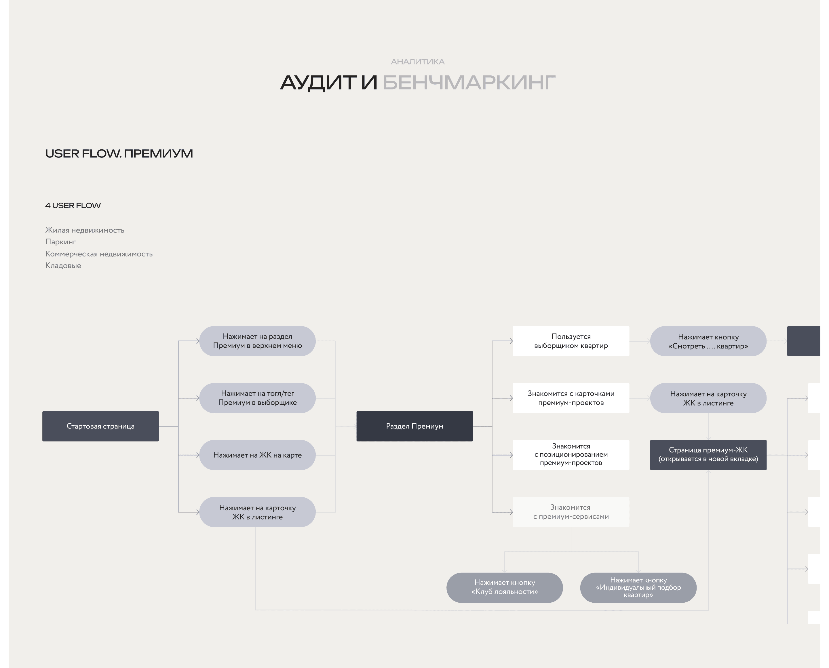
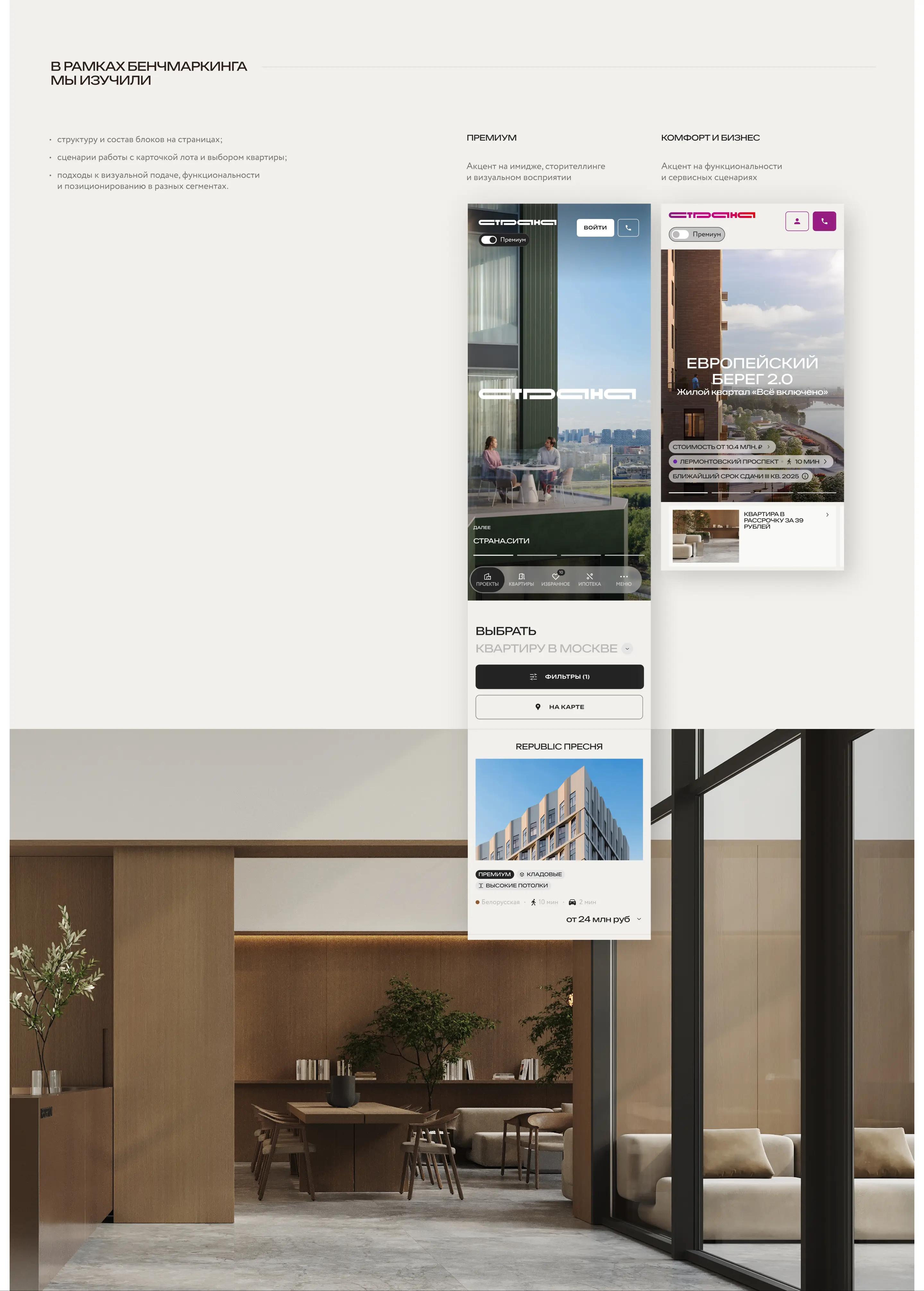
Initial Audit and Benchmarking
The project began with an analytics. We conducted a UX/UI audit of the website with a focus on mobile scenarios and, in parallel, researched how the perception of «premium» is formed in the digital space. For this purpose, we:
• benchmarked developers’ digital solutions in the premium, comfort, and business segments,
• analyzed user flows and user scenarios.
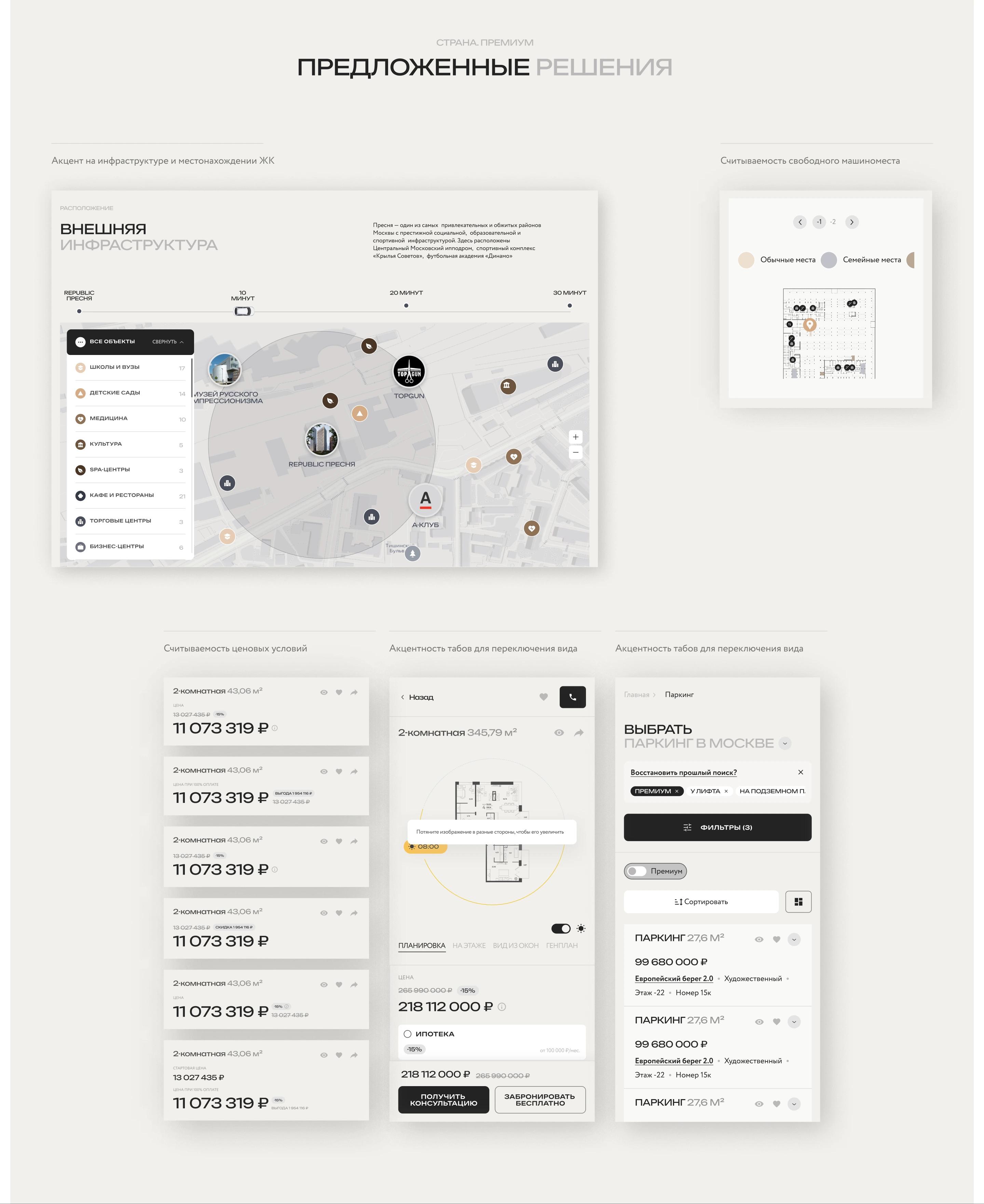
Based on the analytics, a new platform architecture was developed:
• key user scenarios were defined,
• navigation and a housing class selector were designed to switch between segments,
• principles for scaling the design system were established,
• a model for developing the platform as a unified digital ecosystem was formed.
The result of this phase was a map of growth opportunities and limitations, which served as the foundation for all design decisions.
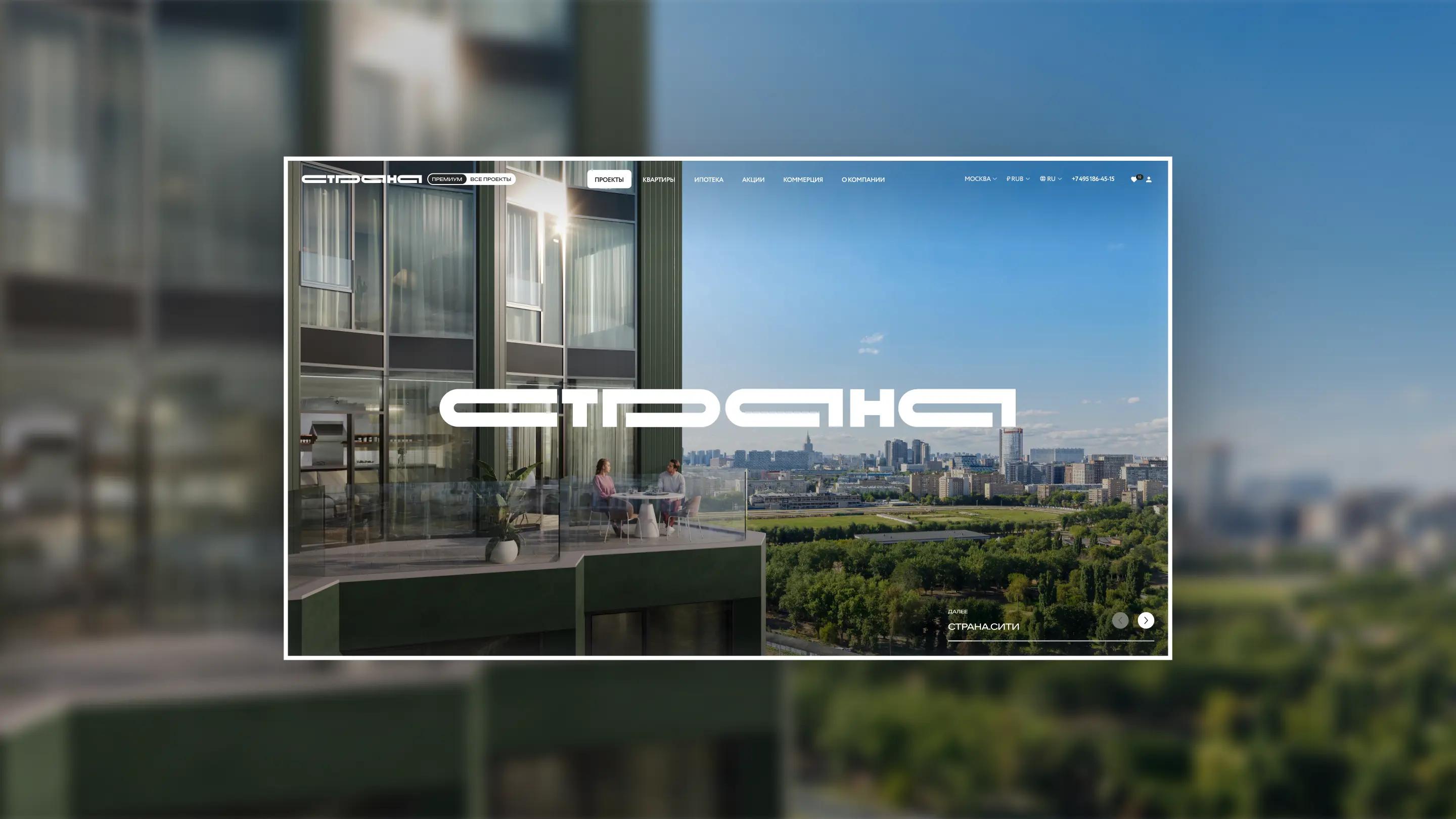
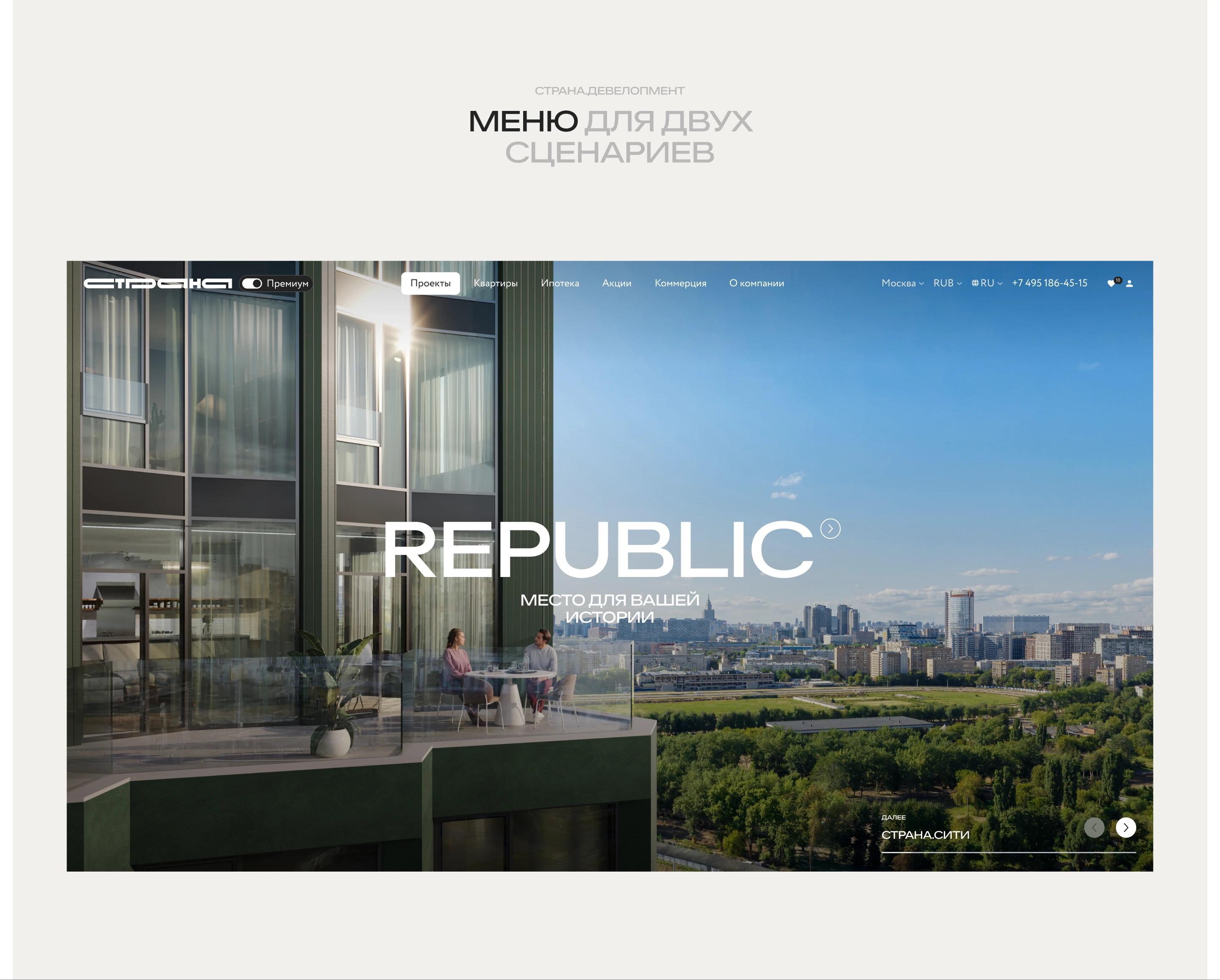
Premium as a standalone scenario
The homepage became the entry point to the site architecture: we restructured it and established a «Comfort/Business/Premium» hierarchy. We also implemented a proper transition flow to the Premium section, ensuring clear positioning of the segment within the overall platform.
Benchmarking and analytics tracking starting from the homepage allowed us to integrate the premium segment into the overall architecture while also developing it as a separate scenario within the site. When navigating to this section, the user enters a new visual and contextual environment while maintaining logical navigation.
We deliberately sought out premium UX and visual solutions. The focus shifted from a service-oriented approach toward emotional perception and visual expressiveness—while maintaining functionality and UX logic.
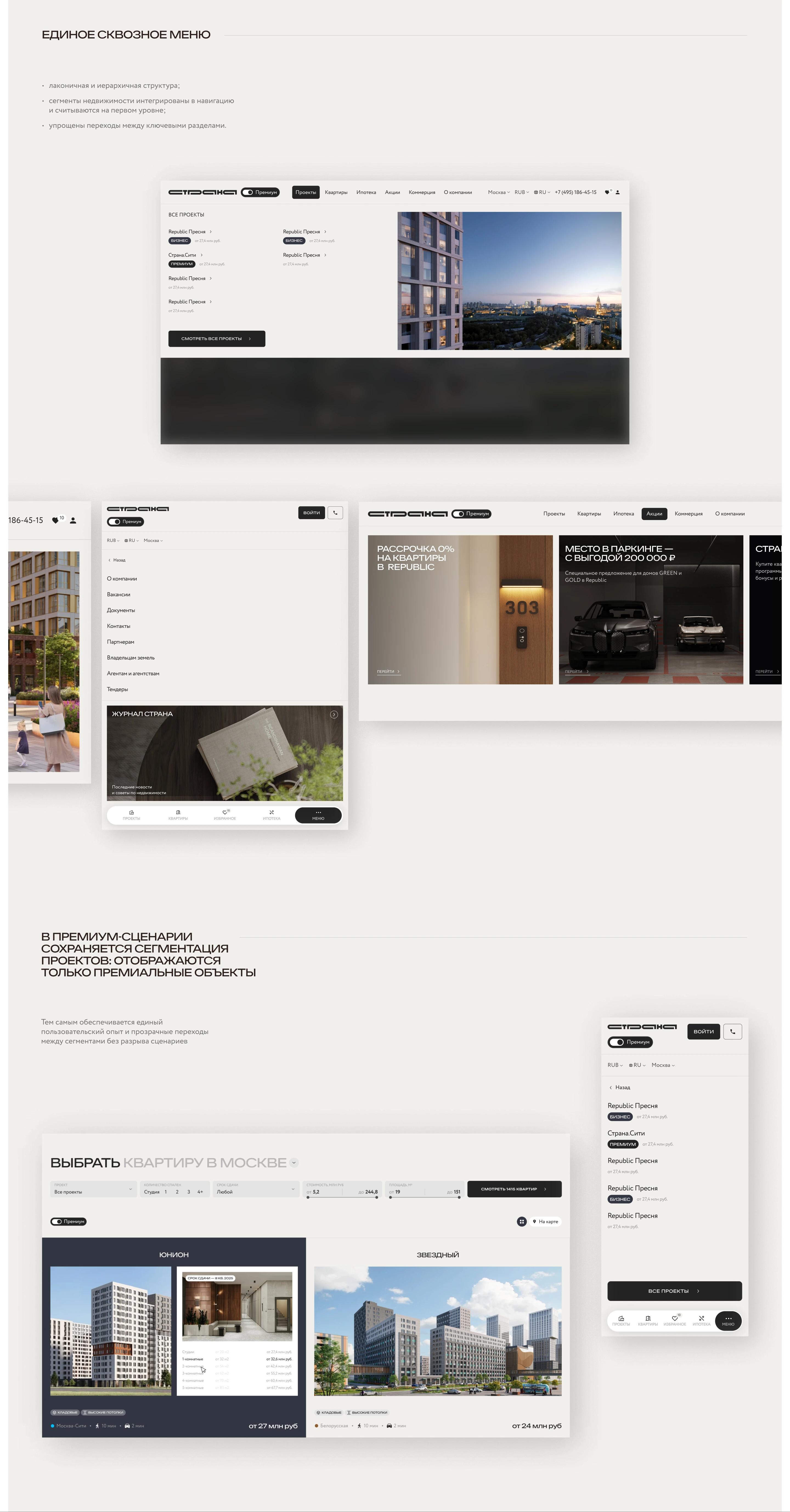
Menu for two scenarios
Navigation was developed as a separate project layer: we benchmarked navigation solutions for the developer’s complex product model and redesigned the top-level structure.
Initially, the menu did not reflect the product’s segmentation and did not support clear user scenarios. We restructured its logic, making the structure more transparent, compact, and focused on user tasks.
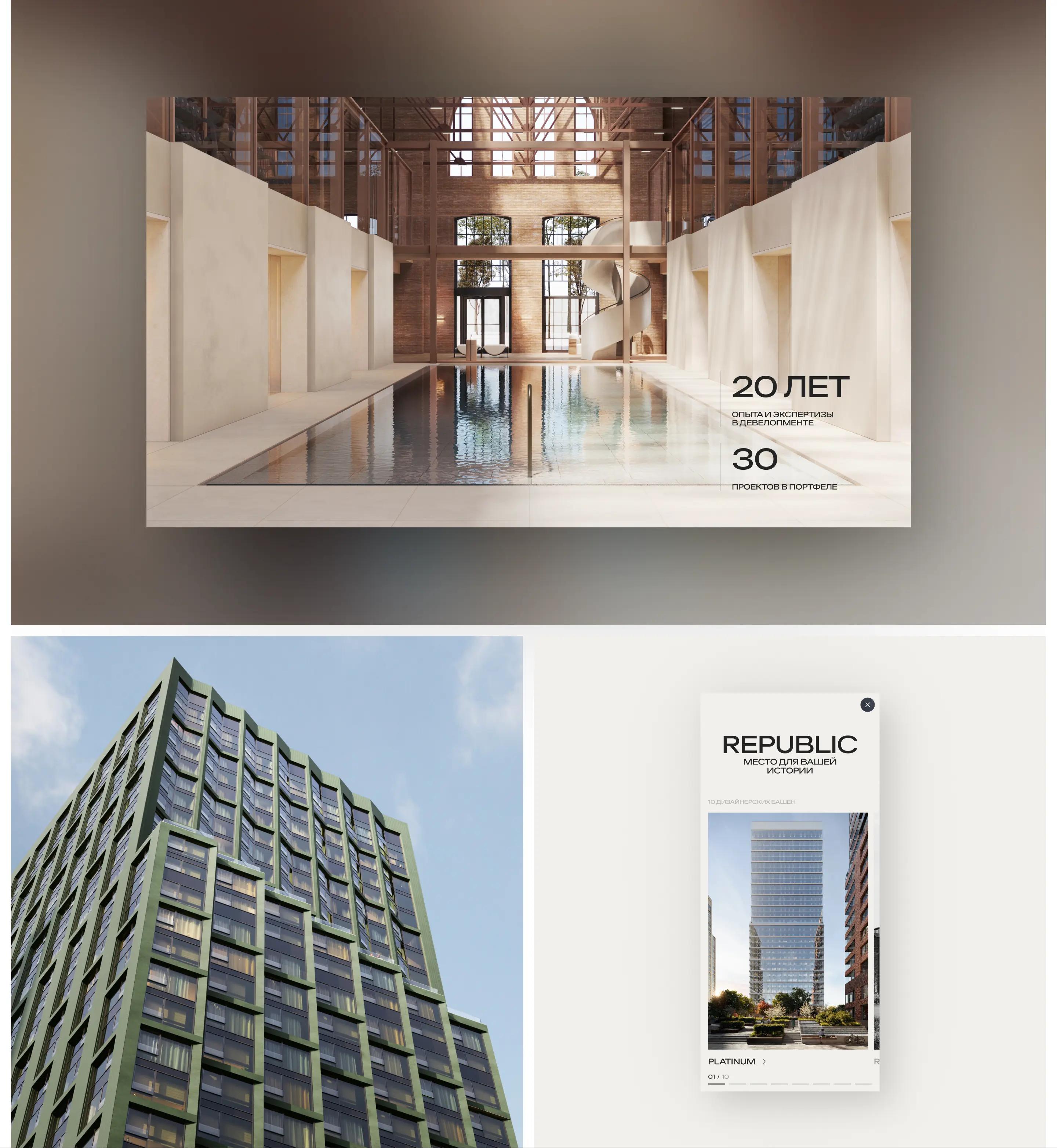
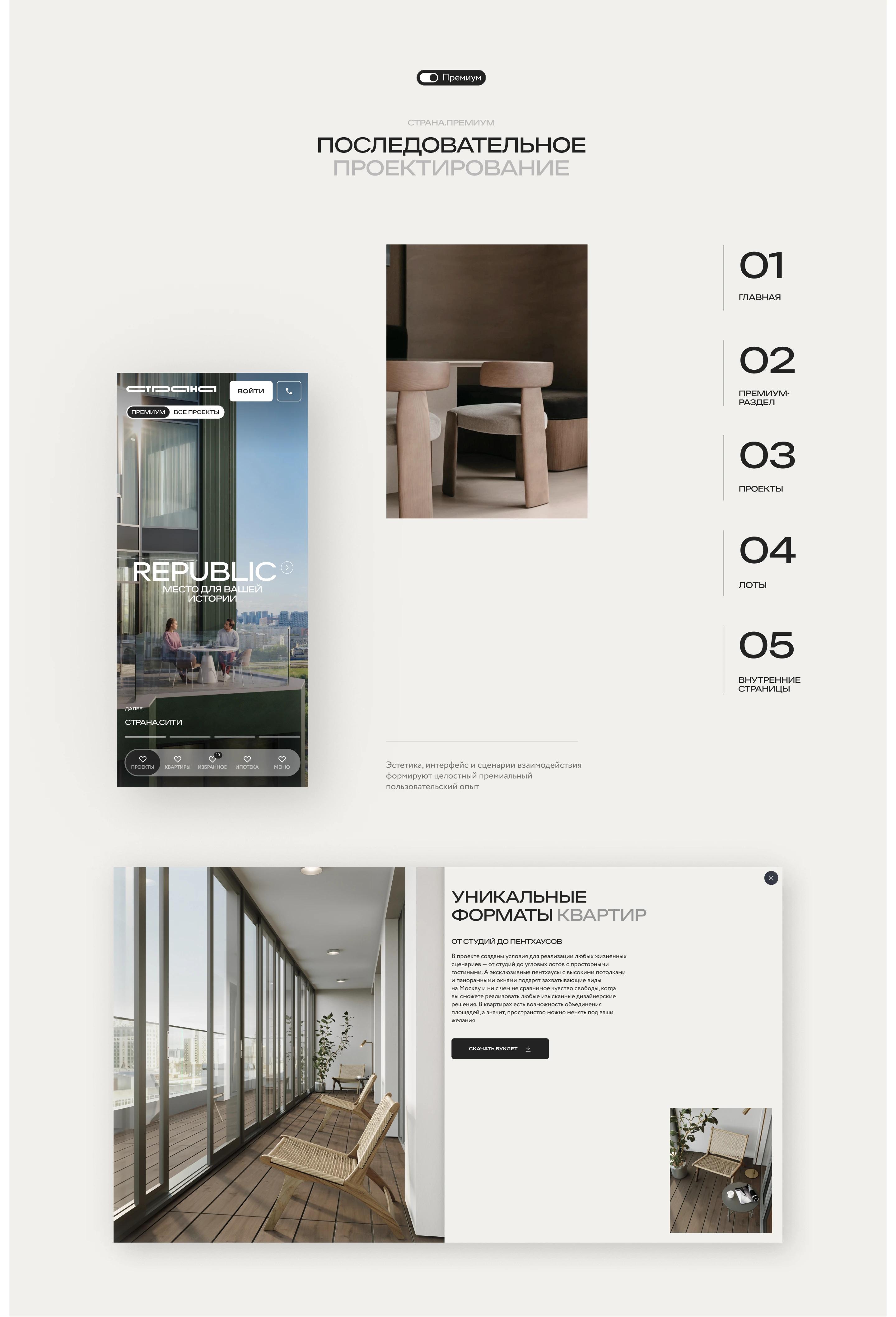
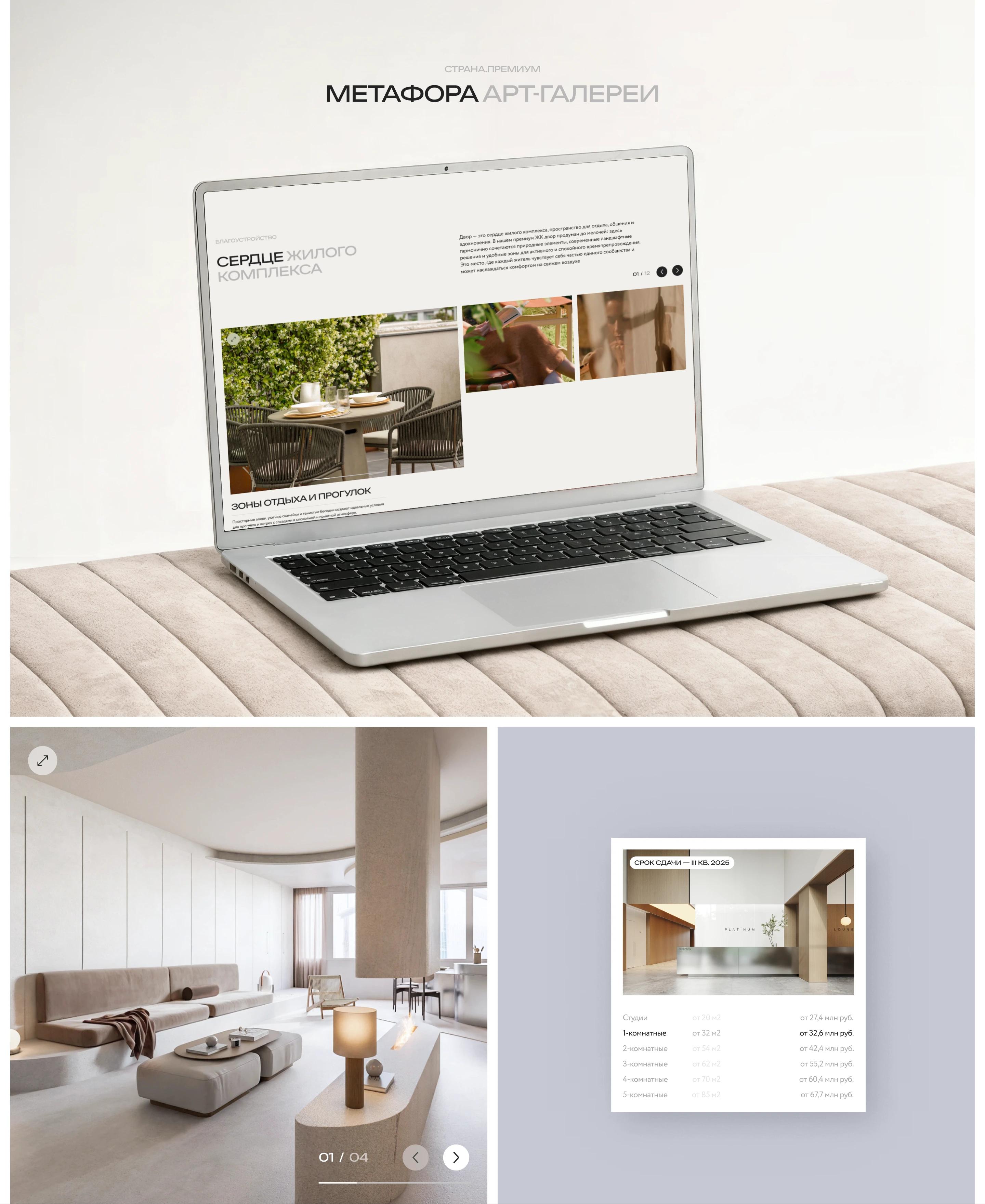
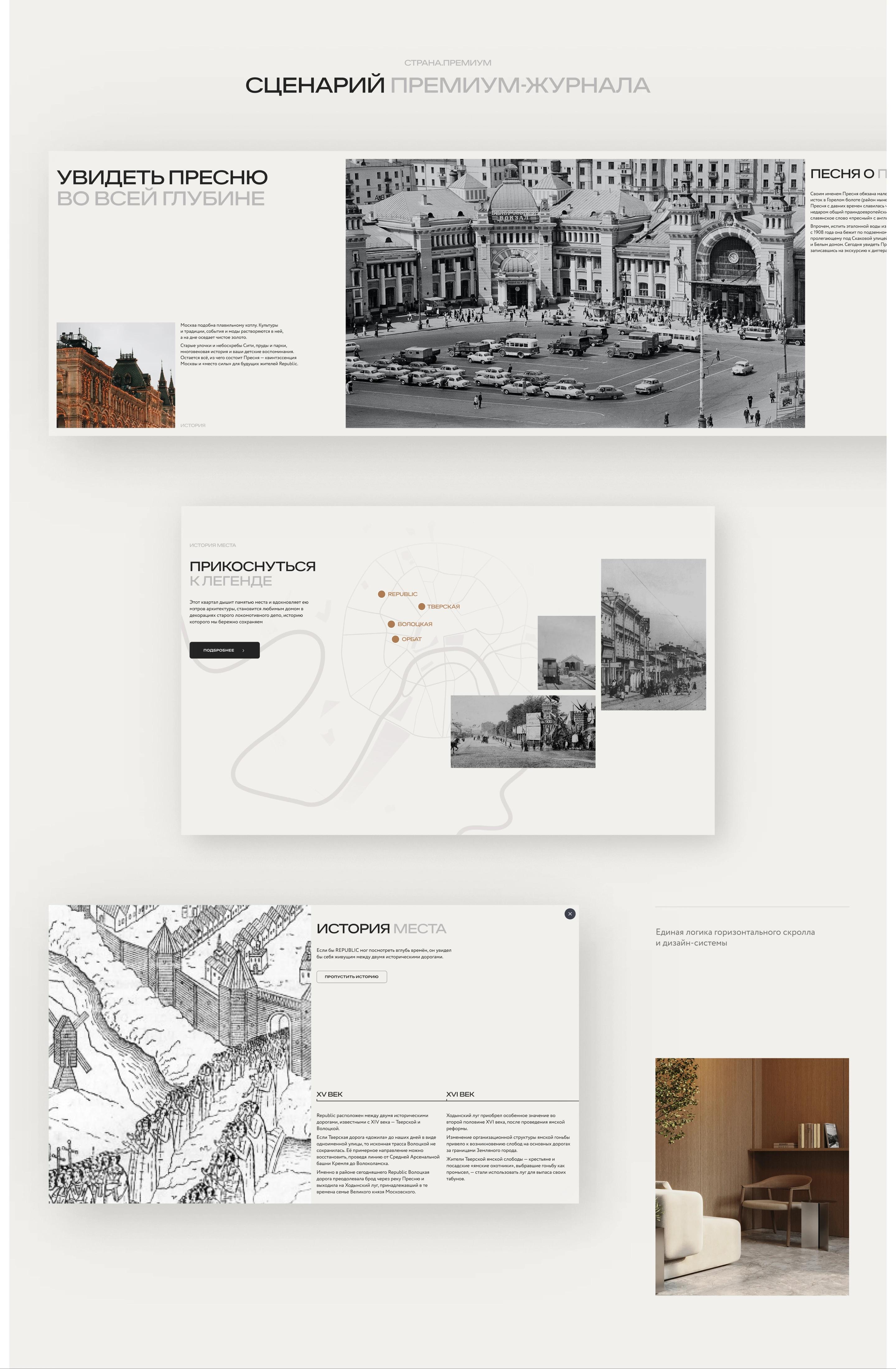
The Aesthetics of an Art Gallery
The visual concept is based on the metaphor of an art gallery
It is a minimalist, bright space where premium objects are presented as independent architectural statements with character and identity. The layout and interface are built on the following principles:
• wide-format «live» images,
• minimalist interface elements,
• an emphasis on open space,
• clean screen composition,
• smooth animations,
• lifestyle content for emotional engagement.
The premium feel is created through scale, rhythm, breathing room, and understated expressiveness—without overloading the interface.
At the core of the platform: a unified visual and UX system that separates segments, maintains brand identity consistency, and creates a magazine-inspired architectural style with conversion efficiency.
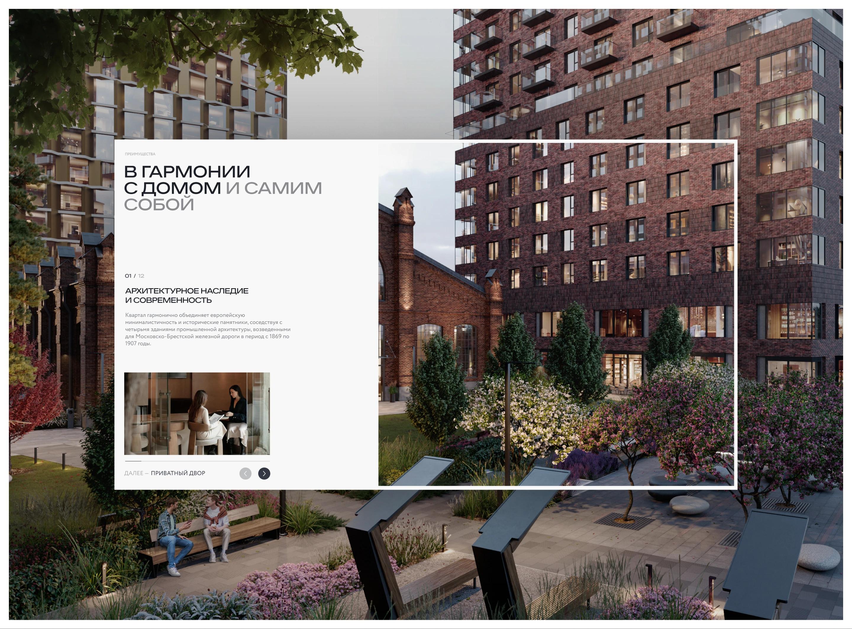
«Flipping through a premium magazine» scenario
The project’s standout feature is the concept of separate promotional modal windows showcasing the history of each home.
Horizontal scrolling evokes the sensation of "flipping through a magazine"—content is presented through a clean interface, creating a visually appealing effect.
Existing blocks were reimagined and adapted to the horizontal scrolling mechanism. Additionally, we developed a type of modular blocks that operate within the unified logic of the scroll and the design system.
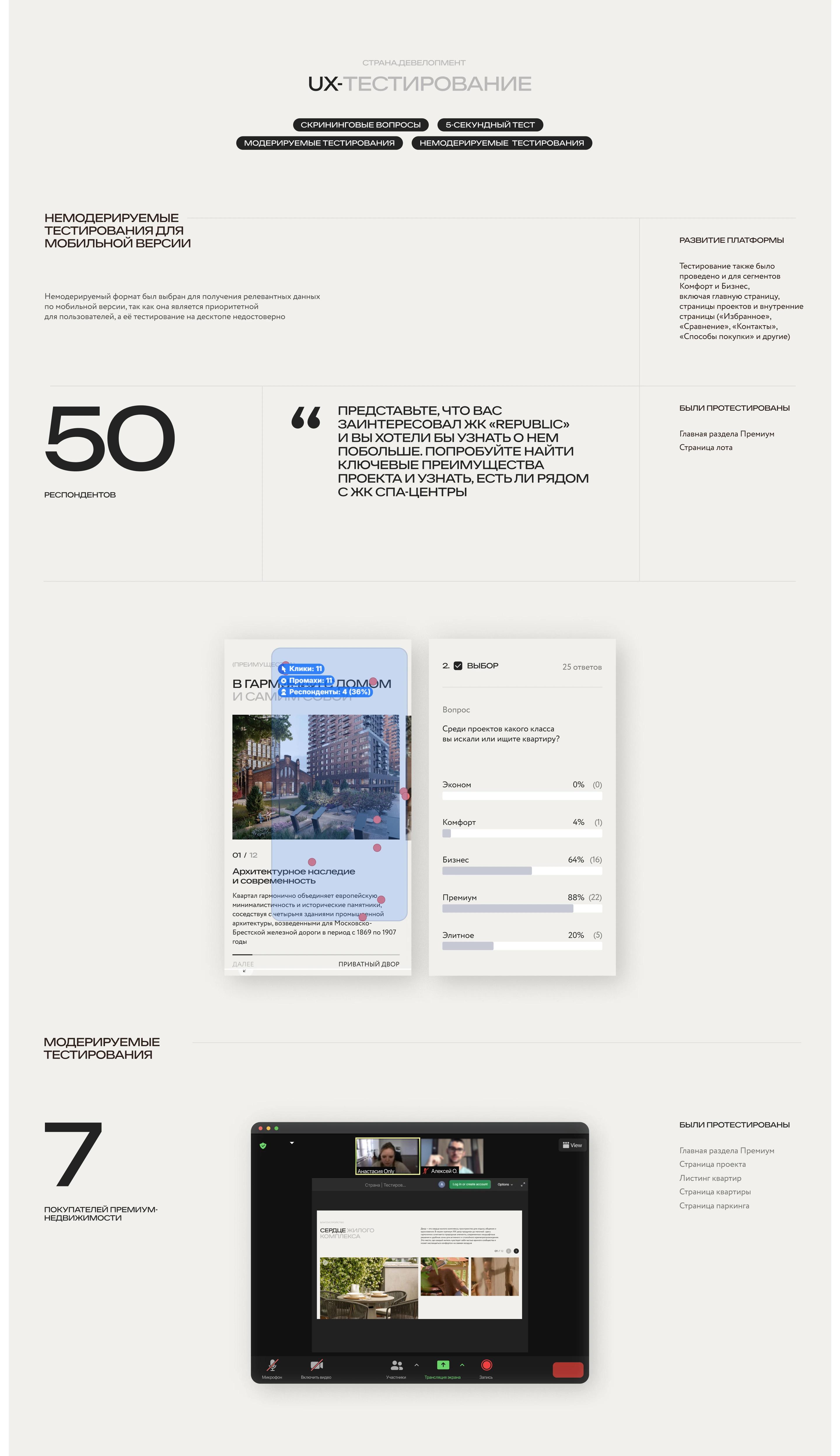
Three parallel UX studies to validate the selected methodologies
As part of the project, we conducted UX research involving real users
These included moderated desktop testing, during which 24 usability issues of varying severity were identified, as well as unmoderated testing on mobile devices, which allowed us to identify an additional seven issues of varying importance.
The research conducted allowed us to evaluate the logical structure of the website, analyze user behavior in key scenarios and page navigation, and identify key areas for functional development.
A/B testing. In response to a client request regarding users failing to read the discount terms and incorrectly interpreting prices, we analyzed competitors and prepared six options for displaying prices and discounts for the mobile and desktop versions within our design system. Based on the results of client-side A/B testing, one optimal option was selected, which we refined and implemented into the final layout.
This stage helped establish a unified approach to design and user experience development and enabled the platform to be developed consistently.
Result
The Premium section has been launched and integrated into the existing website, implementing key scenarios for the premium segment—from accessing the project level to selecting a lot—with visual elements such as horizontal pop-ups.
The platform continues to evolve as a product: the developed solutions, visual language, and design system are being consistently rolled out to new pages and sections. Work continues on the comfort and business segments (homepage and project pages), as well as internal sections—favorites, comparison, commerce, promotions, contacts, etc.—including the development of the “Ways to Buy” scenario.
Solutions for the Comfort/Business/Premium segments set the standard for the visual and UX approach across the entire platform.