The MYSS Project by MR Group
Kirill Dmitrievich Zakhovaev
mr marketing project manager
We would like to thank Only for their creative approach, technical expertise, and attentive attitude towards the client’s needs.
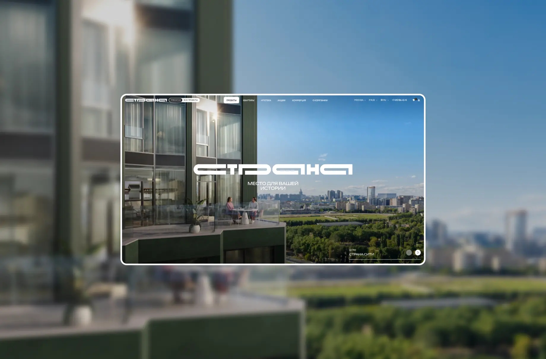
Website development and UX/UI design with handcrafted illustrations for a modern residential cluster
Kirill Dmitrievich Zakhovaev
mr marketing project manager
We would like to thank Only for their creative approach, technical expertise, and attentive attitude towards the client’s needs.
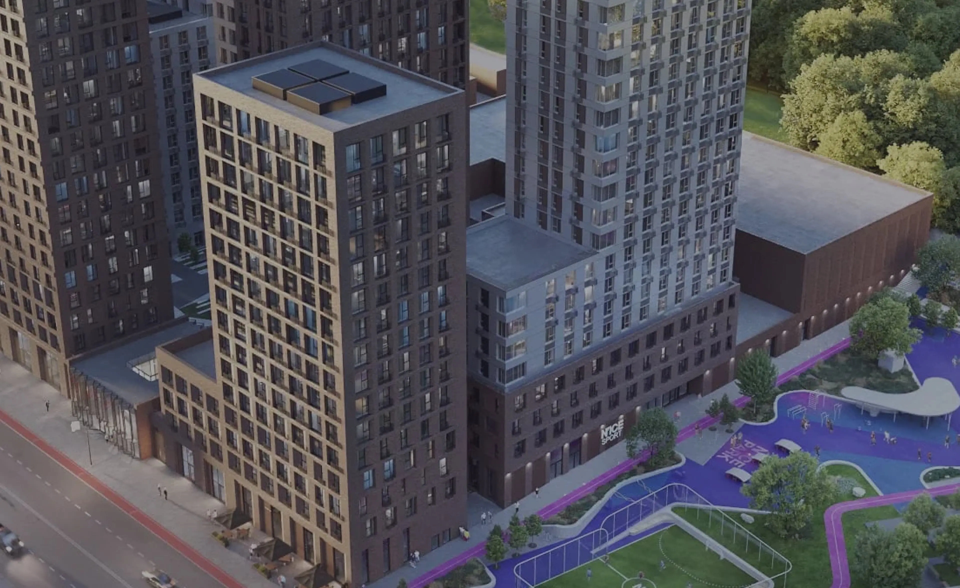
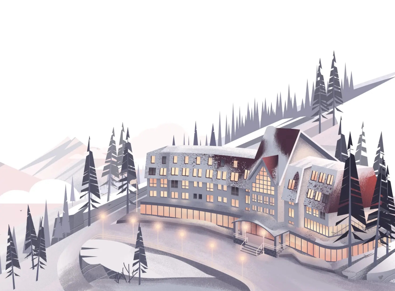
MYSS is a premium suburban project from MR Group, located 15 minutes' drive from Moscow.
The project is based on individual needs, so that everyone has enough space for happiness: for work and leisure, for communication and privacy.
The family-oriented nature of the project is embodied in the slogan «Be yourself. Be a family.»
Website of the day
Shortlist. Web & App category, «Best Performance» nomination
Silver “Real Estate”
Bronze. Category: Digital, nomination: “Project Website”

Overall brand vision
We leveraged the strengths of the brand’s mixed style, which successfully combines family values, warmth, and comfort with technology and modern solutions.
To create a memorable identity for the website, we decided to take a more expressive approach to the visual concept and added hand-drawn illustrations.

Identity
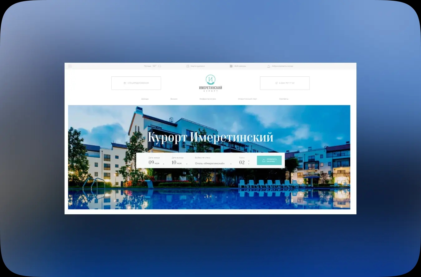
The interface uses the brand’s corporate colors and typography. The palette has been expanded with several soft shades to further emphasize the feeling of comfort and tranquility.
The main font, TT Drugs, is a modern and austere display font with geometric shapes and rounded corners, providing a sense of modernity and reliability.


Graphics elements
The brand identity, using a logo that combines strict shapes with rounded elements, is actively used. The smooth shapes of the linear figures in the style-defining graphics also emphasize the softness and flexibility of the design.
In the interface, rounded shapes are used on elements that serve as backgrounds for covers or for designing cards, banners, images, and buttons.

Illustrations
To maintain a welcoming and crafty feel, we drew animated line illustrations. Their visual style not only echoes the brand’s signature graphics, but also fits organically into the website interface. The illustrations brighten up the interface and make the website stand out from others thanks to its character and attention to detail.

Design
The website design combines two approaches: creating an atmosphere of comfort and demonstrating the technological capabilities of the residential complex. Soft shapes and lively photography, complemented by thematic illustrations, enhance the feeling of warmth and family atmosphere. The interface elements reveal the modernity, convenience, and technological sophistication of the residential complex, balancing the soft visual style of the website.

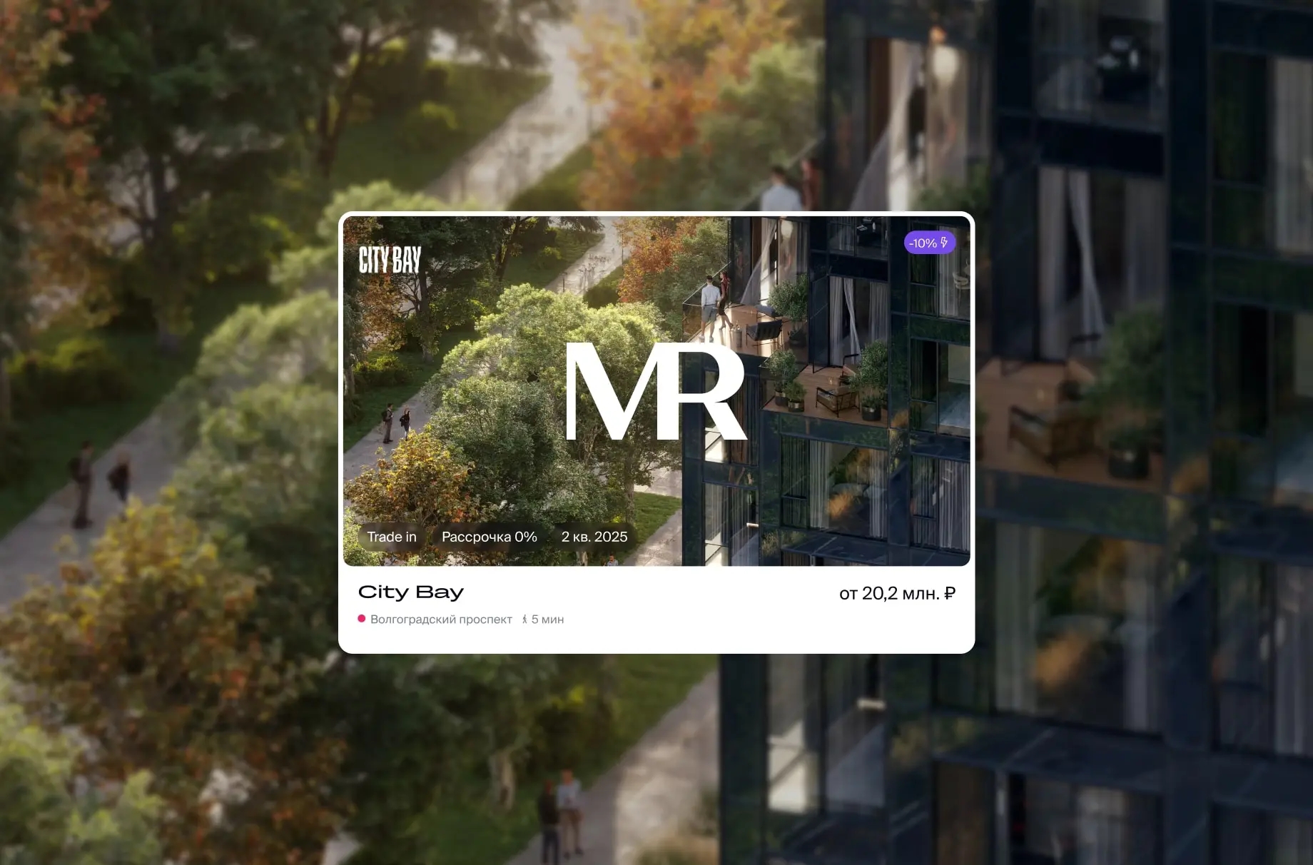
Catalog and lot card
The website not only serves as a presentation tool, but also functions as a conventional tool for selecting housing. We have implemented a convenient housing selector that allows users to select options based on parameters ranging from apartments to cottages and townhouses. To simplify perception, housing types are clearly marked with branded icons in the style of the project.


Development
We focused on creating a technological foundation that remains invisible to the user. First and foremost, we ensured fast page loading and smooth animations so that nothing distracts the user from exploring the site. For the convenience of users, we implemented integration with the client’s CRM system. Now, the data on available apartments in the selector is always up to date, and the selection process has become as transparent as possible.

Result
As a result, the creative concept using animated illustrations combined with a convenient selector allowed users to immerse themselves in the world that awaits them inside the MYSS suburban cluster and take the first step toward purchasing their dream apartment.
The website effectively presents the project as a modern and comfortable space for family life and allows users to choose the right type of housing.