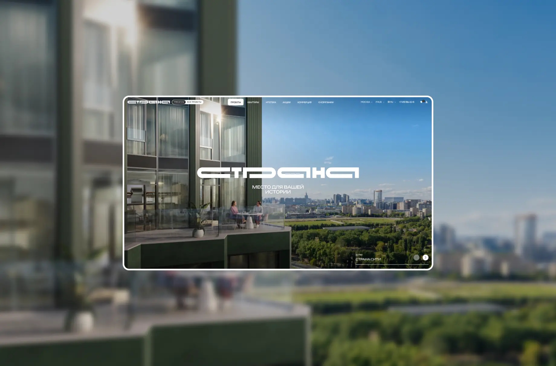
Website of a developer of logistics and industrial parks
D.A. Kuryakov
commercial director at logistics partners
The Logistics Partners Group would like to thank the agency Only.digital for their professional work on developing the company’s new website.
Development and UX/UI design of a developer’s corporate website featuring a property portfolio, brand identity, and integration of external services
D.A. Kuryakov
commercial director at logistics partners
The Logistics Partners Group would like to thank the agency Only.digital for their professional work on developing the company’s new website.
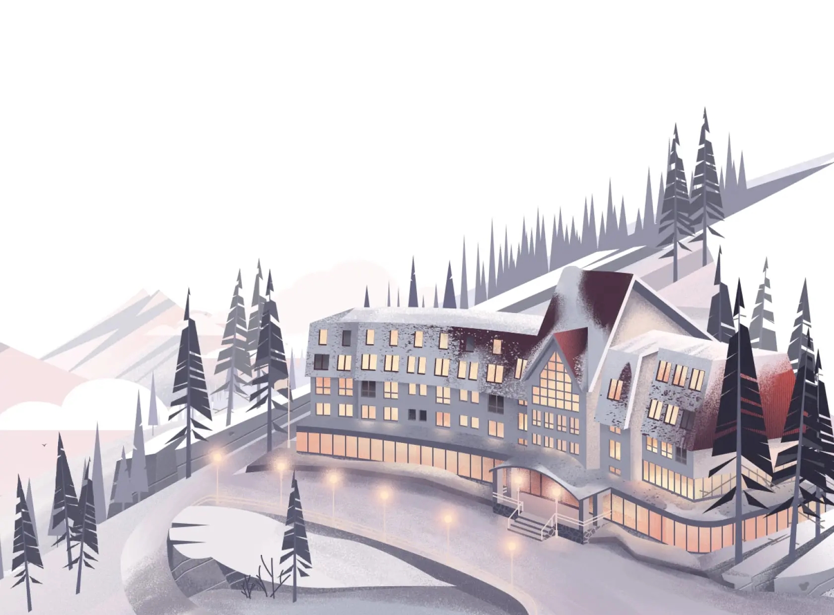
Logistics Partners is a Moscow-based industrial real estate developer with over 30 years of experience
By the time the project launched, the company had reached a new level of scale. There was a need for a digital platform that would reflect the actual volume of business and level of expertise, as well as serve as a systematic tool for development, communication, and market positioning.

Context and Objective
The goal was to create a modern, brand-focused website that would serve as the brand’s primary point of contact with the market and reflect the company’s full-cycle service model
The project included four interconnected areas.
1. Analytics — market and competitor research, best practice identification.
2. Interface — developing a logical structure, intuitive navigation, and redesigning the user experience.
3. Branding — reimagining the visual identity, defining the brand’s identity, voice, and personality, and creating a visual concept.
4. Development — ensuring high performance, seamless navigation, scalability, and integrations with external services.
We updated the website with a focus on solving a key business challenge: demonstrating the company’s scale, its production capabilities, and the logic of its full-cycle services.

Analytics and Market Research
We started the project with analysis: we held briefings and interviews with stakeholders, conducted market research, and benchmarked industry and related segments. This allowed us to go beyond direct analogues and identify both best practices that align with the site’s overall logic and solutions that specifically enhance individual pages and user scenarios.
The analysis revealed:
• key barriers to the user experience;
• the real needs of the target audience;
• the tasks the website must address as a business tool.
Based on this, the user journey logic was established, and key scenarios and content structure were defined, enabling users to quickly find information and perform target actions with no unnecessary steps.

Structure and UX
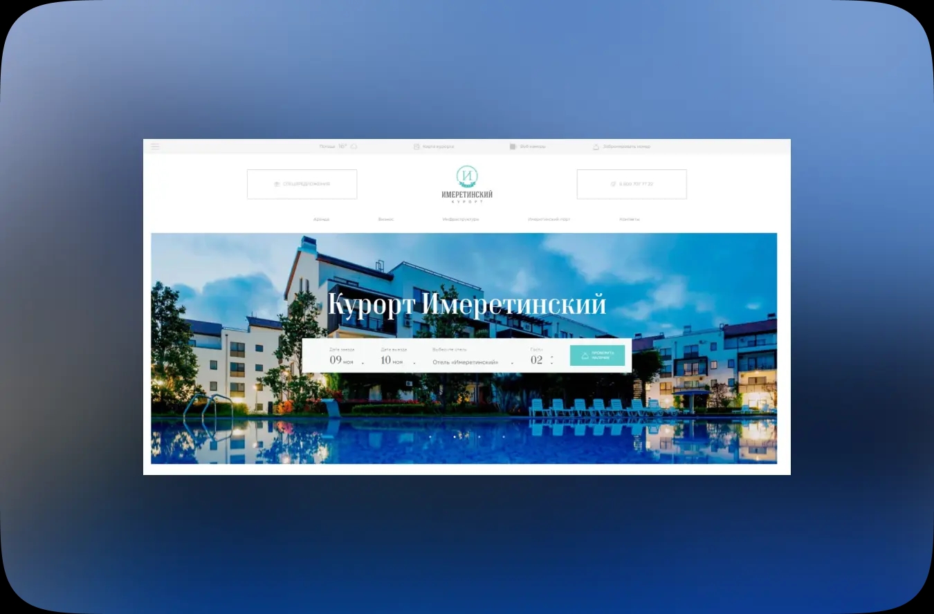
The website's logic, structure, and architecture were redesigned with a focus on the company's production capabilities and its full range of services
A clear data architecture was established, prioritizing sections related to business objectives and real-world user interaction scenarios: from quick facility searches to requests for custom construction.
The design process was carried out through prototyping. First, we compiled and presented the homepage along with a design mood board, followed by prototypes of the internal sections. The structure consists of:
• a directory page for properties to enable quick navigation;
• individual property pages with complete information: area, specifications, and features;
• projects with two viewing modes: as a list and on a map.
Each webpage is structured as a sequential user scenario where information is presented logically and intuitively. Universal solutions blend seamlessly with unique interface elements.
Service sections are integrated into the user journey, fostering the image of a reliable partner. The navigation logic and visual emphasis consistently guide the user toward target actions, reducing barriers.
At this stage, we established visual priorities and defined values that are conveyed through design and content, strengthening the brand and attracting new customers.

Brand Identity and Visual System
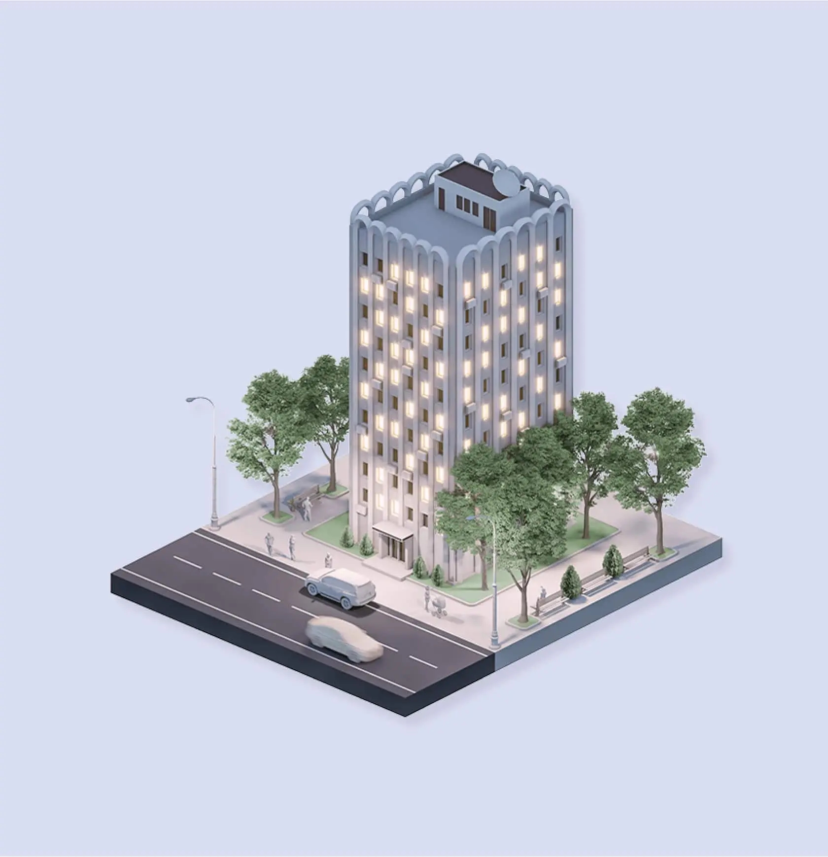
One of our key objectives was to develop a cohesive visual brand concept for the digital environment. The design is based on the image of a full-cycle developer, where the grandeur of the forms is balanced by the restraint of the visual language. Architectural forms served as the foundation, acting as a visual metaphor for logistics spaces and the industrial environment. They conveyed the scale of the business while remaining concise and avoiding interface clutter.
We expanded the color palette with accent colors, redesigned the icons, and established a unified graphic language. We also created a set of outline illustrations inspired by architectural logic. The graphics reinforce the perception of the company’s reliability, stability, and technological sophistication.
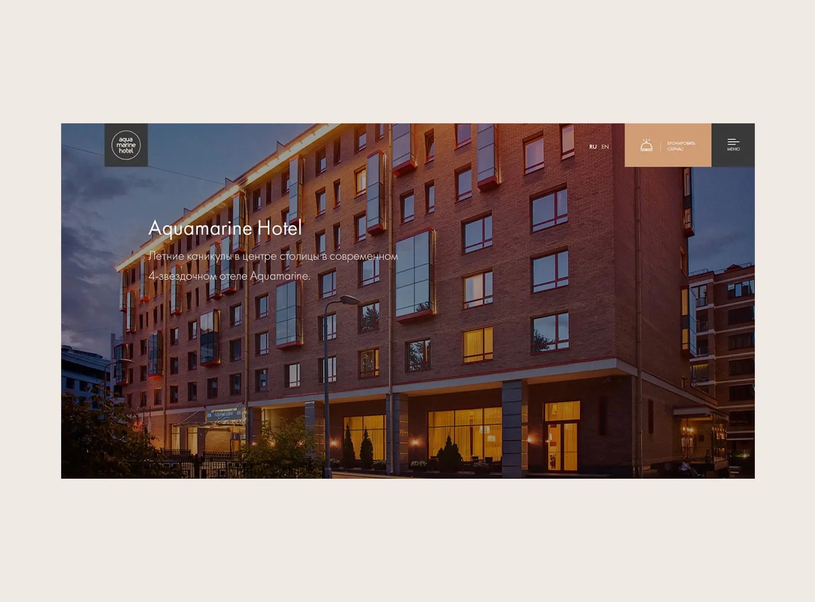
Object photos were selected, edited, and brought to a unified visual standard, becoming part of the corporate identity and key visual elements of the brand.

Design as a synthesis
The design was seamlessly integrated into the interface, maintaining a consistent user experience and continuity with all previous stages. A deliberate move away from a promotional approach allowed us to maintain visual restraint and focus attention on the value of the offering.
A well-thought-out visual hierarchy creates a modern, easy-to-understand, and recognizable brand image, helping to effectively distribute visual emphasis and unify all pages with a consistent style.


Brand Book and Communication
All visual and conceptual guidelines have been compiled into a brand book, serving as a comprehensive manual for the use of the corporate identity. It includes the color palette, typography, graphic elements, visual communication guidelines, and corporate media, establishing uniform standards for the brand’s future development.
The tone of voice combines professionalism and reliability, emphasizing the transparency of processes and the quality of the properties. The portfolio of completed projects and client list help build a consistent brand perception and strengthen audience trust.


Development
The website was built using React and Laravel, featuring responsive navigation, animations, and integrations with Yandex.Maps and Yandex.Metrica. The analytics system allows for tracking user scenarios and audience behavior, as well as systematically collecting data.

Result
The updated website has become a comprehensive digital brand platform that reflects Logistics Partners’ business structure and full range of services.
It fosters a cohesive brand image, strengthens the brand’s positioning, and serves as a consistent entry point into the ecosystem, systematically supporting business objectives and driving conversion growth.