Devprom ALM: Solutions for Development Process Automation
Product website for a company that develops software lifecycle management solutions
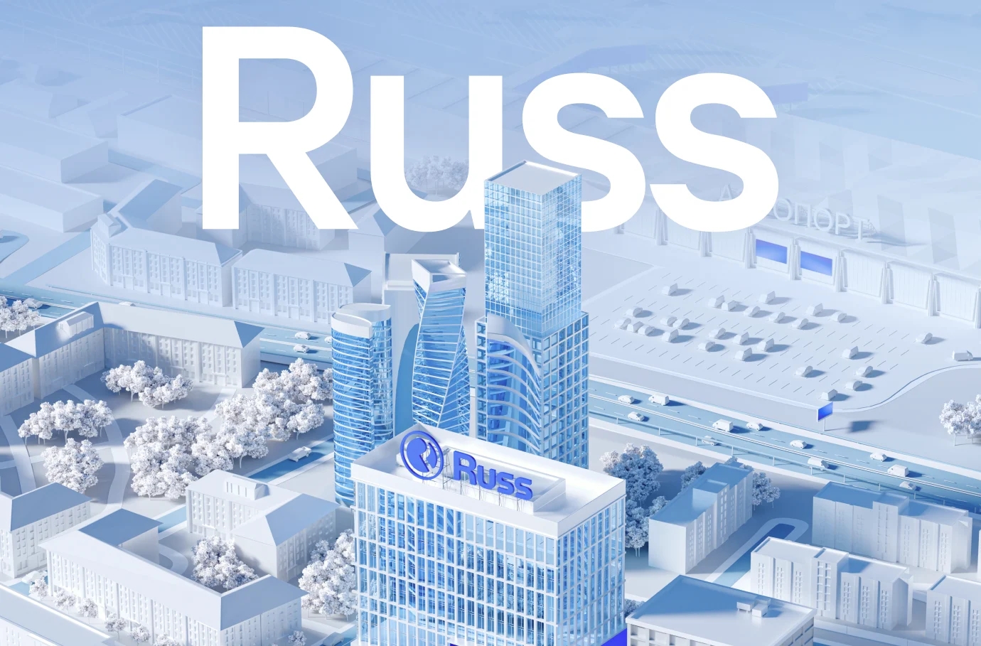
Devprom is a Russian IT company that has been developing an Application Lifecycle Management (ALM) platform since 2012
Our task was to design and implement the Devprom ALM product website as the initial stage of the funnel, an entry point into the ecosystem, and a sales tool.

Context and Objective
By the time the project launched, the website no longer reflected the product’s maturity or the company’s stage of development. The company had moved to direct sales, creating a need for a digital tool that:
• presents products and their capabilities in a structured way;
• communicates the brand’s positioning and builds trust;
• demonstrates the platform’s advantages;
• lowers the barrier to entry and increases conversion to demos and inquiries.
The key requirement was understated, professional communication without excessive marketing, tailored to a technical audience.

Analytics and Design
We started with a competitive analysis and a study of best practices in the ALM and enterprise solutions segment. We delved into Devprom’s product architecture: the structure of its modules, the connections between solutions, and usage scenarios within teams. This allowed us to redesign the website’s architecture and organize the navigation around product solutions rather than industry sectors.
We repackaged the product line, updated the content with an emphasis on import substitution and transparent pricing, and designed the UX for various scenarios—from the first encounter to requesting a demo version. The website ceased to be a showcase and became a tool for working with the product.

The website as an extension of the product
Devprom’s target audience consists of experienced B2B users: development managers, architects, team leads, and engineers. This is a pragmatic audience that values structure, specificity, and transparency in solutions.
The website is designed as an extension of the product—with an emphasis on logic and clarity.

Concept
The website is viewed as the first stage of the product usage funnel. Its purpose is not only to inform, but also to create a sense of connection with the system.
The concept is built on a balance of rigor and technological sophistication. We rejected abstract graphics and decorative elements in favor of understated forms, a muted color palette, and a clear visual hierarchy. This approach focuses attention on the product and emphasizes the platform’s reliability and maturity.

Design and Visual Identity
The interface is built on a narrow grid, a card-based structure, minimalist icons, and legible typography. This ensures organization and readability even with large amounts of information.
Color accents are drawn from the brand’s palette, and the logo element, utilizing gradient fills, has been transformed into a graphic technique for designing the cards. The main screen focuses on the platform’s key advantages, while compact solution cards provide quick access to relevant sections and key actions.
Soft shadows, gradients, and animations are used functionally—to create depth and hierarchy—without visual clutter.

Visual techniques
The visual language is built around showcasing the product: interfaces, mockups, and UI cards allow users to familiarize themselves with the system before interacting with the team. This significantly reduces uncertainty during the decision-making process.
The icon style was chosen to reflect the geometry of the logo itself and to highlight the capabilities and engineering nature of the company’s product. Rounded shapes and a modular structure reinforce the platform’s sense of openness and flexibility.
We used a sparse spacing system, neutral backgrounds, large typography, and accent color markers to reduce visual noise and enhance focus. A unified approach to mockups and UI elements ensured the integrity and consistency of the interface.
We assembled a modular set of blocks with the potential for further development via a UI kit.


Result
The updated website has become a single point of entry for B2B and B2G customers, as well as for developers—the platform’s users. The system we’ve built organizes the complex product architecture, clearly communicates the solution’s key benefits, lowers the barrier to entry for new customers, and consistently guides the user from initial contact through to decision-making.
The visual restraint and rigorous logic of the interface reinforce trust in the brand, while the integration of graphics and UI into a unified visual and functional framework creates a consistent communication language based on specificity, automation, and manageability.