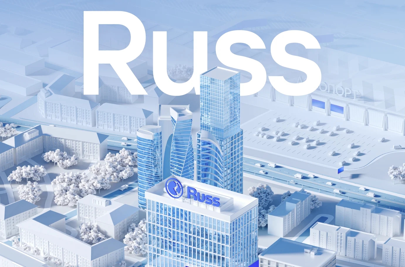
Bimeister corporate website
UX/UI design and development of a corporate website, as well as production of 3D graphics, videos, and animations for the company
Bimeister is an international group of companies engaged in the development, engineering, and implementation of innovative digital solutions for industry

Task
The renewed website should translate the positioning of BIMeister as a stable, confident and, at the same time, actively developing company. An essential task of the project was to work out the website structure in order to provide the user with full information about the brand value proposition and to distinguish it from its competitors.

Research
The analytics phase showed the need to combine elements of promotional and corporate websites. By combining approaches, we borrowed such corporate elements as the functional and clear separation of content blocks and service elements. At the same time, as with promotional websites, we can reveal the brand identity as much as possible through a single narrative.


In order to accurately convey the benefits of the company’s products and services, we decided to describe them through three perspectives: the fields of application, the tasks to be solved, and the specific modules. In addition, the narrative is built in the context of the three stages of the project lifecycle, which emphasizes the complexity of the Bimeister software solution.

Design
The design is soft, light, and unobtrusive. It seamlessly introduces the user to the scope of the company and conveys the ideas of progress and digitalization. The smooth scrolling and animations provide a relaxed vibe, reflecting the stable and confident nature of the brand.

Digital identity
Brand identity elements such as dots and pluses patterns were adapted for certain blocks on the website. As accents, they also create the effect of working with the web, referring to the specifics of the Bimeister platform.


Development
The project uses Pug, SCSS, TypeScript on the frontend and Bitrix on the backend. One of the most interesting things in terms of implementation was the first screen on the home page, where part of the image is colored when hovering over the pin.
To implement it, we needed to use an SVG mask with the models on top of the base image and make sure they were exactly the same at all resolutions. At the same time, it was important to tie each of the pins to its object, so that their position remains fixed when the screen size changes.


Bimesiter is a technology partner that helps its clients implement large digitalization projects. The updated website has become a reflection of this idea through a single set of solutions on the analytics, design, and development side.


