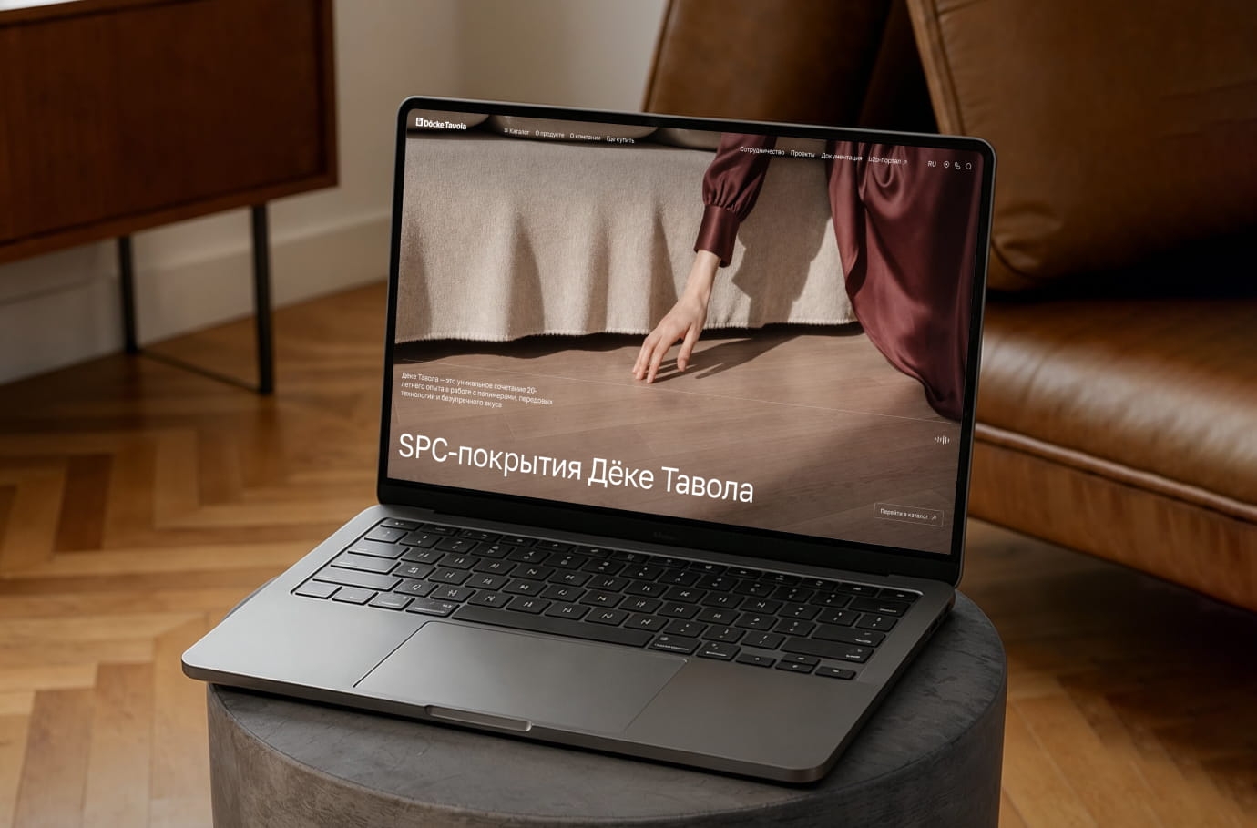
BAIKAL430: A New Approach to Digital Positioning
T.M. Gadzhiev
general director
We would like to thank the Only team for their professional approach and timely completion of all phases of the project.
Design and development of a brand promotional website featuring photorealistic 3D animation and lifestyle content to reposition the brand in the premium segment
T.M. Gadzhiev
general director
We would like to thank the Only team for their professional approach and timely completion of all phases of the project.
In 2025, BAIKAL430 embarked on a major rebranding initiative and began developing a new brand platform
• conveys the new premium positioning and shapes the brand’s emotional image;
• focuses on the 0.45-liter format as «always-with-you» water: for the city, on the go, and for everyday scenarios;
• engages the user through a sensory experience, 3D graphics, and animation;
• functions as a B2C tool, shaping a lifestyle perception of the product without directly pushing for a purchase.
The website was viewed as the hub of the new brand platform — a reference point for visual and conceptual standards for all future brand communications and for cementing its transition into the premium segment.

Solution
We implemented a full-cycle project: from analytics and brand immersion to conceptualization, content production, design, development, testing, and launch
The key feature of the project was the 3D model of the bottle: it serves as the central visual and conceptual element of the website.
The main metaphor is the bottle submerged in water. It directly visualizes the product’s key USP (a water intake depth of 430 meters) and forms the foundation of the entire user experience.
Built around this metaphor are:
• screen architecture;
• scroll rhythm;
• visual language;
• animation and technical solutions.
Design, storytelling, and the demonstration of the USP have come together into a single, coherent narrative that the user experiences while scrolling through the site.
Bringing the brand platform to digital
At the heart of the project is the BAIKAL430 repositioning strategy
The brand is shifting from the image of «Baikal water as a place» to a brand focused on people and their lifestyle. It focuses on the experience the product creates and enters the premium product category, competing on perception and emotional value.
We developed the website as an extension of the brand logic, transformed into a cohesive system of visual, UX, and communication solutions.

Lifestyle Positioning
It was important to position BAIKAL430 not as a mass-market water, but as a relaxed, confident, and modern premium product that complements a chosen lifestyle.

Design Concept: The Principle of Sufficiency
The product itself serves as the carrier of the brand’s identity. The logo and the general color palette were specified by the client, while we designed all other elements of the visual language from scratch.
The interface serves as a conduit to the brand’s philosophy: it is minimalist, restrained, with a muted color palette and subtle animations.
Finding a Balance
We sought a balance between a serene, natural aesthetic and a modern visual rhythm. Clarity and serenity are combined with movement, shifting states, and interactivity, making the product feel alive and relevant. Key principles of visual and conceptual presentation:
• using backgrounds and their transitions as tools for rhythm and mood;
• visualizing a «deep dive» as a metaphor for clarity and awareness;
• lifestyle content emphasizing the product’s presence in everyday life.
The principle of sufficiency has become not only a design technique but also a reflection of the brand’s philosophy: the transition from excessive consumption to conscious choice.

3D as a storytelling tool, not just a decorative element
The project’s standout feature is the photorealistic 3D animation of the 0.45-liter BAIKAL430 bottle. Here, 3D serves as a comprehensive visual language and the key medium for conveying the product’s unique selling point: water sourced from a depth of 430 meters.
Scene Logic and the Physics of Movement
The animation was directly tied to the landing page’s structure. In the scene, we adjusted:
• shading (materials for realistic light transmission);
• the refraction of water in the bottle and the sense of depth;
• the interaction of light with the liquid and the bottle’s surface.
Simulating air bubbles and the physics of the bottle’s movement in water presented a separate challenge. Achieving realistic bubble behavior required dozens of iterations: they couldn’t be too large or too fast, obscure the logo, or look unnatural.

Optimization and final rendering
The water and bubble simulations were built on top of the pre-existing bottle animation, taking into account the finer details of how they interact with the geometry. Optimization was carried out simultaneously: limiting the simulation area, caching, and eliminating unnecessary calculations — all to maintain visual quality without overloading system resources.
The result is a seamless 3D animation in which the complex technical work remains invisible to the user but creates a sense of depth, physical realism, and the product’s premium quality.
The 3D animation became the central element of the website.
Photo production and lifestyle content
The photo shoot was our initiative and an integral part of the design concept. We took charge of developing the storyboards, preparing detailed technical specifications, organizing the shoot, and overseeing the final results, treating the content as an extension of the brand strategy.
The content was based on the audience profile from the brand platform and reflected the real lifestyles of BAIKAL430 consumers. Four scenarios were produced in a single day of shooting:
• sports as a hobby;
• the urban business rhythm: self-sufficient, confident people;
• studio portraits: emphasis on the product’s premium quality and aesthetics;
• photographs of the bottle itself.

Photo Content
The photographic content is integrated into the website as part of its visual narrative: the still images reinforce the brand’s philosophy and create a cohesive image of the product: relaxed, mindful, and modern.
The created photo content has become a universal visual asset for the brand and can be used across other digital channels and communications.

User interaction
The website is designed as a sensory experience, where users engage with the brand through a sequence of screens, the rhythm of scrolling, and changing states.
In terms of format, it is an image-driven B2C landing page optimized for mobile devices.
The UX does not force a purchase: sales points are kept in the background, and the interface creates a clean and calm interaction experience, inviting the user to immerse themselves in the brand’s values and make an informed choice.

Technical implementation
The project utilized neural network automation: the data structure was fed into a neural network, which generated code, thereby accelerating development while maintaining quality.
Special attention was paid to the visual experience:
• a smooth transition from the static first screen to 3D animation;
• complex sequences featuring a bottle submersion;
• preloading and caching for continuous scrolling and stable performance on all devices.
Two language versions (RU/EN) and an admin panel were prepared, and comprehensive testing was conducted prior to launch. Upon completion of the project, the team prepared a complete package of project and technical documentation, ensuring a transparent handover of the solution to the client and the possibility of further scaling and product support.

Stack for 3D
Working with 3D turned out to be the most challenging and resource-intensive phase of the project. We rendered the bottle model, adapting it for animation and simulations: we refined the geometry and materials, and prepared the model to behave realistically in water.

Results
The project marked BAIKAL430’s transition from a product category to the arena of premium brands and served as a digital manifesto for a new philosophy.
The image-building promotional website functions as a standalone B2C tool, creating an immersive experience and setting a unified visual and communication standard for the brand’s future digital assets.