Angionorm® promotional website
Development and design of a promotional website with a coherent user flow
AngioNorm® is the flagship brand of Otisipharm
Our task
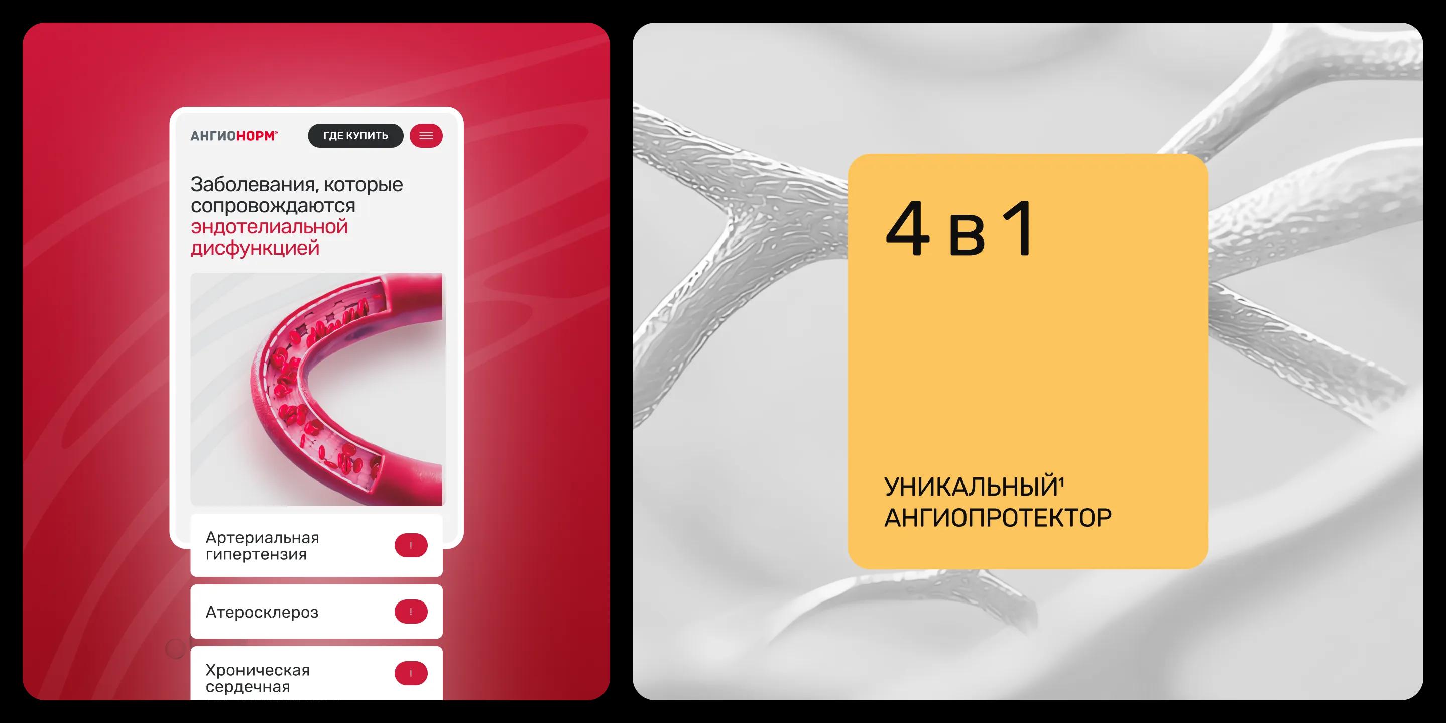
Updating the promotional website and creating a seamless user journey: from initial brand exposure to a deliberate, targeted action. An interactive quiz guides users from general information to a personalized scenario.
Cohesive Narrative
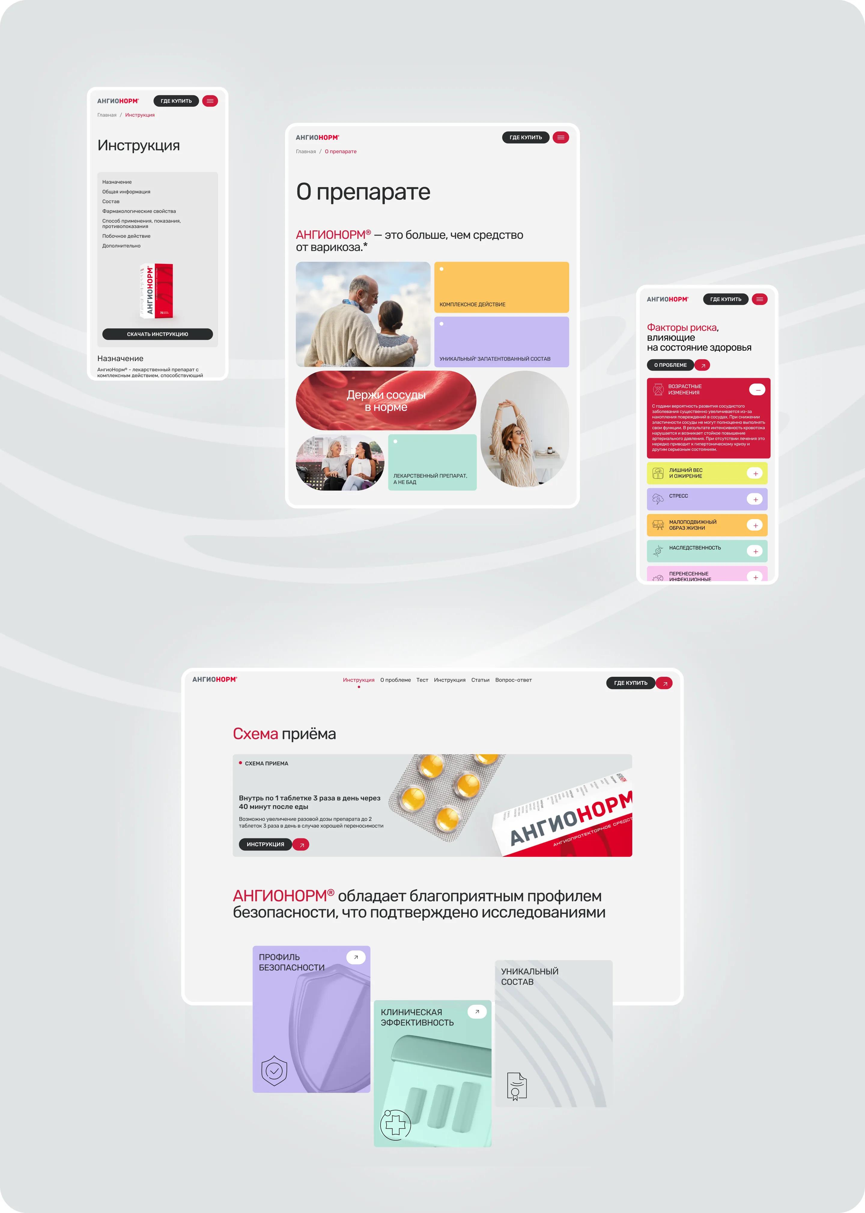
We built the communication as a cohesive narrative that addresses three key questions: from risk factors, through understanding the value of the medication, to the purchase.
1. “Does this apply to me?”
The section on risk factors and early signs helps users relate the information to their own condition. The interactive test “Assess Your Risk of Cardiovascular Disease Using the SCORE2 Scale” engages the user and provides more details about symptoms.
2. “Will this medication help me?”
The action principles are explained in an accessible way, without an overload of medical terminology.
3. “Why this specific medication?”
We have systematically explained the composition, mechanism of action, and specific usage instructions.
Thus, the structure is based on a unified emotional positioning of the medication, integrating both the content blocks and the visual design of the website.
Color and Composition
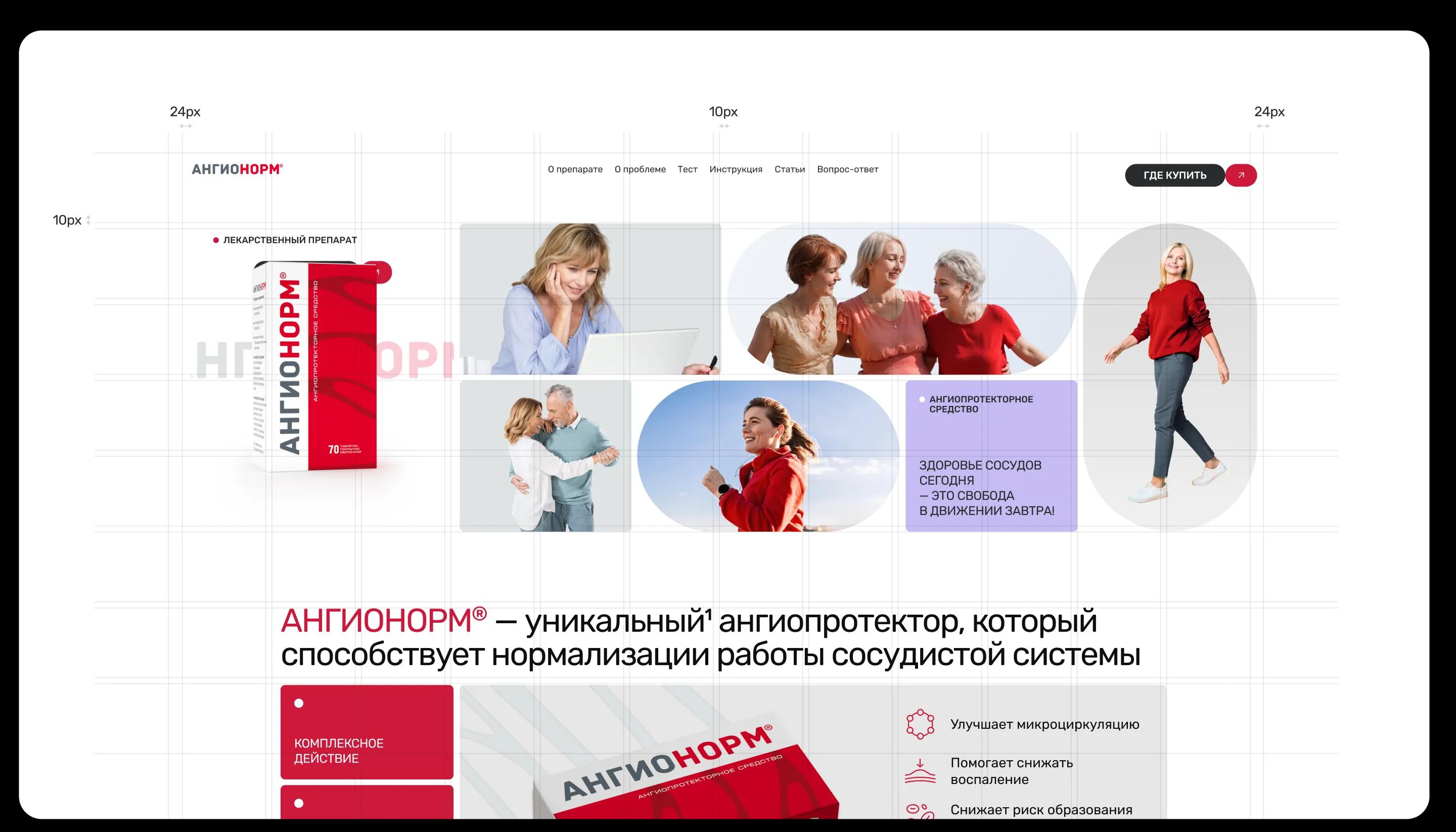
The visual language is based on the packaging identity
We carefully adapted it for the digital environment, preserving its recognizability and enhancing its expressiveness:
• contrasting elements that echo the packaging;
• an expanded color palette with the addition of light shades;
• a sans-serif font with slightly rounded corners creates a sense of softness and lightness, while remaining legible and echoing the packaging’s typography.
The use of color, patterns, and composition reinforces the brand identity without creating visual clutter.
Brand Identity and Graphic Elements
Digital identity is built on the brand’s visual elements:
• a brand pattern as a graphic marker;
• packaging animations and 3D renderings of plant-based ingredients;
• minimalist line-art icons.
Photographic Style
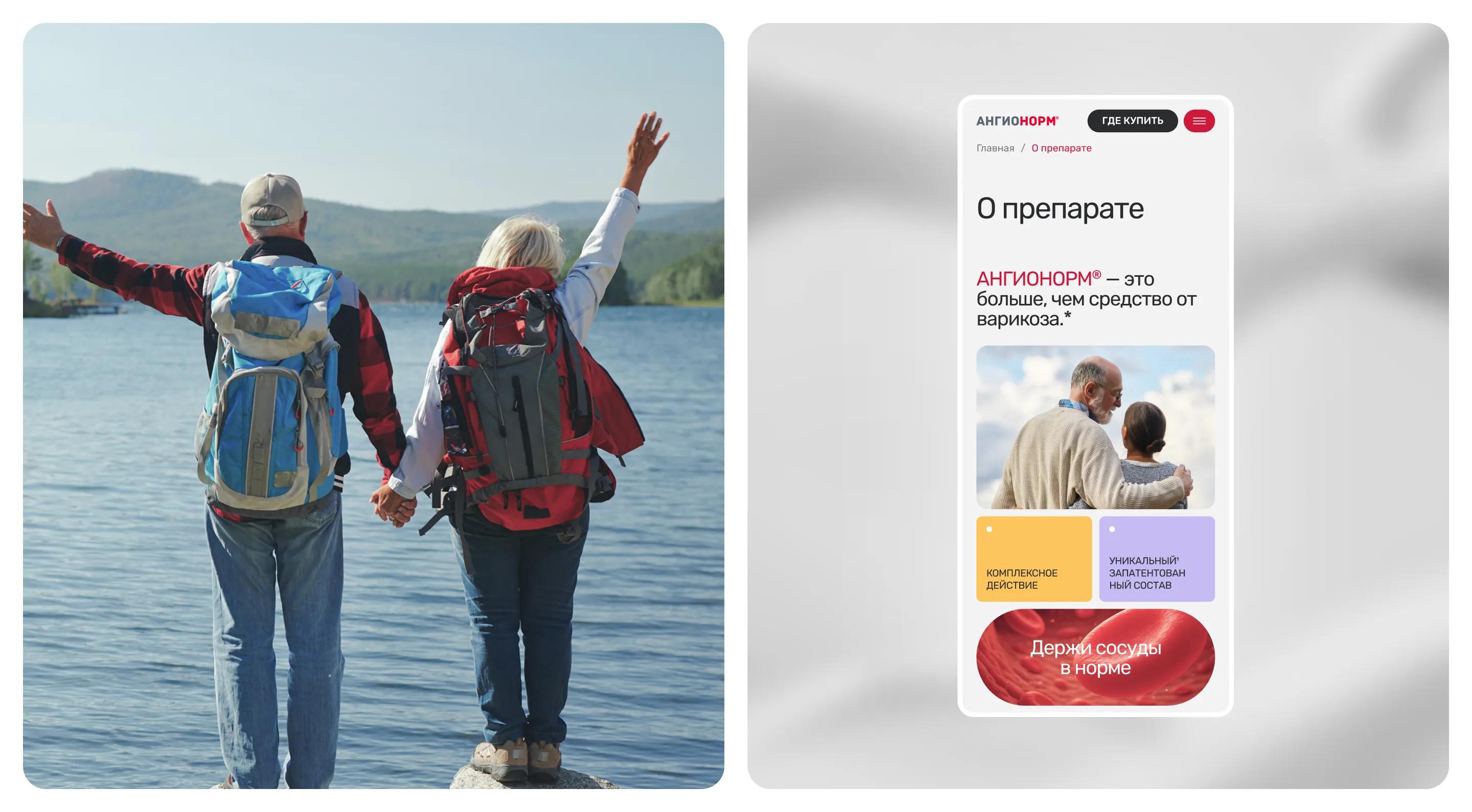
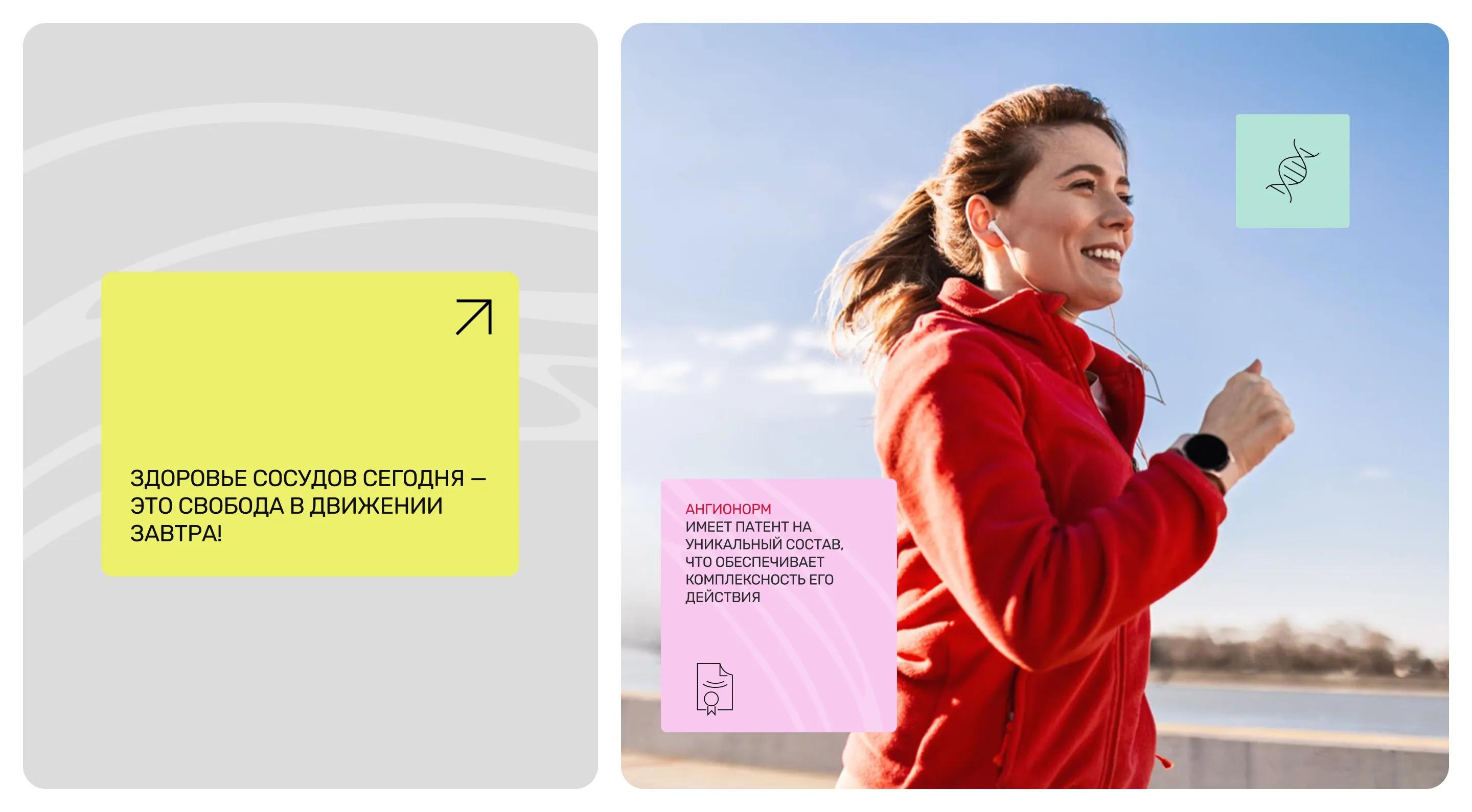
The photos convey the emotions of an active lifestyle: movement, lightness, and a familiar rhythm
The subjects are active, smiling people who dance, play sports, and travel.
The layout reinforces this feeling through clean compositions and generous spacing. Bento-style compositions combine photos and brand patterns into a unified visual tone.
Result
The website addresses a key strategic objective: it showcases the brand’s position within the industry and reinforces its updated positioning
The promotional website, with its cohesive visual language and well-structured communication, supports the product’s updated positioning while speaking to the audience in the language of movement, possibilities, and the familiar energy of everyday life.