NeuroPort website
Elena Gennadievna Yakimuk
general director
The project has proven to be invaluable to our business. The new website has significantly improved our online presence, increased our customer base, and boosted trust in our brand. Thanks to its user-friendly and functional interface, our customers can now easily find the information they need.
Design concept, UX/UI design, motion design, Tilda
Elena Gennadievna Yakimuk
general director
The project has proven to be invaluable to our business. The new website has significantly improved our online presence, increased our customer base, and boosted trust in our brand. Thanks to its user-friendly and functional interface, our customers can now easily find the information they need.
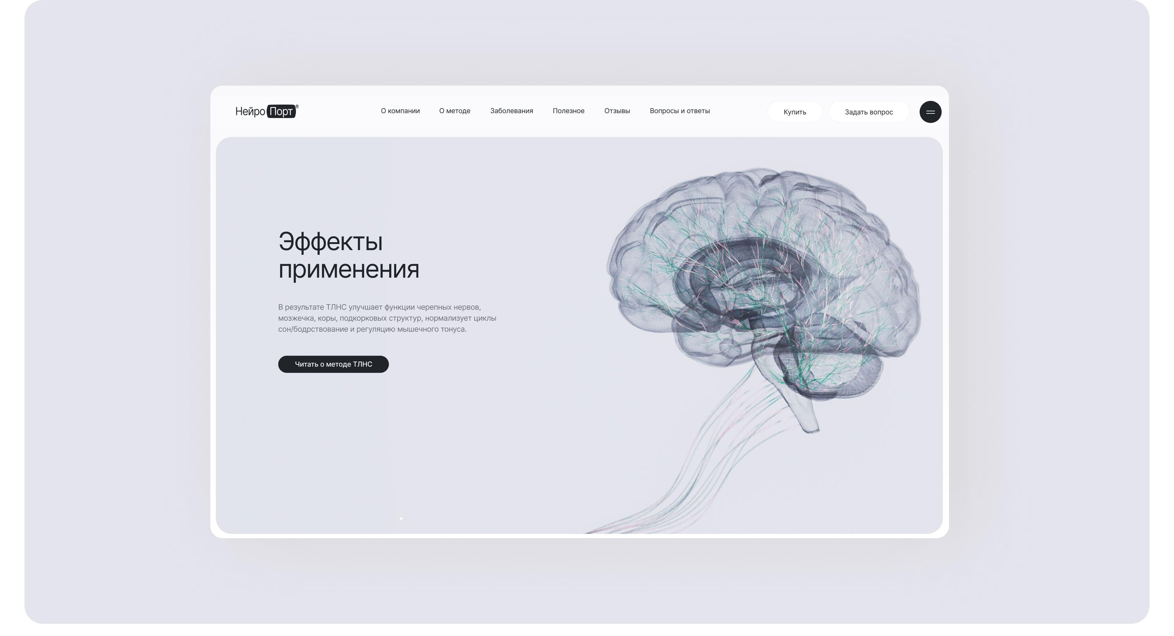
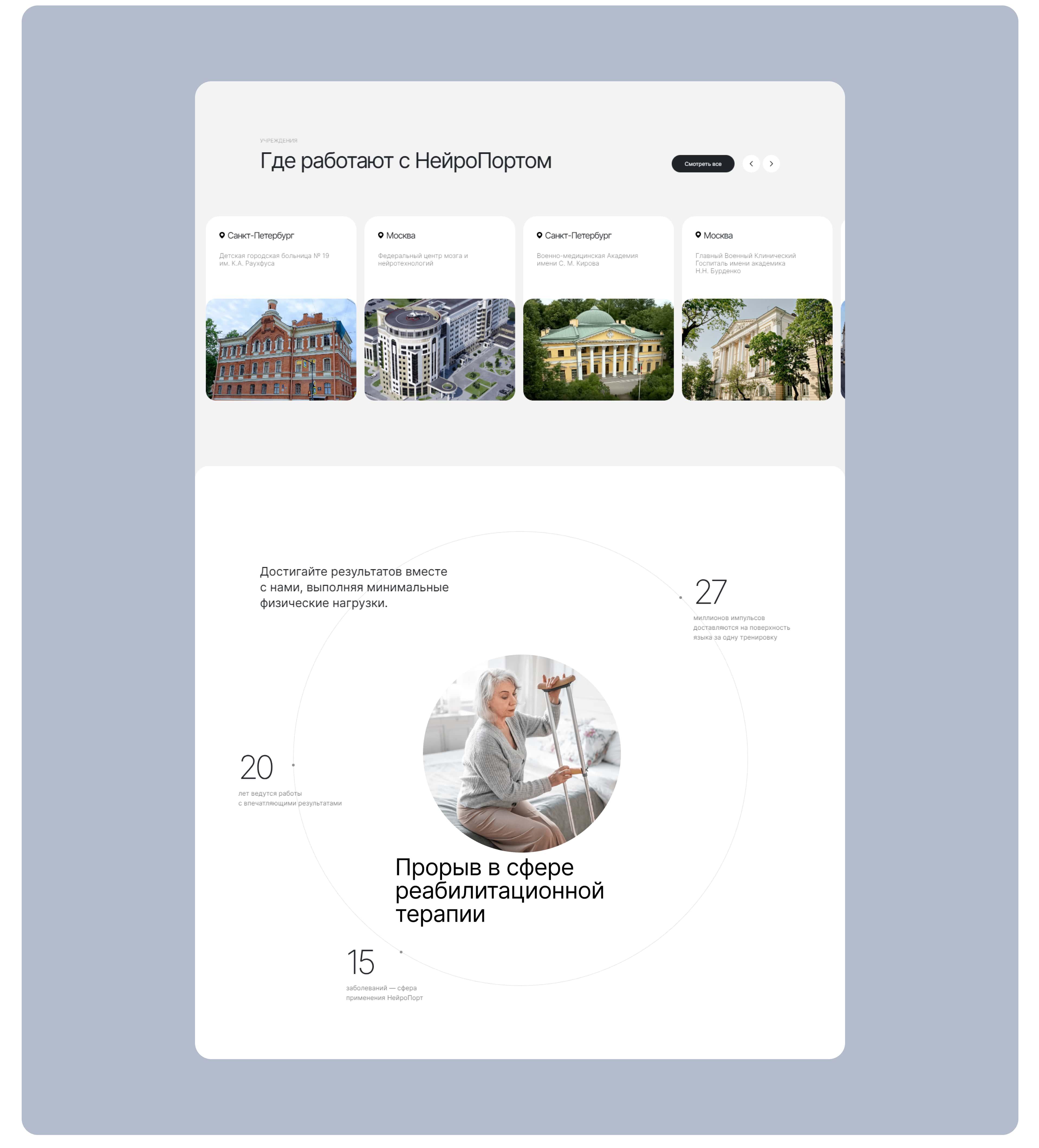
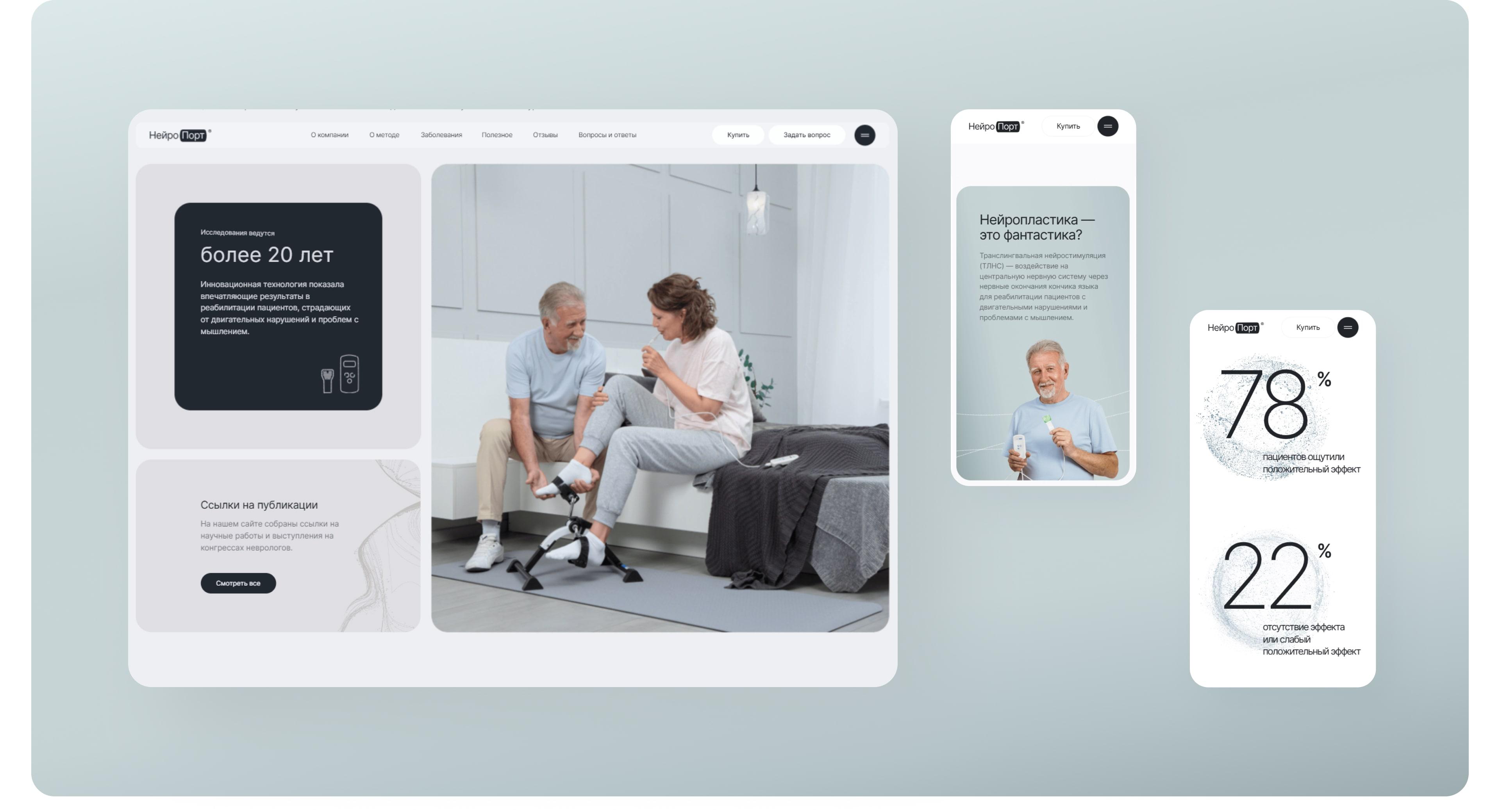
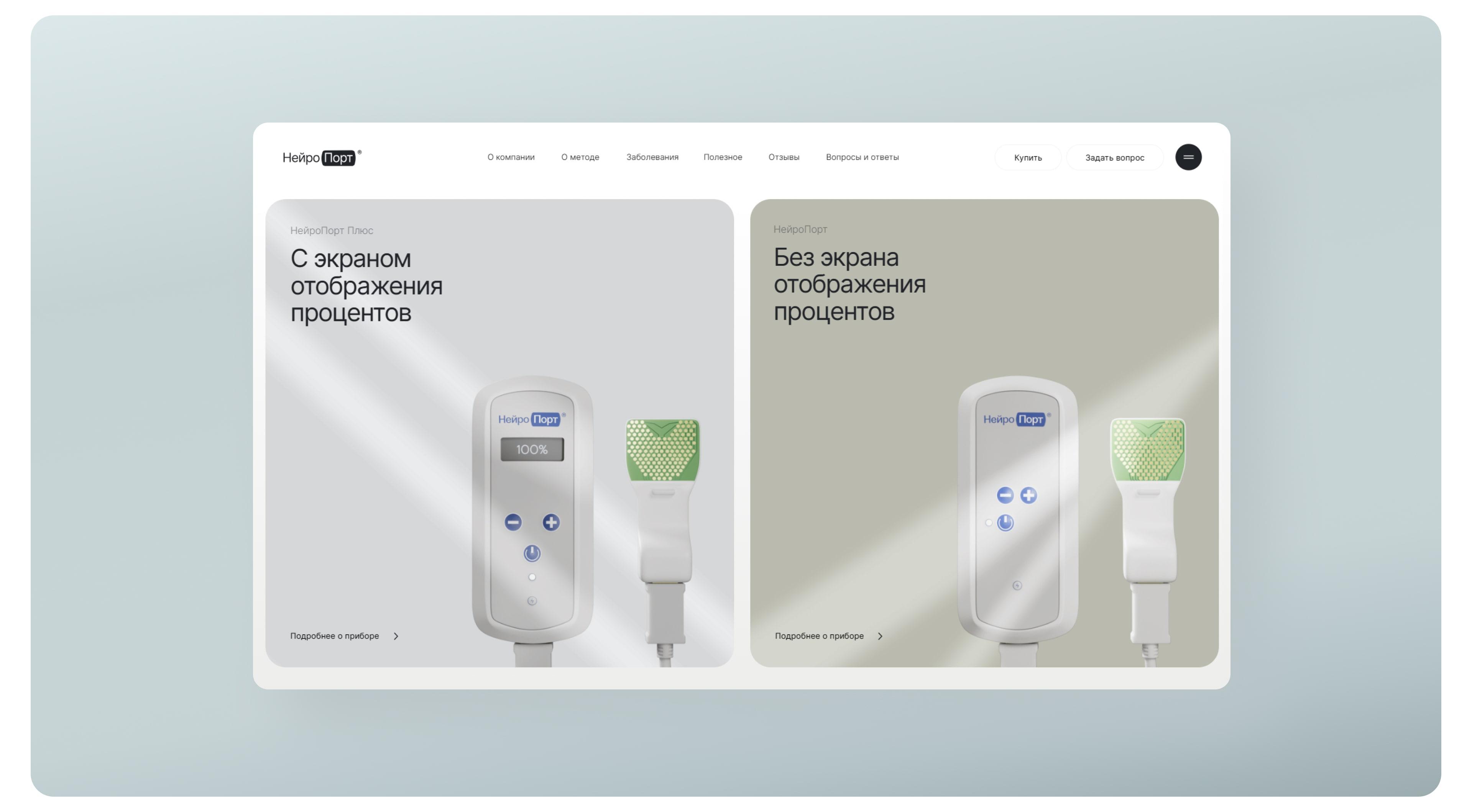
NeuroPort is the first Russian medical device implementing the method of translational electrostimulation. It is used for the rehabilitation of patients with disorders of the nervous system.
Special Kudos. Best Innovation. UI design. UX design.
Silver. The best website about medicine
Design
It was important for us to carefully emphasize the brand communication and the benefits of the device using digital identity.
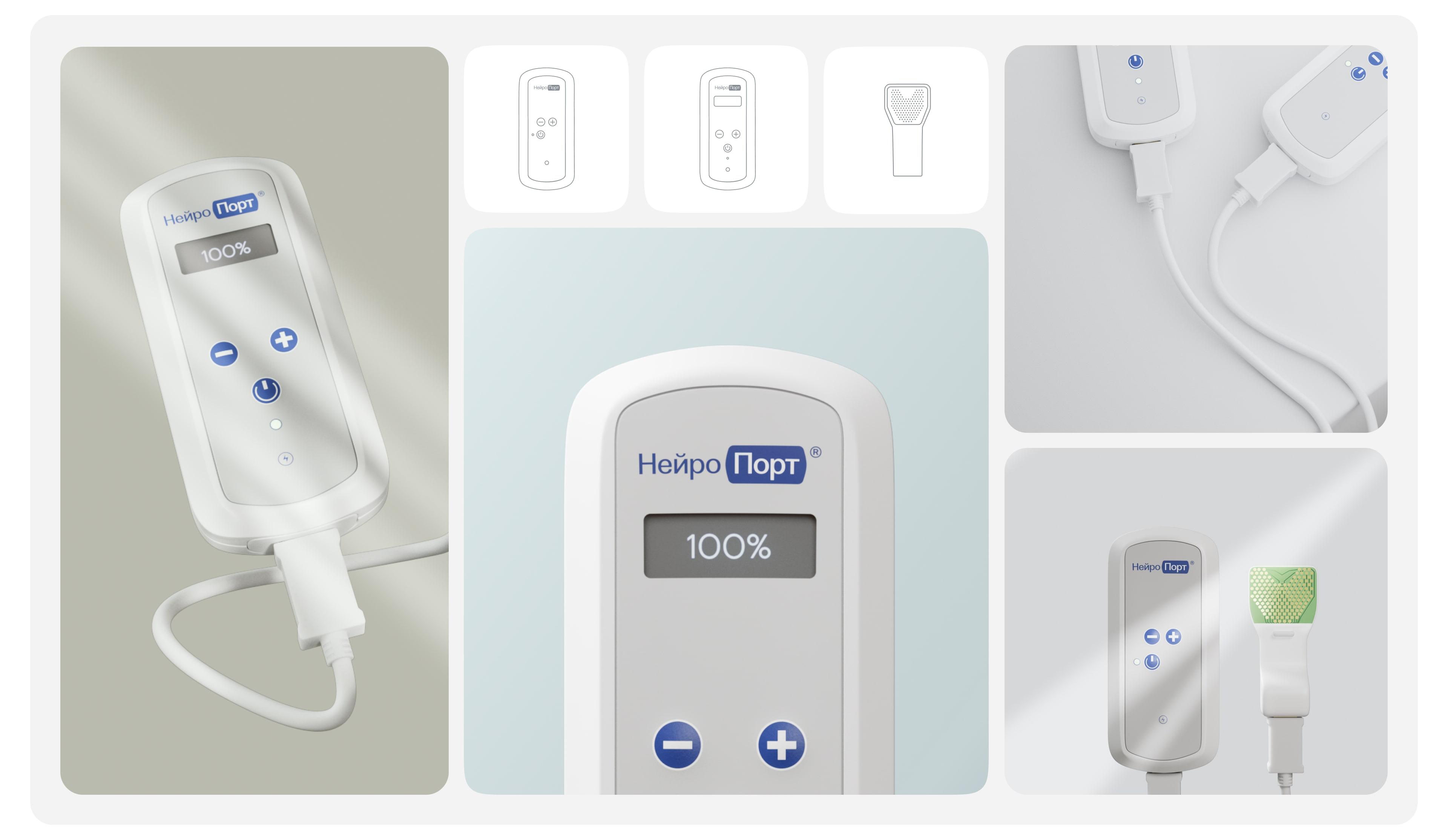
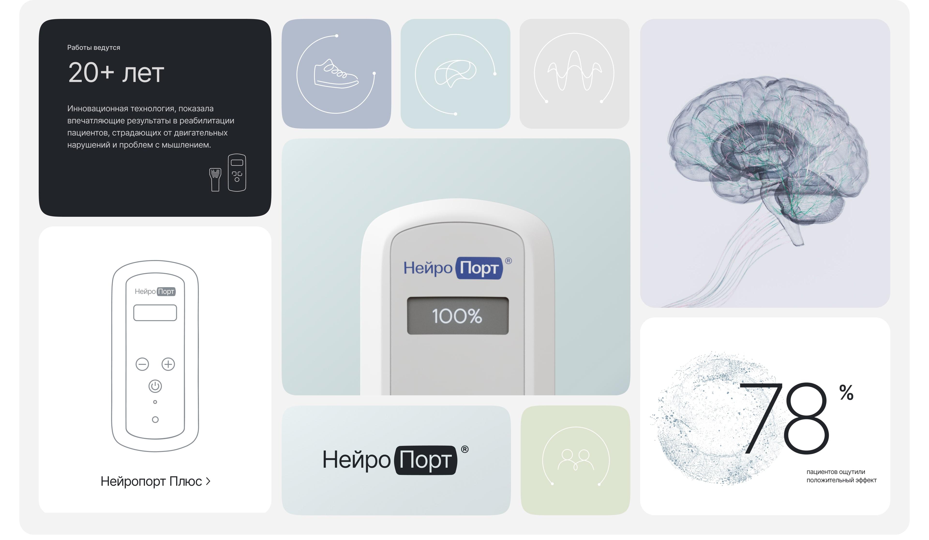
The device became the basis for the graphics. To demonstrate it clearly, we created 3D models in neutral colors.
The logo has also been updated: it is based on the contours of the device and combined with the name. The color system is represented by pastel colors, with black and blue accents.
The case illustrations are laconic and neat, with references to neural connections. They work well in a quiet, minimalistic layout.
Result
We formed the USP and reflected the value of the device on the homepage. We developed the structure and design concept of the website, which we supplemented with 3D models of the device. As a result, we developed the layout on Tilda.