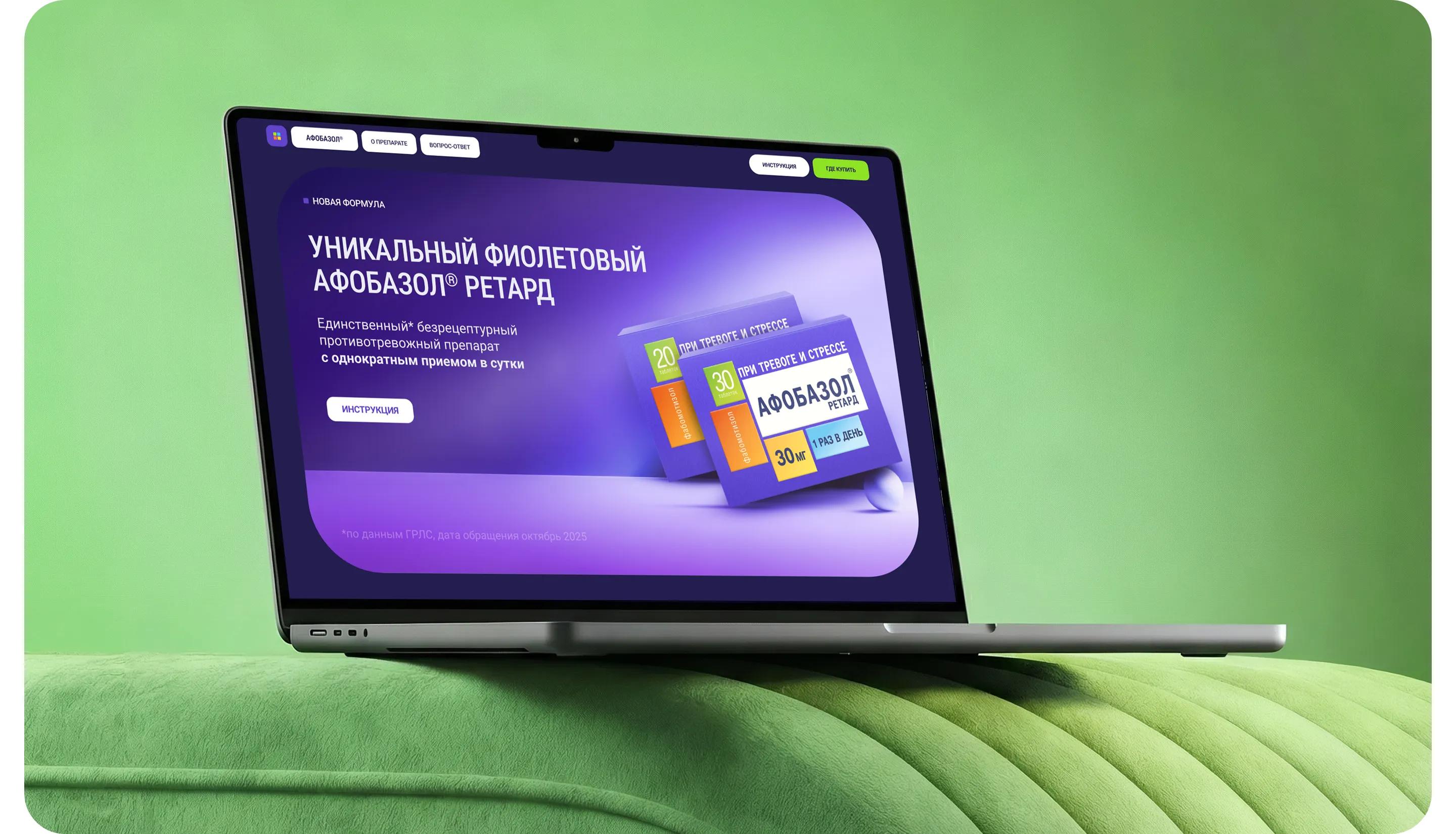
Afobazol® Retard promotional website
Design and development of a promo site blending fintech aesthetics with health & wellness
Afobazol® Retard — a new format for the brand’s flagship product
The key challenge was to translate the product’s unique characteristics into modern digital language, moving away from the conventional "pharmacy-style" presentation typical of the category.

Tasks
1. Build awareness of the sustained-release form of the medication through a system of visual and conceptual attributes in digital media.
2. Drive conversions to purchases through a seamless transition to e-commerce.
3. Ensure clear differentiation from competitors in the category.

An emotional story built around user life scenarios
We built our communication around the concepts of control and stability, ensuring the site integrates seamlessly into the user's daily routine.
Moving away from a traditional medical aesthetic, we adopted a modern digital style inspired by fintech services and the health & wellness industry. The site centers its narrative on the user and their real-life scenarios—guiding them from familiar situations to an introduction to the product and its capabilities.
This approach fosters a sense of confidence, strengthens the brand's emotional core, and creates a cohesive user experience.
Guided design
The creative concept is rooted in the idea of manageability and control
All design elements are highly adaptable and echo the brand’s core message: control and stability. The dark version of the concept highlights the brand’s high-tech, scientific character.
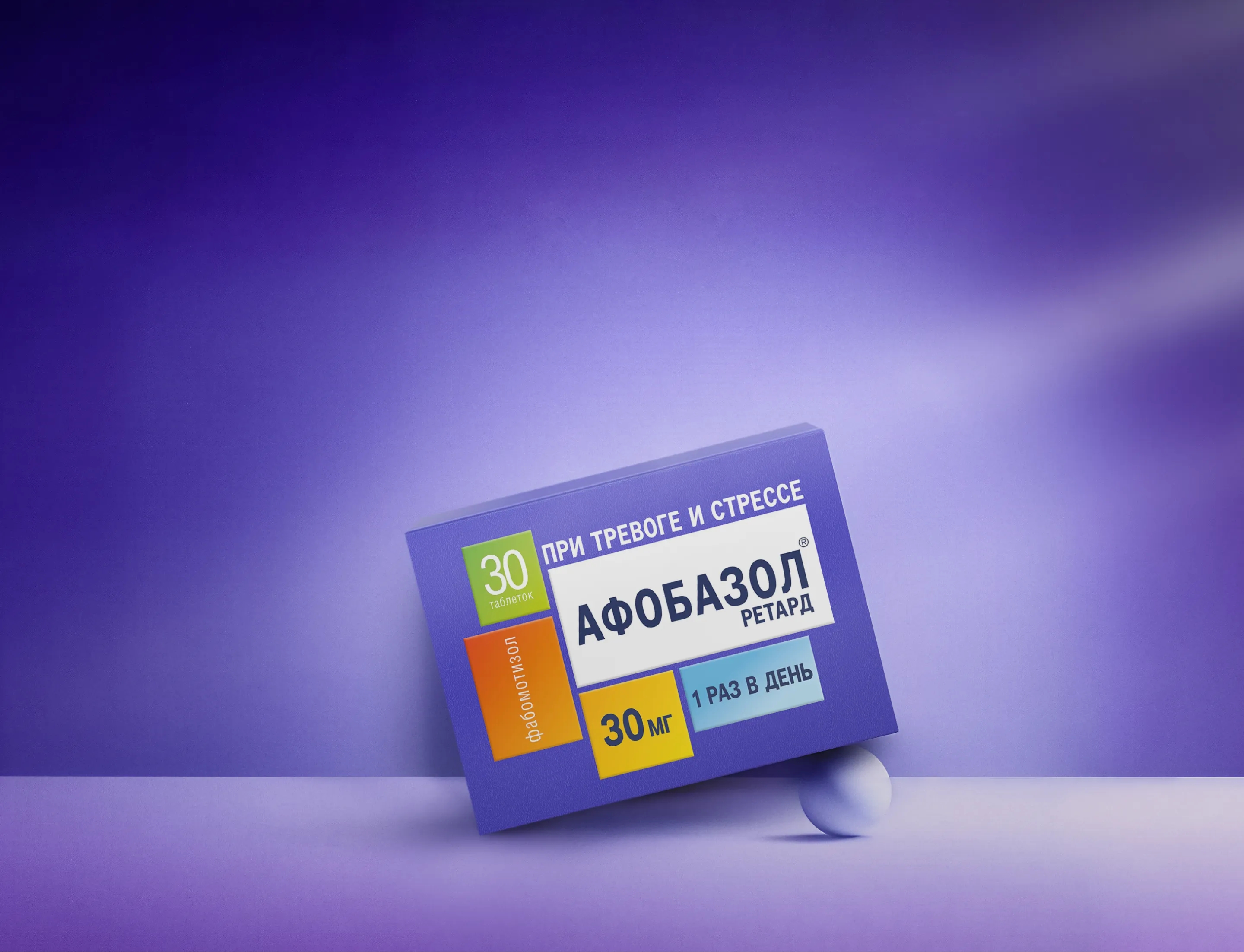
The website serves as a visual extension of the packaging’s aesthetic.
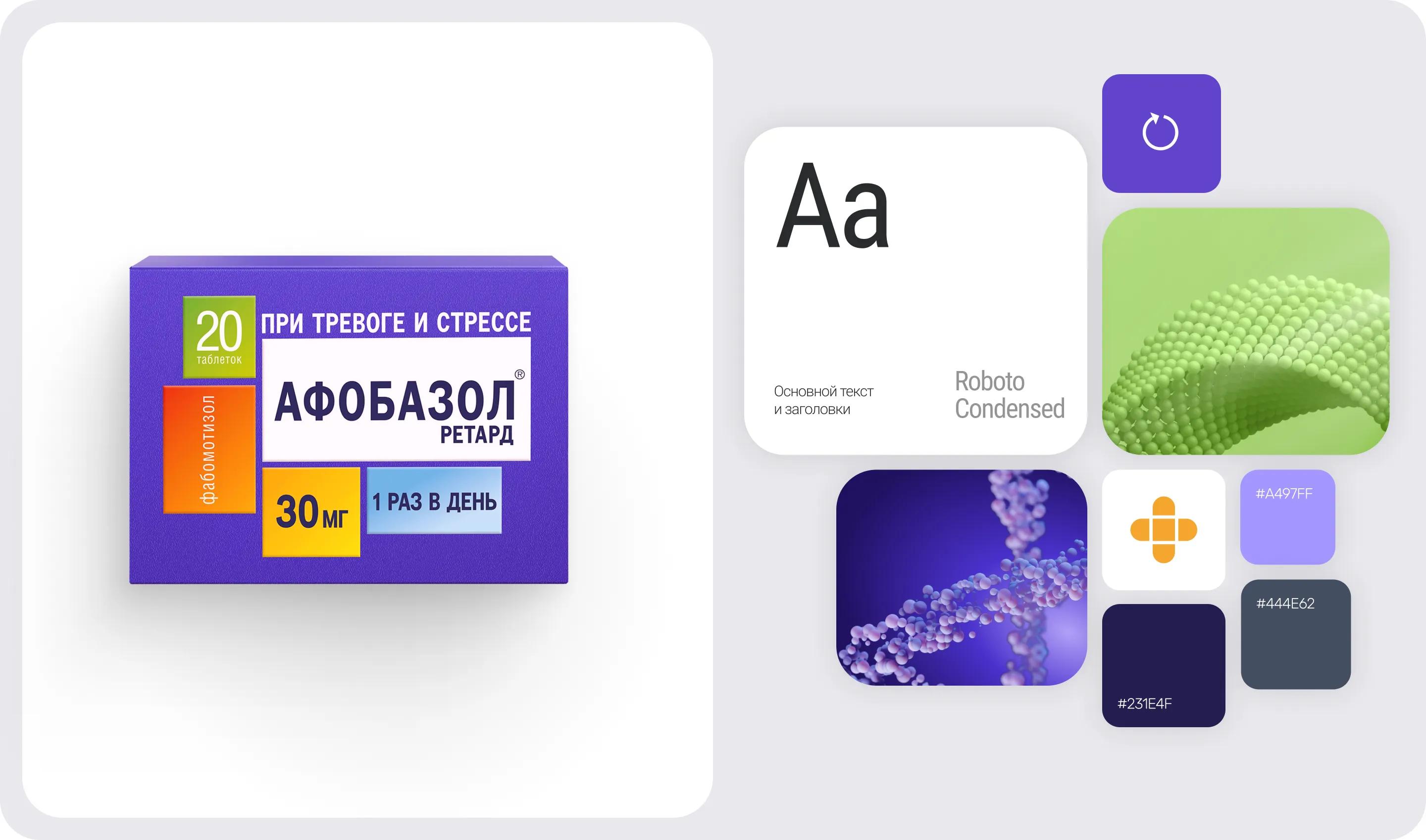
Graphic elements
The visual identity is based on three-dimensional abstract forms with a smooth, symmetrical structure
Composed of smooth, rounded modules, they symbolize stability, cyclical continuity, and inner balance. The unified graphic system includes:
• volumetric 2D graphics based on the concept of smooth, wave-like forms,
• 3D shapes made of small particles that transform into various figures and are set against a soft gradient background,
• an animated "pill" graphic that clearly visualizes a key feature of the product.
Layout
A systematic Bento-style layout ensures a clear and logical content structure
A grid of rounded blocks and additional "dynamic" shapes gives the layout a modern look, making it contemporary and memorable. The responsive system facilitates the site's future development.
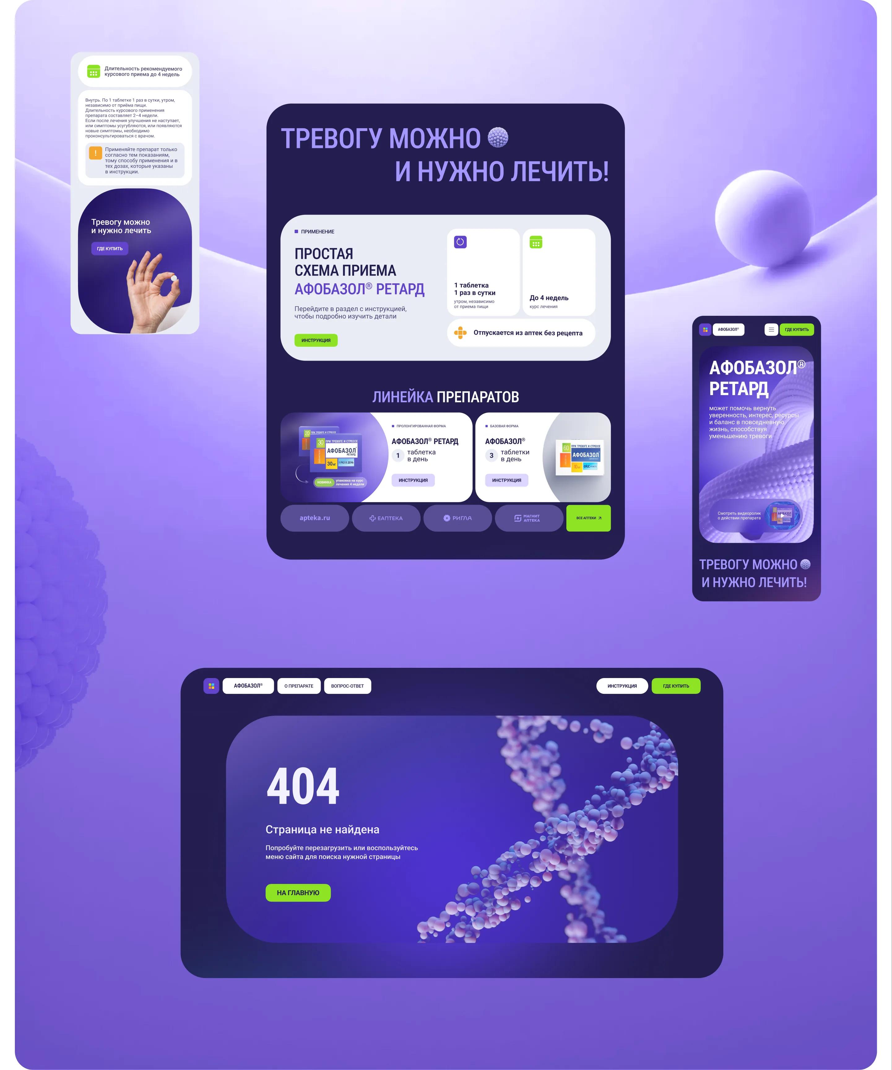
Control and stability
The website builds awareness of the sustained-release form of Afobazol and reinforces the brand’s position as a technology leader in the category
A cohesive visual language and a well-crafted communication structure highlight the product's uniqueness and foster an emotional connection with the user.
By speaking the language of control, stability, and a familiar daily rhythm, the site translates complex brand concepts into an accessible digital experience—building trust and establishing a distinct communication platform for the brand within the category.