
Hi, this is Only. We build digital architecture and communication for large companies and brands. One of the highlights of our career has been working with Severstal, a leading Russian steel producer and the leader of the metallurgical industry of the future. The company approached us with the task of developing and launching Severstal's corporate website, which should unify the disparate system of business units into one digital platform.
In this article we will tell you in detail about the block-by-block system and the pitfalls of implementing such a system under 1C-Bitrix for frontend developers.
Block-by-block editability
We were tasked with developing a website based on the CMS “1C-Bitrix: Site Management” and giving content managers full authority over pages and their content. Content managers {read not developers} should be able to build pages from pre-created blocks, determine the order of these blocks on the page, manage the settings of additional visual design for each of the blocks and edit content within the supported data types. And all this is managed through Bitrix visual editor without the need to manually create a new infoblock for each block on the page. Such a system can be called “Block-by-block editability”.
Moving on to the frontend part of the project, we should mention that all sources, including layout, are stored separately and assume the use of webpack assembler to form the final html, css, js files, which are subsequently transferred to the backend.
Categorizing block types
To simplify work with a large number of blocks, we have divided blocks into separate types and into alternative design variants. The blocks that contain different data types or differ greatly in their logic became independent types. In total, 74 block types were formed, or over 200 with design alternatives. You can consider these alternatives as additional add-ons to blocks that insignificantly change its appearance or logic.
Examples of block types:
- header
- widget
- promo block
- slider
- infographic
- diagram
- product block
- table pictures
- text block with a switch
- list of documents, etc.
In the end, the total number of types and variants reached 200+. At the same time, customization of small elements such as buttons or widgets is not included in the extra design alternatives, as they exist separately.
For example, a regular card slider is a separate type and contains its basic logic and appearance, while the content of the slider determines which of the design alternatives the block belongs to. These alternatives can only modify or augment the basic logic of the block. For example, an alternative might change the slide switching animation or add a modal window call when a slide is clicked, but the basic logic of the slider remains unchanged.

Each individual block is a JS-class, and additional variants are initialization parameters described in the base class constructor. In case a variant changes or augments the appearance of a block, a css class with description of additional styles is created for each variant.
Mixins
When working with a large number of variants, the css of each block can grow to such a scale that it is hard to maintain the code. To simplify the task of working with additional variants, we used mixins provided by the sass/scss preprocessor. With mixins, you can separate the generation of alternative styles from the code of the main component.
Scss preprocessor allows you to use your own variables, mixins and functions, which makes it much easier to work with css in large projects.
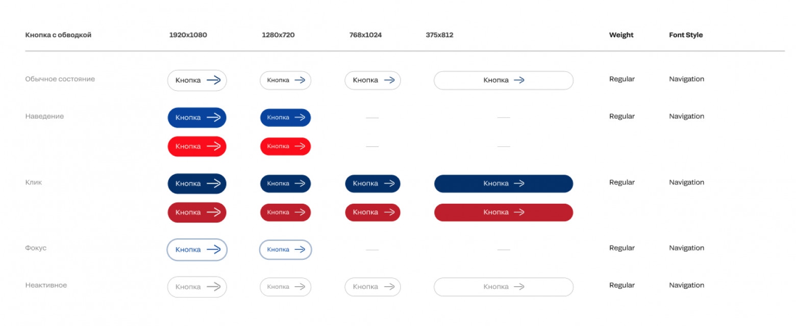
Let's consider this approach on the example of a simple button that does not contain js-logic. Such a button, in addition to the basic styles, has additional design variants that can be combined to form 48 unique combinations (6 color themes, 4 types of icon styling, basic and contrast variants). Each color theme has 5 basic states (normal, hover, focus, active, disabled), including the contrast variant.
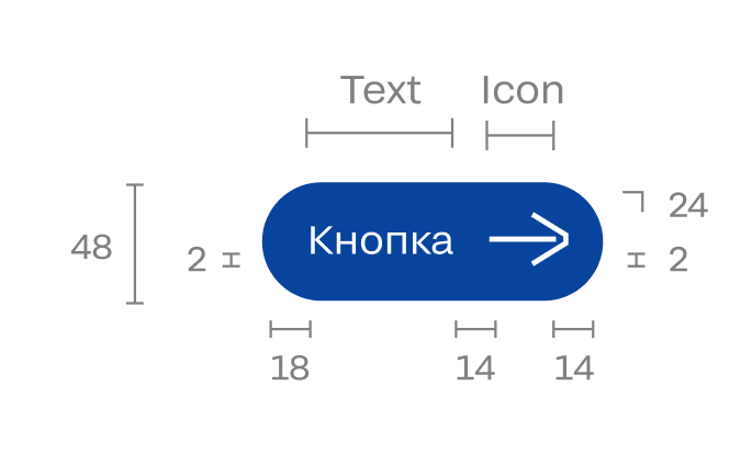
To avoid manually describing the styles for each css class, we described only the modifiable values for each of the variants and stored them in a scss variable. For example, this is how a partial description of styles for color theme variants looks like:
$button-types: ( fill: ( background: #0041A0, hover: #002F6C, active: #001E46, disabled: #F4F4F4, ), fill-alt: ( background: #FF0000, hover: #BF1D26, active: #81080F, disabled: #F4F4F4 ), /* … */);
Then in the main scss file, containing the description of button styles, the common-button-types mixin is called, which is responsible for generating color theme styles. For each described variant, an additional common-button-style mixin is called, which describes all the logic of color theme generation, taking into account possible contrast.
@mixin common-button-types() { @each $type, $value in $button-types { &.#{$type} { @include common-button-style($type); } }}
Work with icon design styles is done similarly.
This approach allows you to assemble block styles using independent generating functions, which greatly simplifies the organization of numerous variants. Variants of new pages and adjustments to existing ones are performed by content managers directly, without involving developers. However, it is possible to use such a method only if there is a detailed design system, in which each of the possible variants of block and page design will be described as accurately and thoroughly as possible. As a result, we have a solid website with a well-designed information structure, convenient services, and high-quality visualization.

