
Our customer was Stool Group, a Russian manufacturer, importer, and wholesale supplier of furniture. The company's product range includes furniture and lighting for HoReCa, shopping centers, offices, country houses and apartments.
Our task was to update the design of the online store and develop its new identity.
The Stool Group team carefully studies the customers' requests. The store's product range includes stylish and comfortable designer furniture, selected on the basis of modern trends and quality. If the desired model cannot be found, it will be made in-house.
The company came to us with a specific task — to update the design of their online store. During the briefing, the task expanded to the creation of a brand platform and identity.
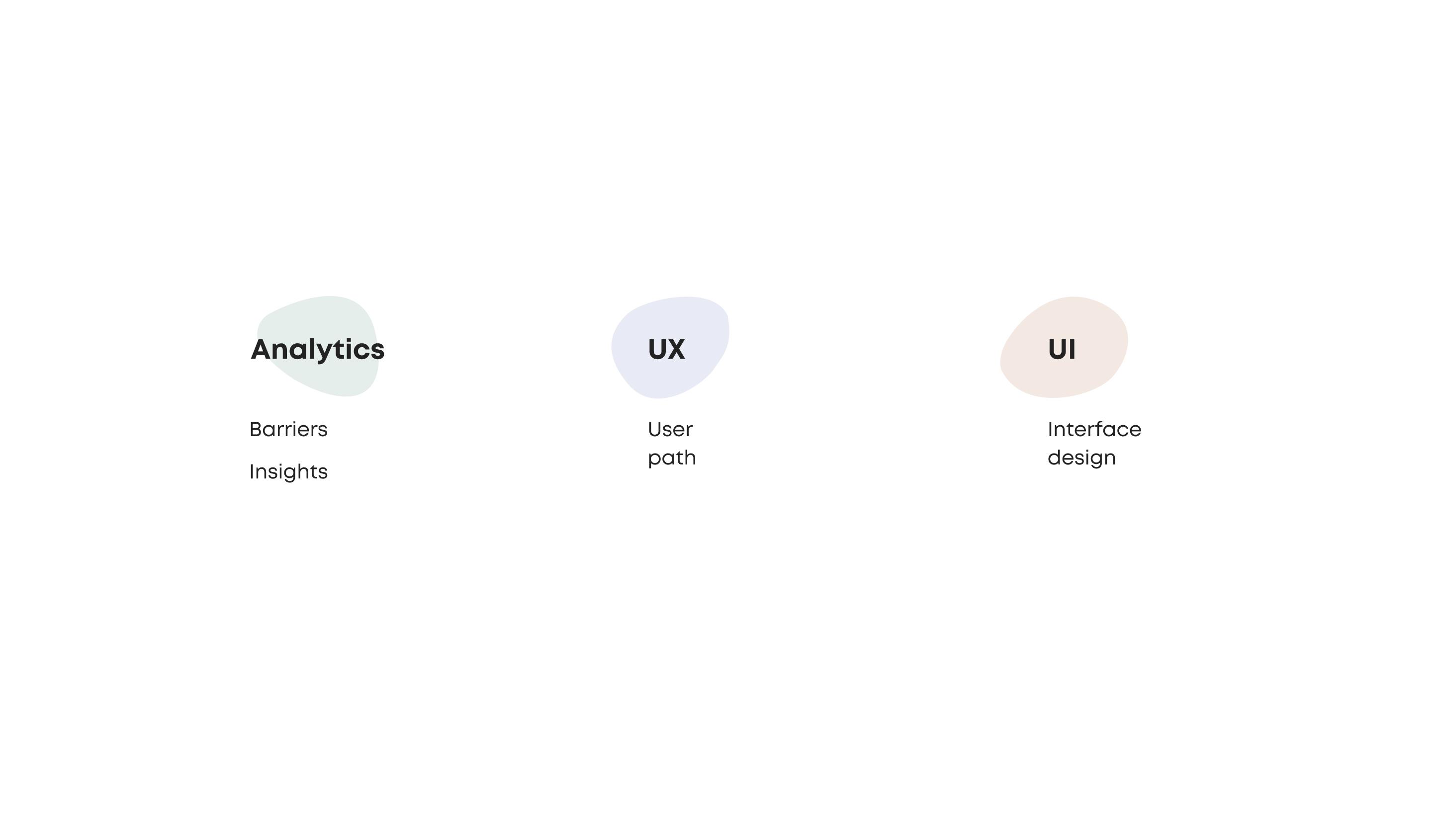
Prior to developing the creative concept, we realized the need to find a “semantic pillar” that would unite the brand's visual communication and design for the online store. To solve this task, we conducted a comprehensive analytics, including customers, key employees, the brand's product and competitors.
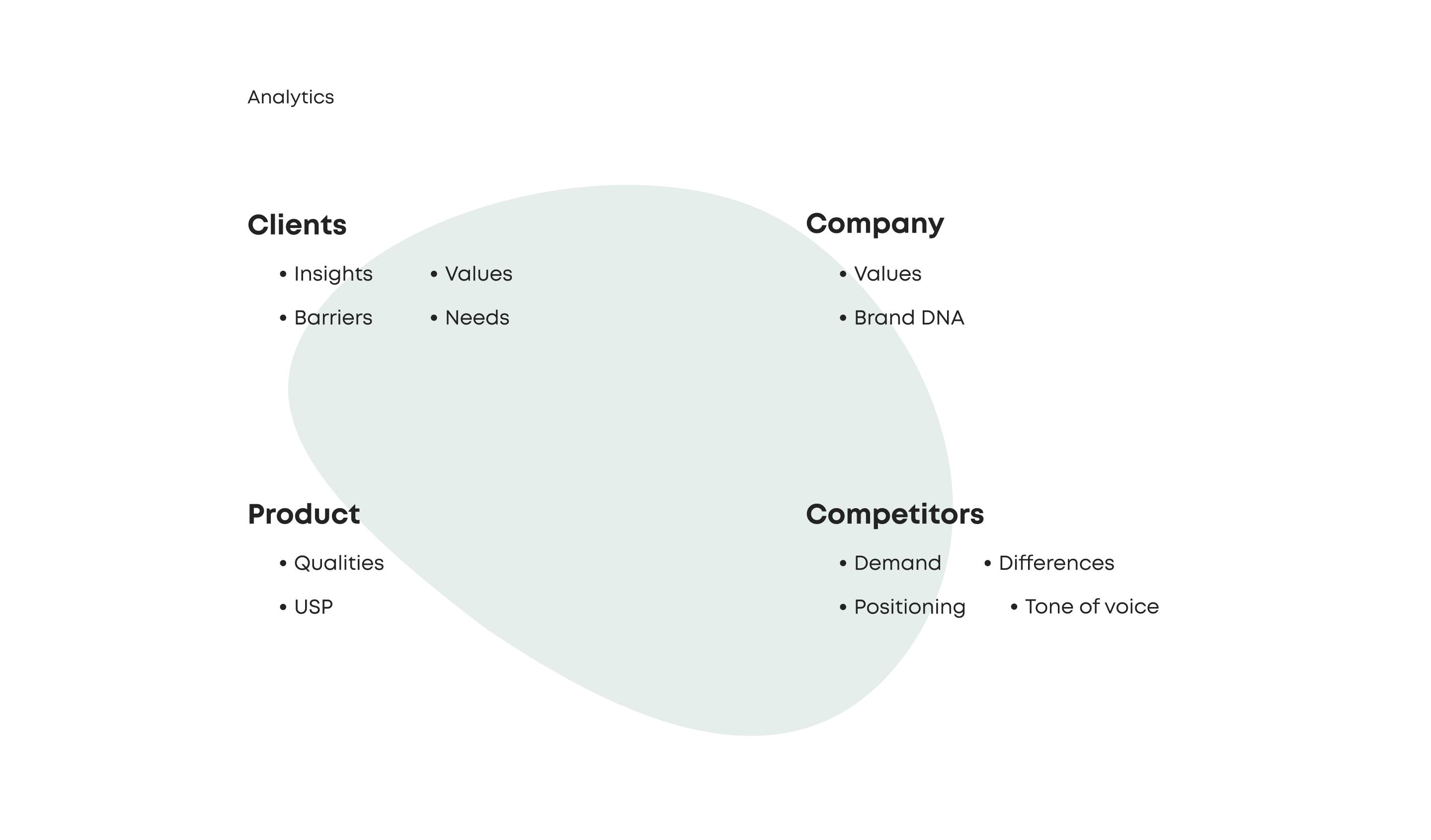
A detailed study of different categories allowed us to shape the idea of simplicity, convenience and freedom, which in the future became the creative basis of the identity and influenced specific decisions in UX and UI design.
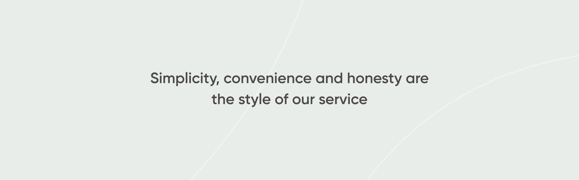
Time and attention are valuable resources for both the brand audience and the company. It is important for Stool Group that the customer feels comfortable making a choice, and that the ordering process is clear and predictable. If a store has too wide a selection, lacks a coherent concept or has excessively complicated features, the customer will have little desire to make a purchase. All has to be clear and straightforward.


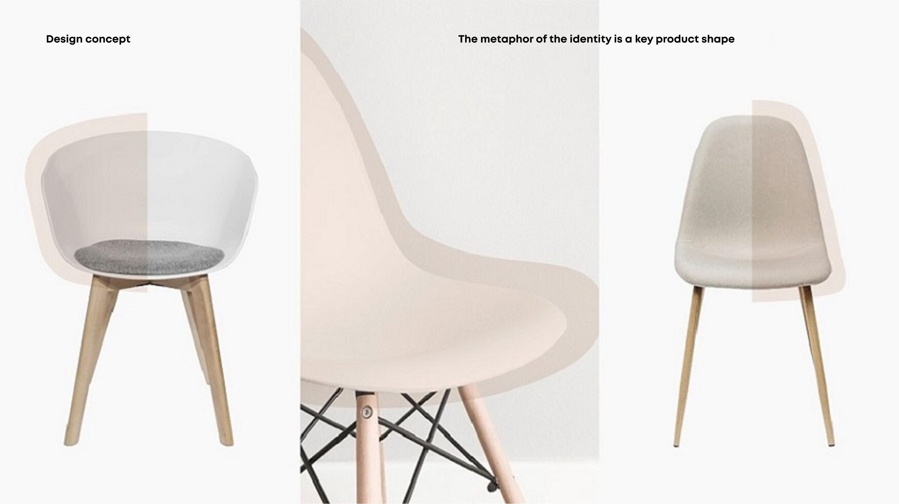
Identity
The new identity also reflects the idea of simplicity and freedom. We developed a simple, sincere and stylish design for the furniture store, which corresponds to the reserved style of communication and shifts the focus to the brand's product.
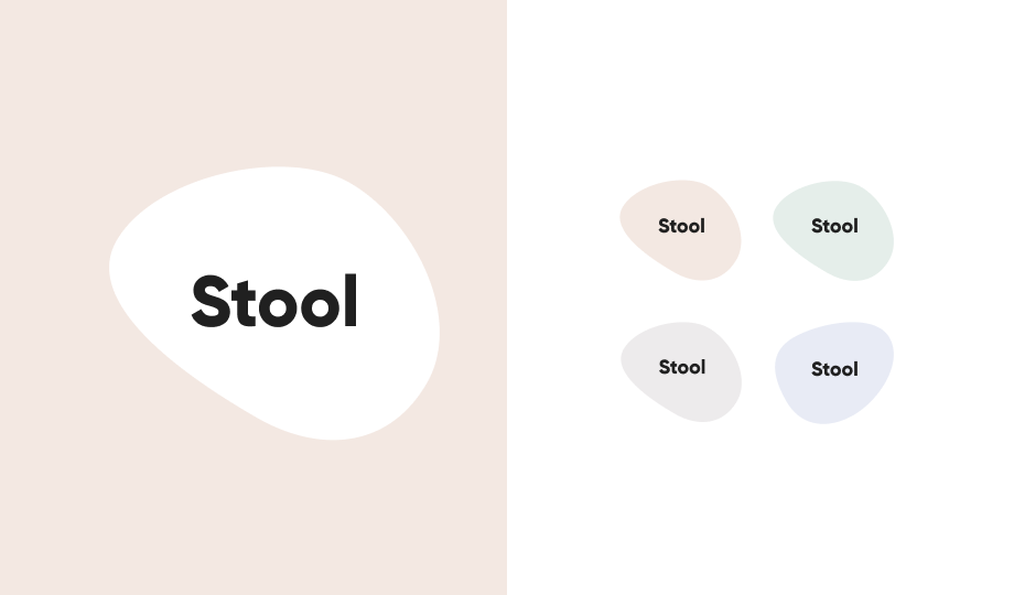
The typographic logo is concise, clear, and simple. The whitened pastel colors in the palette are pleasing to the eye and make it easy to communicate with the brand.
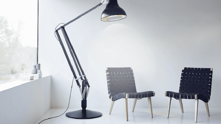
The flexible identity draws an analogy to key product forms: furniture and falling lamp light support convenient communication style.
Online store
We took the brand drivers as the guiding principles for the design of the furniture store, and checked each specific decision with them like a checklist.
Multiple interface elements work together to create a unique user experience and support a comfortable shopping process.
Navigation
The first important change concerned website navigation. We redesigned the structure of the header, separated the corporate part, the catalog and service elements. The catalog sections remain on all pages of the website, always in front of the user, and perform the primary selling function.
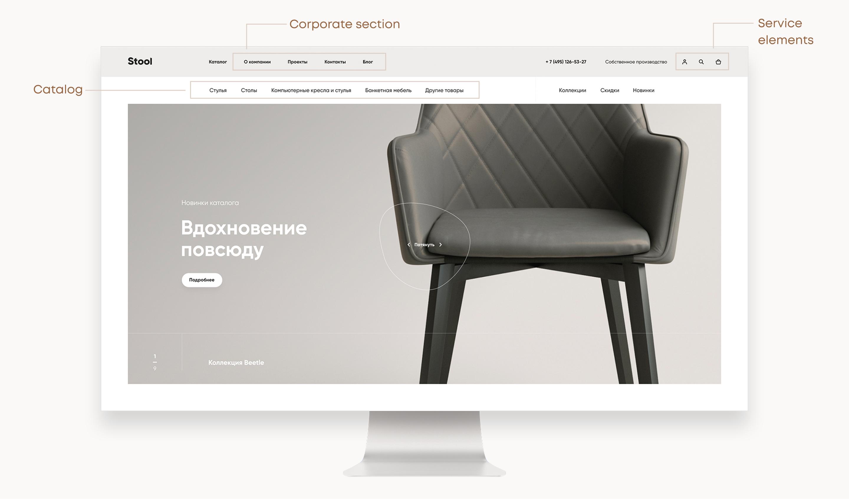
The “Favorites” and “Compare” icons appear on the panel only after you add items to that category.
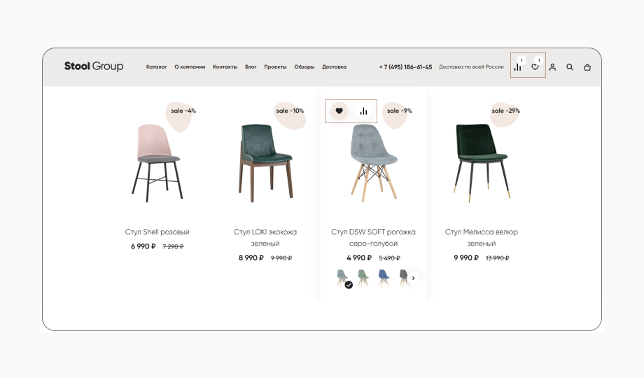
The layout of navigation elements on the page is dictated by the emphasis on the assortment: most of the page is devoted to products, the basic filters are placed in a line, and all filters are opened via click.
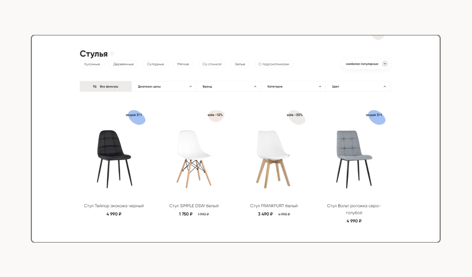
There are no unpredictable moments when selecting filters. Filters work without the “Apply” button, and the preloader showing up will prompt the user that the filter has worked.

Content
When buying interior items, visualization plays a key role. For the best visualization, Stool Group conducted a large-scale photo shoot to our specifications. To maintain a unified communication style, the backgrounds in the photos are painted in the primary brand colors, and the video montage effects maintain the soft style of the design concept.
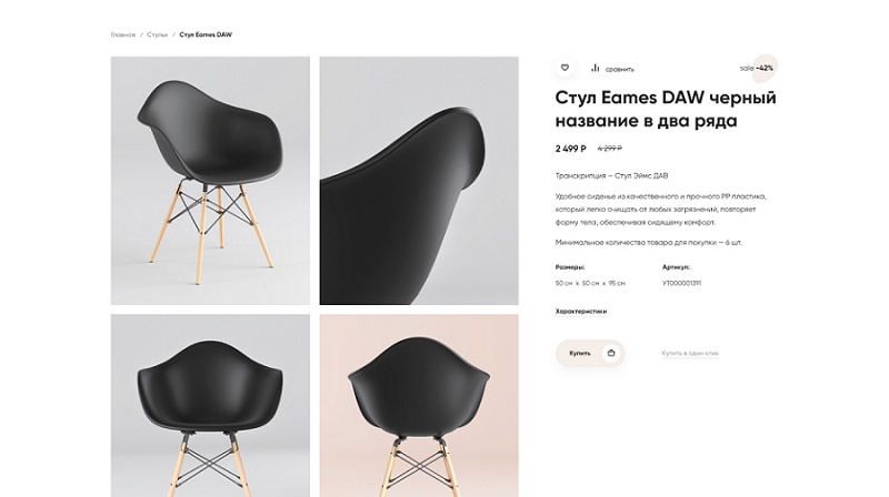
Item card
We formed a comfortable selection atmosphere inside the card. The layout of information has been thought through. The flexible identity element continues the corporate style and unobtrusively informs the user about the special offer for the product.
Non-standard scroll layout provides constant access to the key information: title, description, price and the “Buy” button are always at hand.
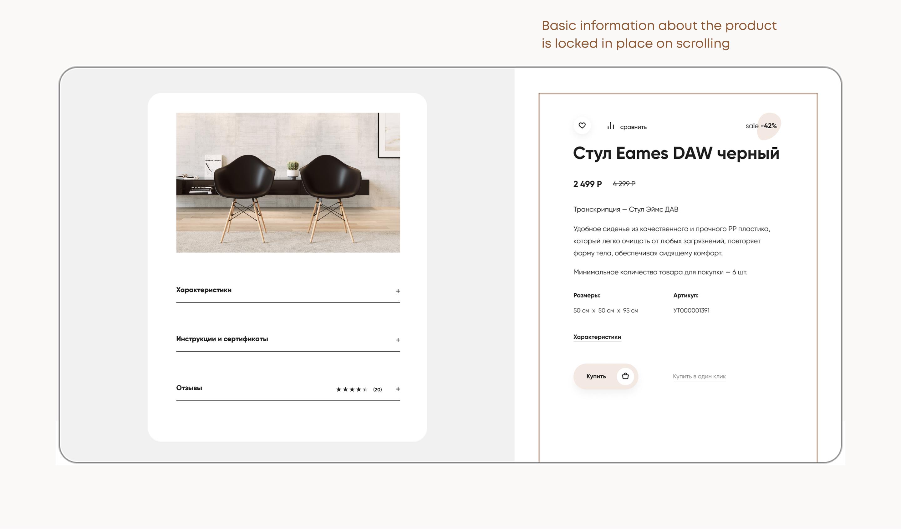
We expanded the description of the product and hid the rest, so that the customer could choose for themself whether they want to look into the contents and study all the properties of the product in detail or not.
Ordering process
When placing an order, it was important to make the process accessible and simple.
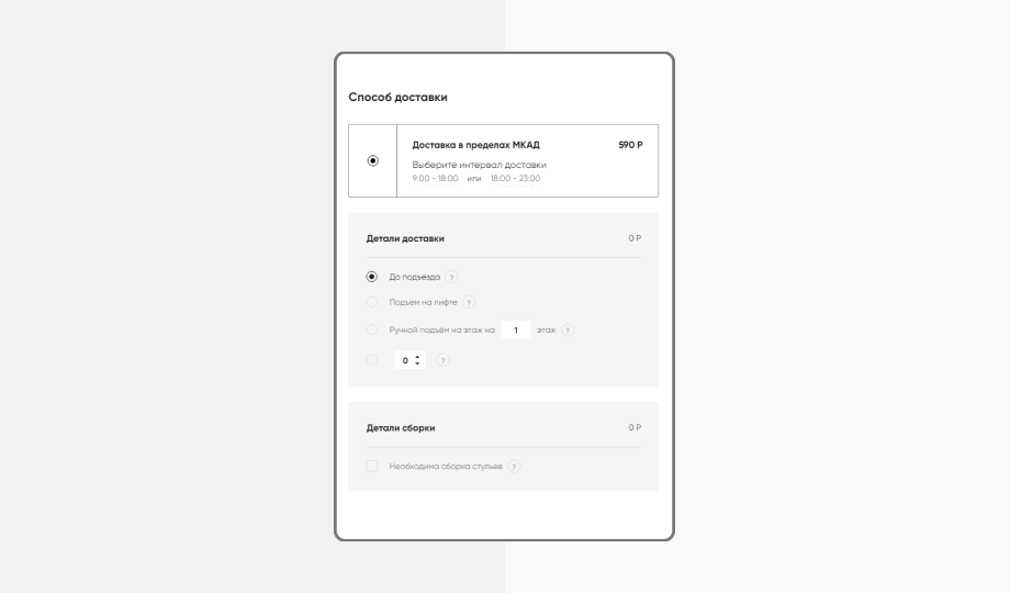
We minimized the amount of information to enter, leaving only input fields relevant to the user, such as delivery or payment. During the data entry, there are hints and input masks.
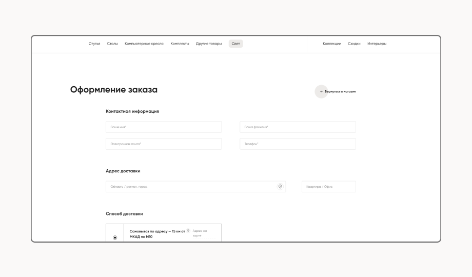
The delivery functionality has also been updated. We suggest delivery methods depending on the entered delivery address. The user can check the address on the map. If the address is not correct, it is possible to move the pin on the map, and it will be automatically submitted to the delivery field.
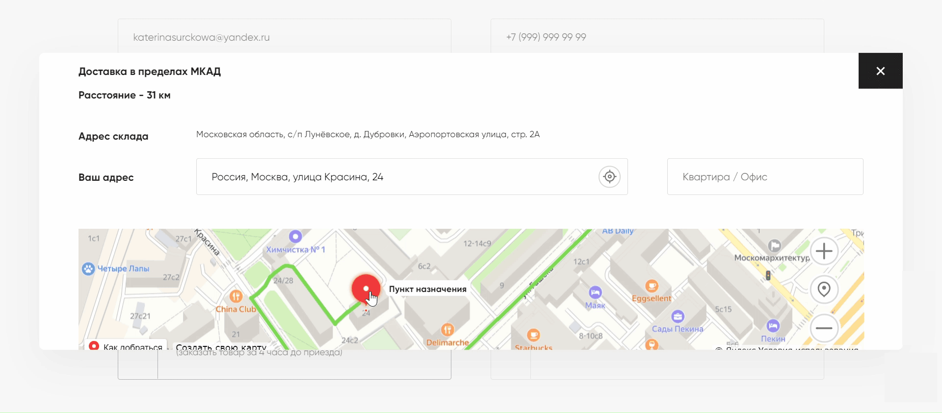
We differentiated delivery by zones: inside the Moscow Ring Road and outside the Moscow Ring Road, Moscow region, all of Russia. It was implemented using a custom module for CS-Cart, the functionality of the React based frontend part.
Delivery distance is calculated using Yandex maps, delivery cost and additional options are also calculated: lifting to the floor, assembly of different types of furniture.
Search
Responsive search in the form of a full-screen modal window picks up the customer's idea, recommends options and shows suitable products.
Results
Users do not get lost among the huge amount of content on the website, but calmly choose what is necessary and interesting. The clean visual style reflects the brand concept and is in tune with the demands of the target audience. Each UI solution is aimed at simplifying user interaction and maintaining emotional comfort.
There is a positive trend in many metrics:
- depth of browsing +16%;
- monetary turnover +8.2%.
The project won:
- Two first places at the Runet Rating 2020: in “Online Stores” and “Furniture and Interior” nominations.
- The winner of the Golden Website in the categories: “Best website of the Federal District”, “Best online store design”, “Online retail store”.
- “Special Kudos. Best Innovation. UI design. UX design.” at CSSDA.
- “Honorable Mention” at AWWWARDS.

