
Our client and the task
Stool Group manufactures and supplies furniture for HoReCa, shopping centers, offices, country houses. It works with b2b and b2c segments in Russia and the CIS.
We were approached for a new, more UX-friendly website design. The task at the start was exactly that: to refresh the design, make it more visually pleasing and solve problems in navigation.
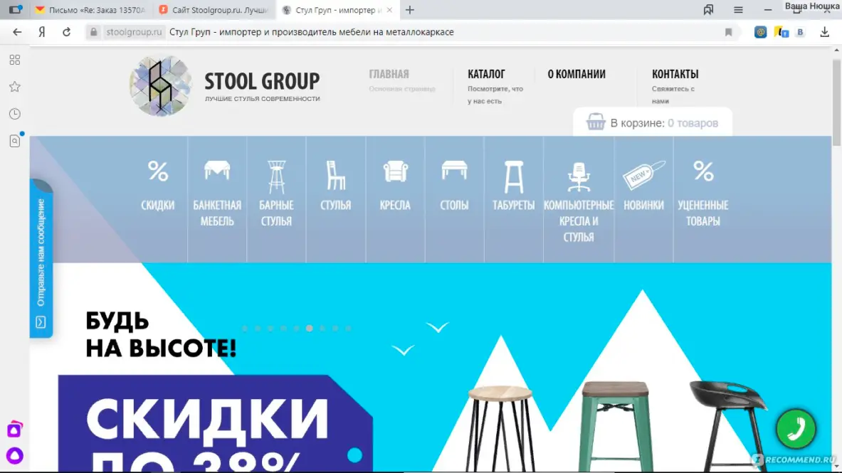
Old website design
Process
Initially, the client did not have any branding work planned, only wanted to update the logo and had already chosen a third-party designer for this. When the website design concept was ready, the logo design was still unclear. But the concept itself was approved on the first try, and we proposed to continue working on the corporate identity on its basis.
In the process of design development, we came to the need for a “semantic pillar” that would organize all of the company's numerous digital activities and help make integral and meaningful decisions in the future: from the tone of voice in social networks to sales stimulation measures.
An important constraint: the company is introducing illumination into its product range, and the new identity should not focus only on chairs.
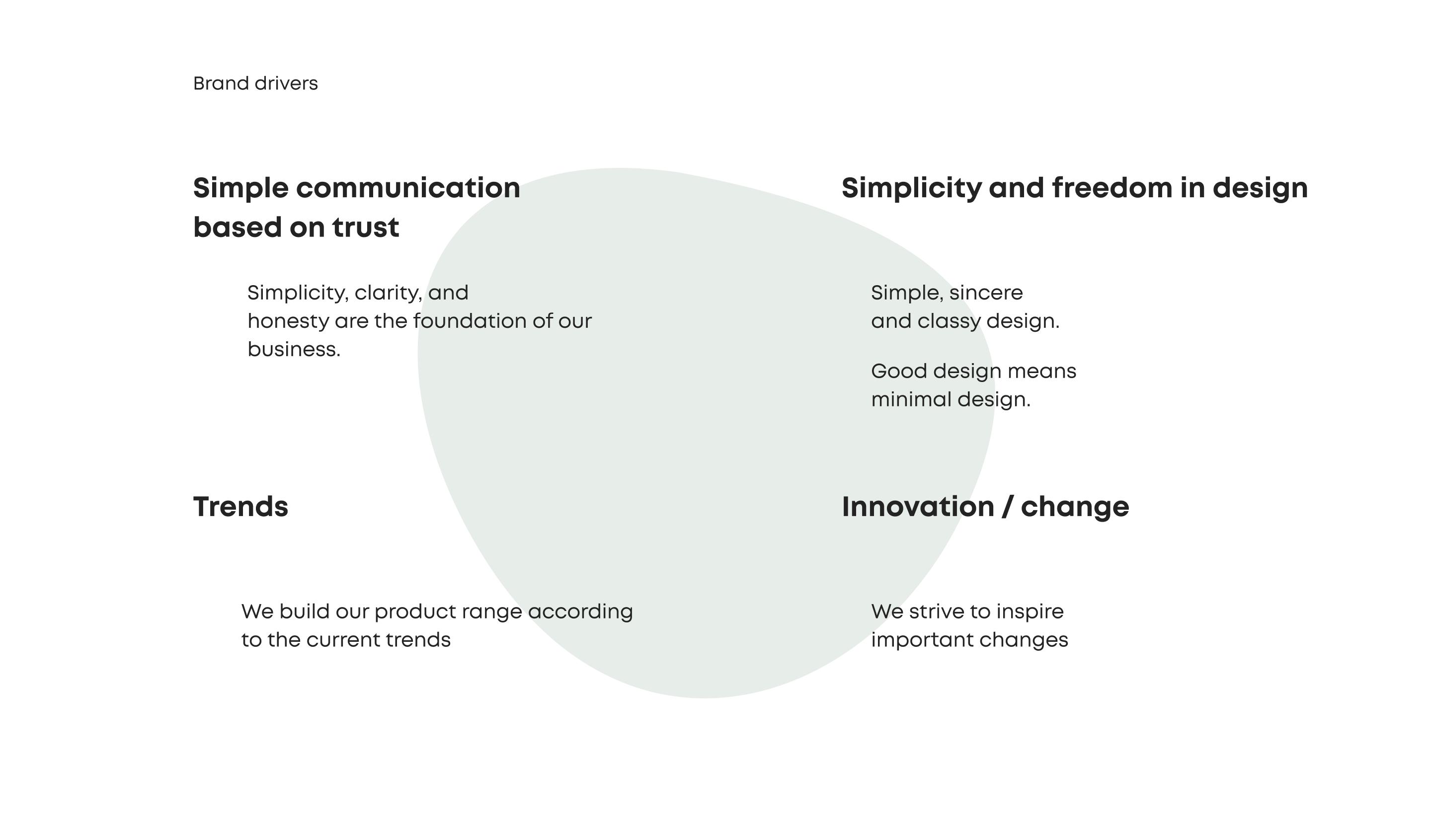
We conducted a strategy session using the CRAFT methodology, during which we found out that the values of the target audience coincide with the values of the company's key individuals and the overall strategic vector of the company's development. At the intersection of these values we formed the core idea of the project.
Stage by stage, it looked like this.
1. Analytics
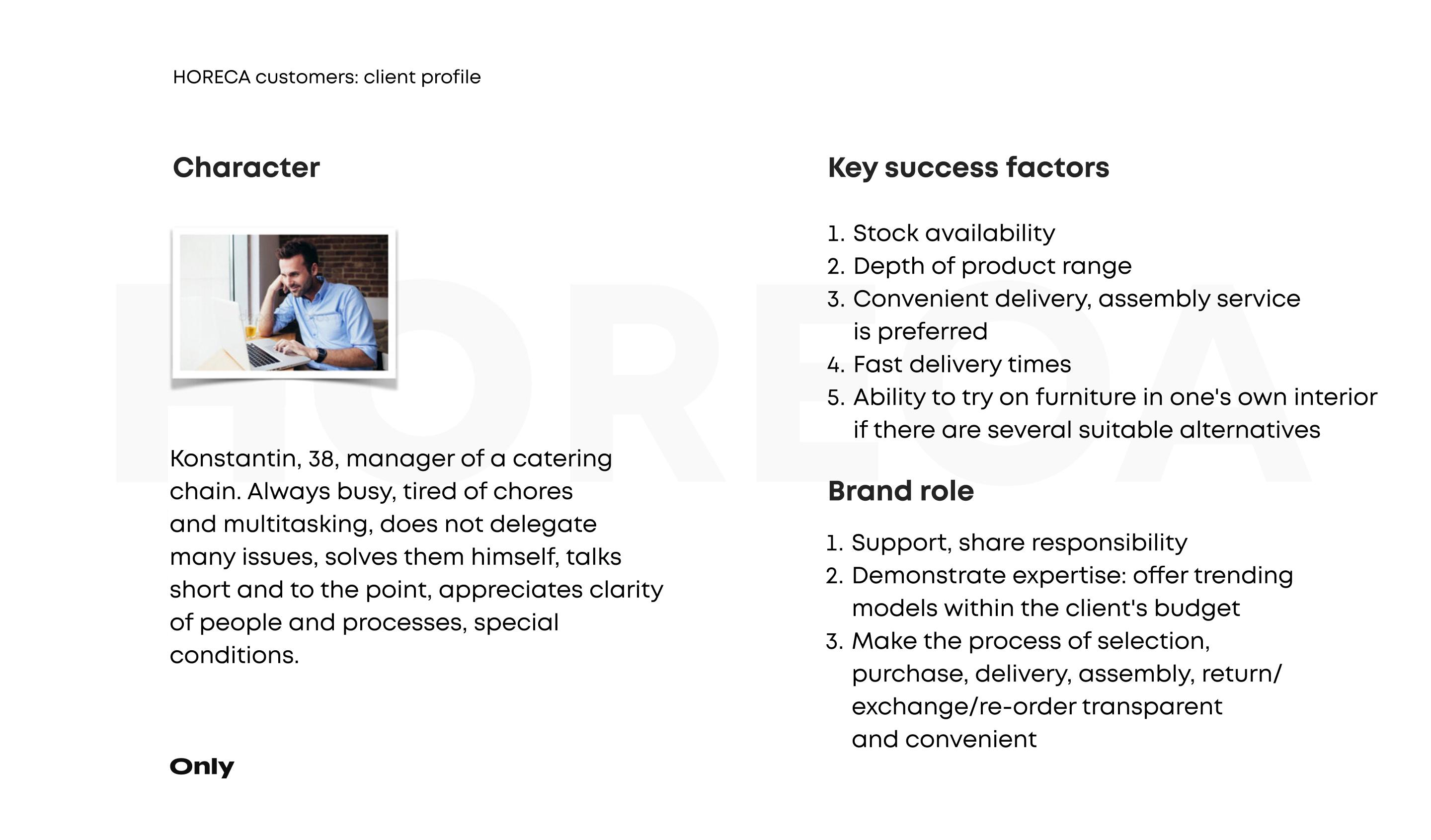
We described personas from three customer groups:
- Managers and owners of HoReCa facilities (the core of the target audience);
- interior designers;
- household customers.
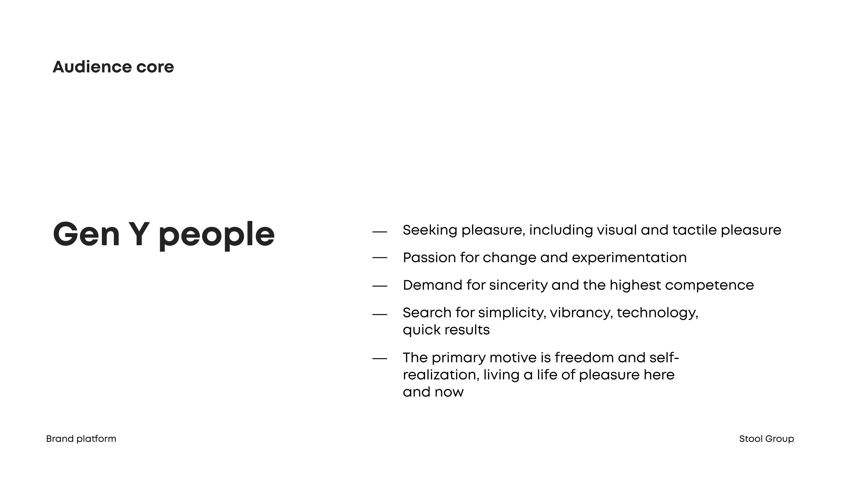
In terms of generational theory, the core of the target audience belongs to generation Y. Therefore, the creative concept is based on the idea of simplicity, convenience, and freedom as a reflection of the target audience core values.
2. Searching for ideas
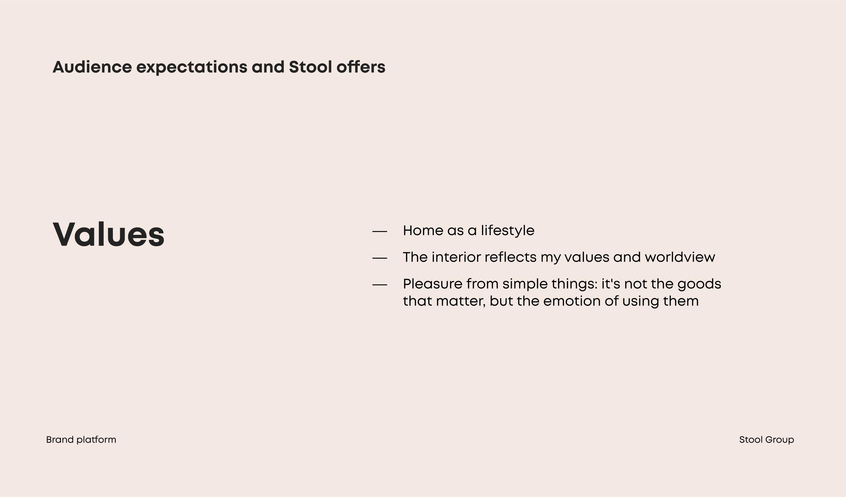
Target Audience Insight. Time and attention are valuable resources. If the selection is too broad, the store has no unified concept/specialization, the shopping process is too complicated and long. There is no time or desire to understand complex wording and functionality, everything should be simple and convenient.
The role of the brand is to support in the process of change, to be an expert in current trends and to offer models that are optimal in terms of price and delivery time.
The process of interacting with the brand at every stage should be simple and comfortable. This positioning provides a qualitative detachment from competitors, many of whom use a more nativistic communication style.
3. Formulation
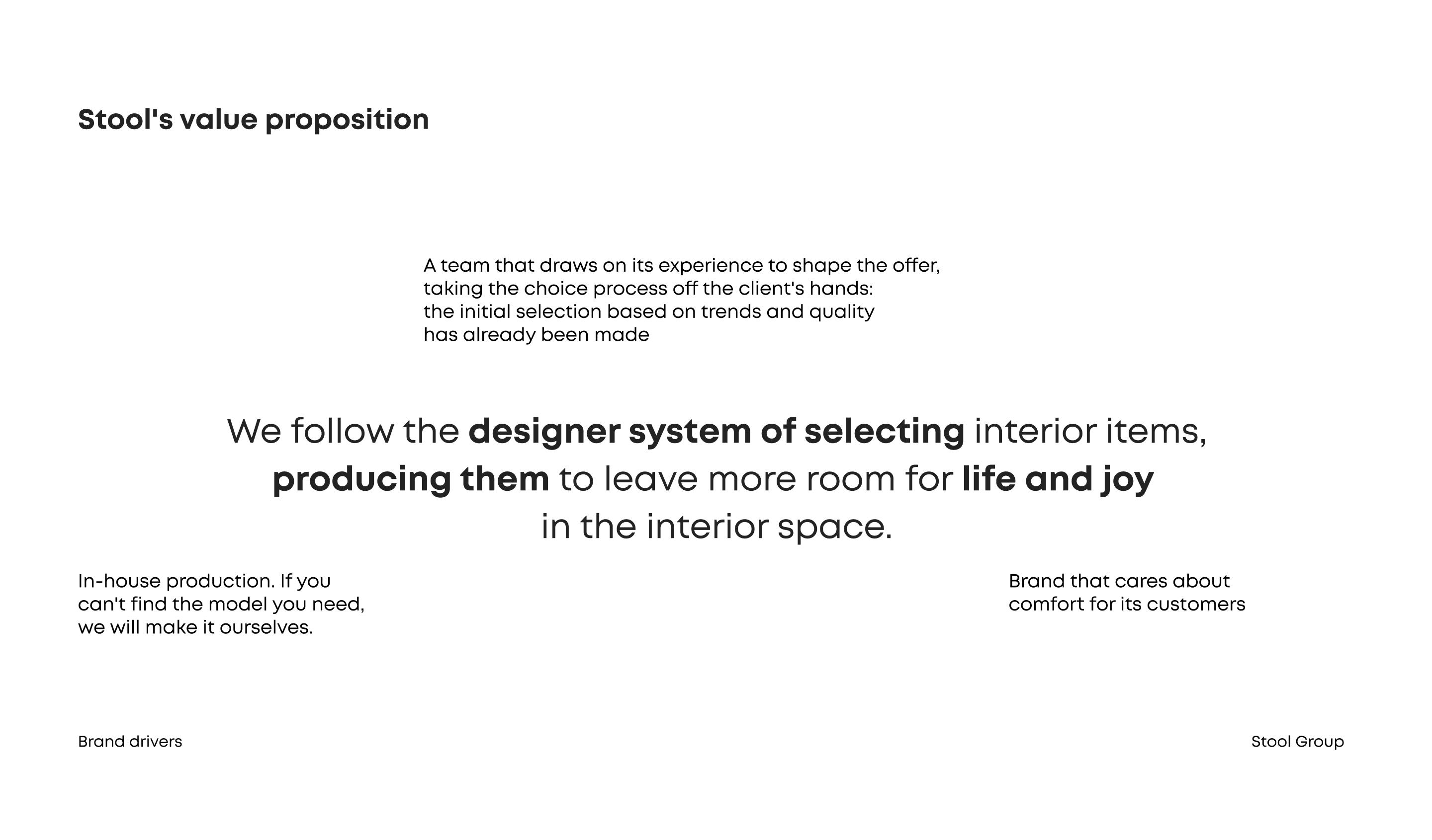
We formulated a series of slogans united by the idea of simplicity, freedom, clean restrained design. They are used on the website, advertising channels and in printed products.

4. Identity
Graphic constants of the corporate identity continue the idea of the project. The base is a typographic logo, supplemented with a flexible identity and soft colors.
The guideline describes general rules, but does not impose strict restrictions on the use of new elements, provided that the overall style is preserved.
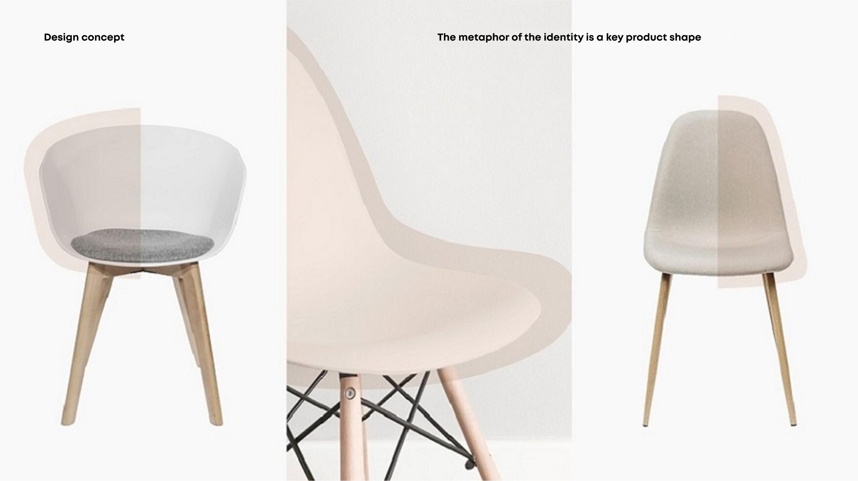
The metaphor for the identity was the key product forms: furniture and the falling light of a lamp.

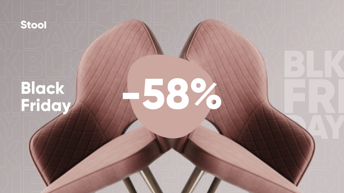
Example of applying additional elements in Black Friday banners
As a result, we created a business tool for Stool Group to further transform the company and build a more trusting and cohesive communication with its customers.

