VK Capsule Pro website
Promotional website for VK's flagship speaker
VK Capsule Pro is VK’s flagship smart speaker with a custom touchscreen, surround sound and smart sensors inside.
We carried out the digital presentation of the product. We worked on the concept and ux/ui design of the promotional landing site, interior 3D models.
Red Star. Jury's Choice. The Best
Context and task
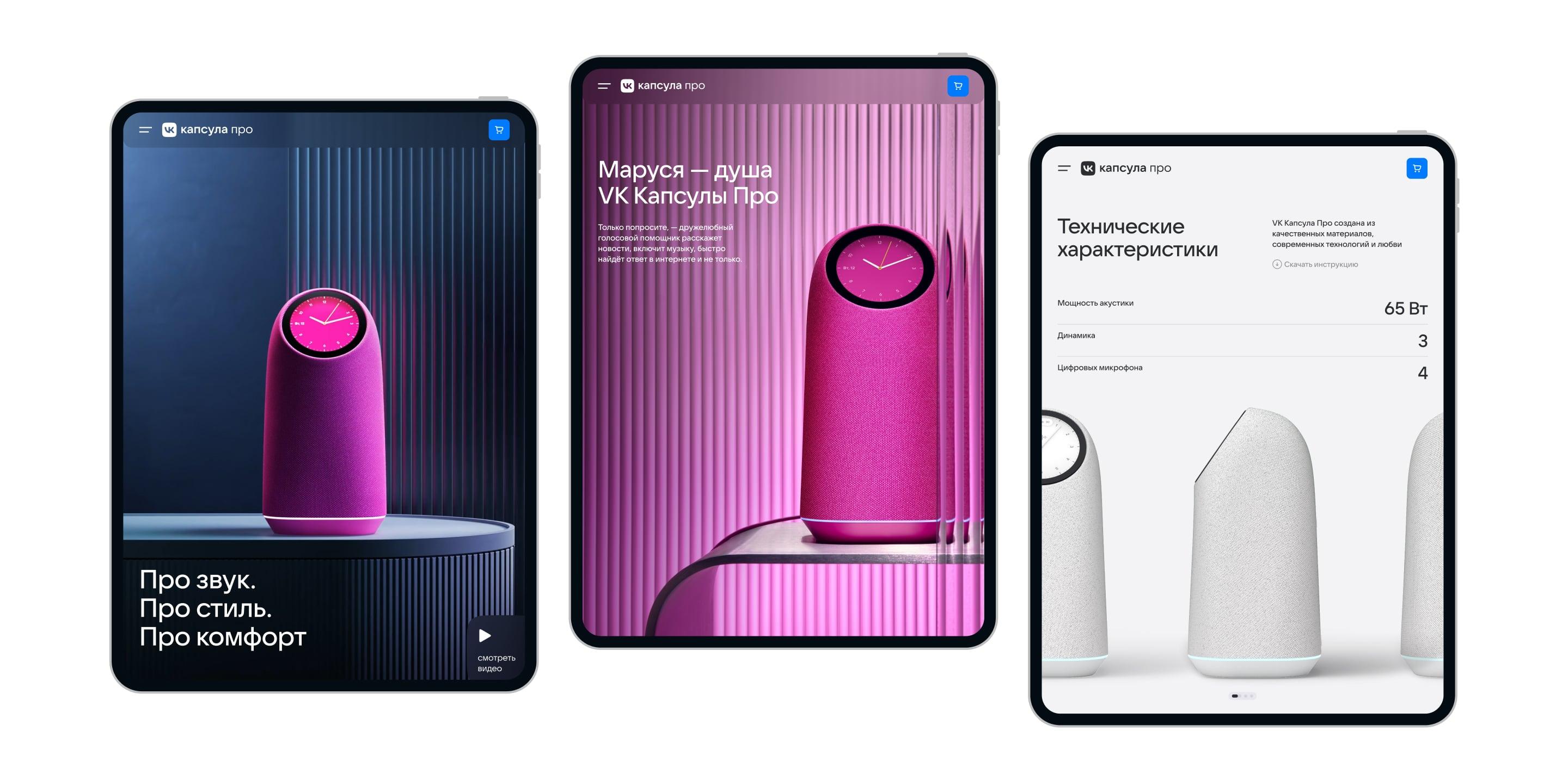
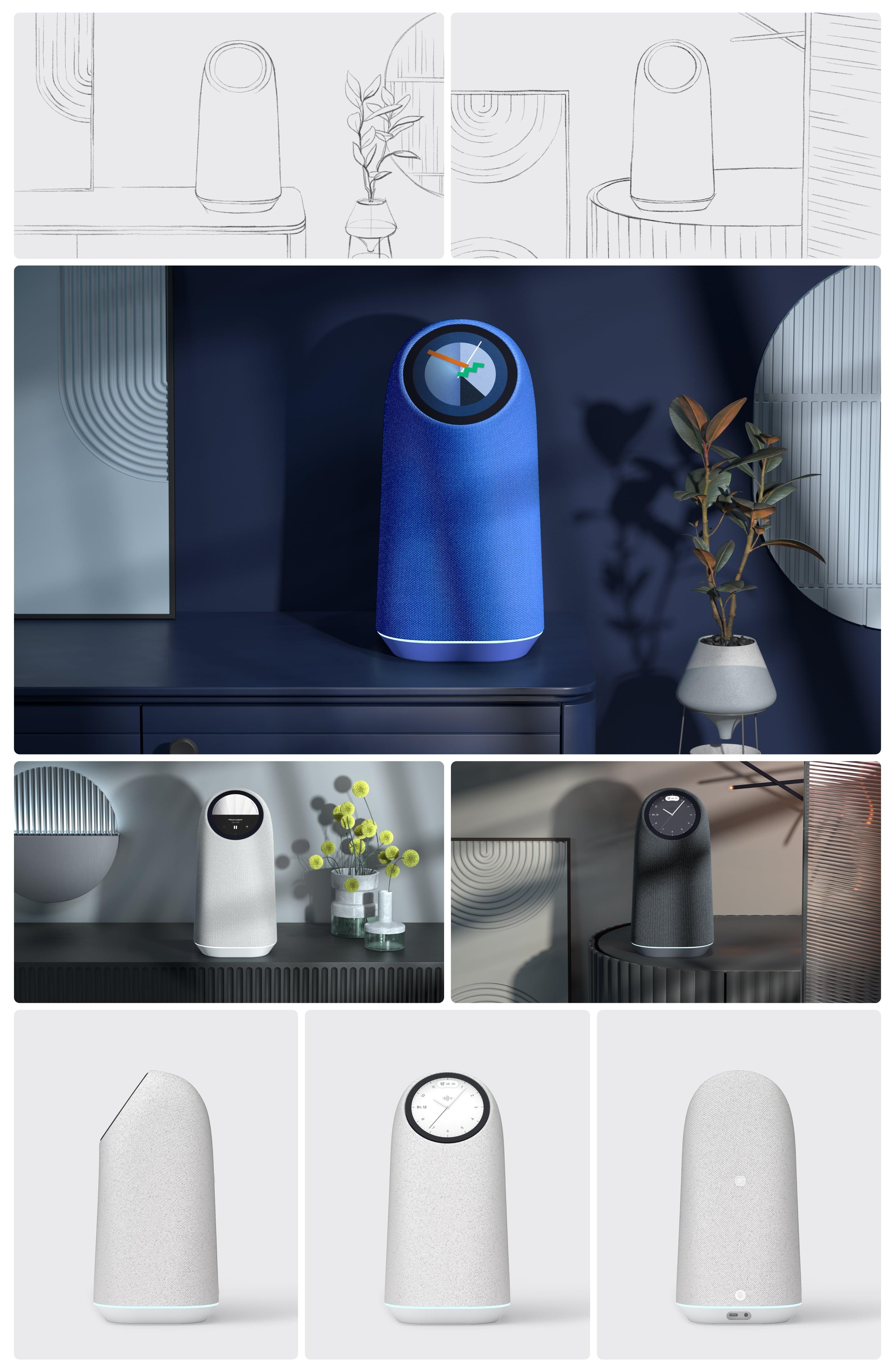
We were tasked with presenting the touch screen as the speaker’s main USP, with an emphasis on the personalization possibilities. To convey the feeling of how the speaker interacts with the space, because Capsule Pro is positioned as an interior speaker.
Design
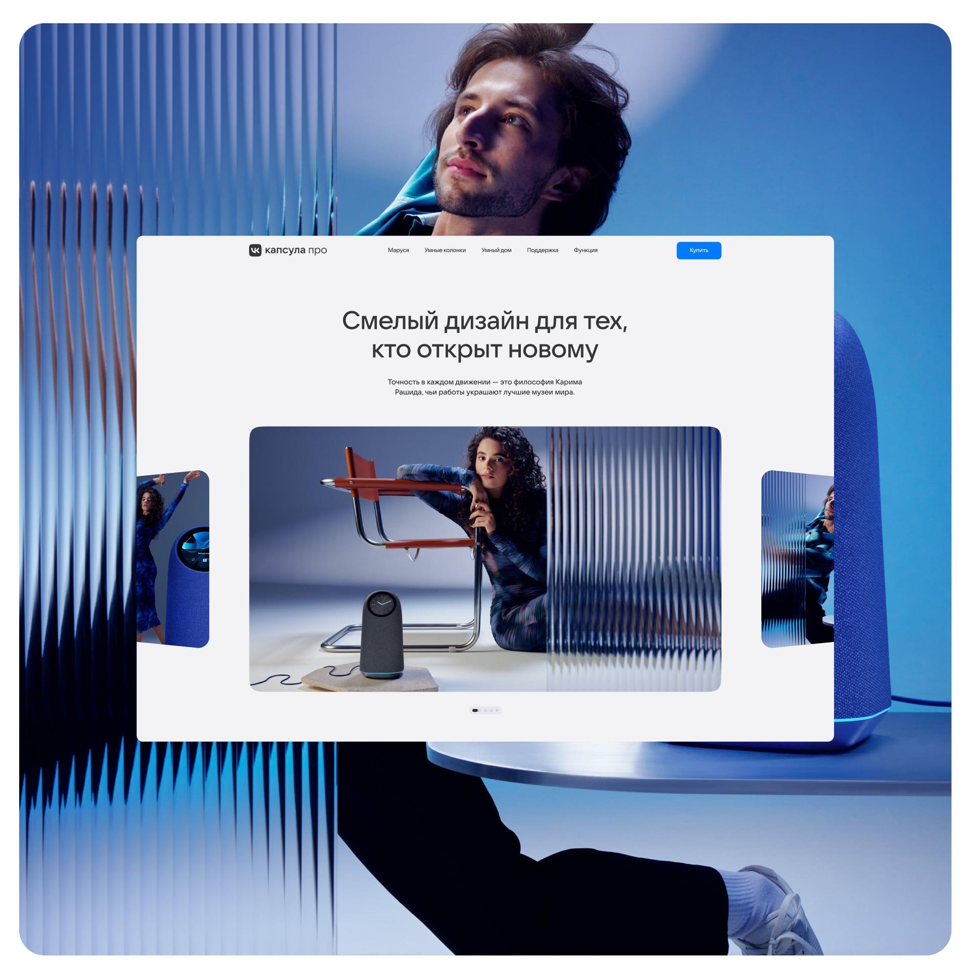
Structure of each unit is sharpened to showcase a particular feature, benefit or parameter: design by Karim Rashid, spatial sound, touchscreen personalized dials, zigbee hub, Marusya and smart home, superior power.
This helped form a consistent and compelling storytelling for the user as to why this speaker is special.

Design
We have considered subtle semantic and visual transitions between the blocks. For example, after the second wow screen with a CG video about the spatial sound effect, it’s no coincidence that the next screen is about a convenient player.
Zigbee hub
In the block about the zigbee hub, we used a wide accent layout with smooth curves to harmonize with unusual choreography of the characters on the visuals and the shapes of the speaker itself.
We took inspiration from apple wallet, creating a composition and animation of cards about smart home scenarios to translate the speaker’s technology through the design.


Design
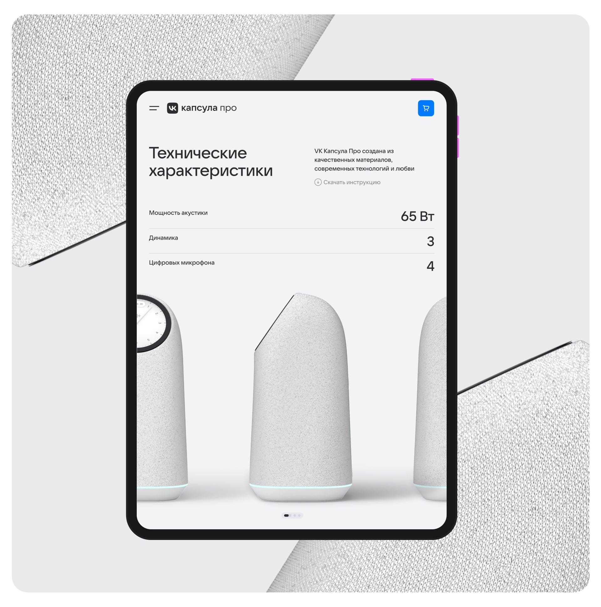
We intentionally chose a white background for the speaker specifications screen, so that the user could escape from the saturated visual flow and focus on individual parameters.
Despite creating a bold interface, we considered that the landing page should be integrated into the existing VK speaker website — we used the existing grid and adapted the menu.
3D models
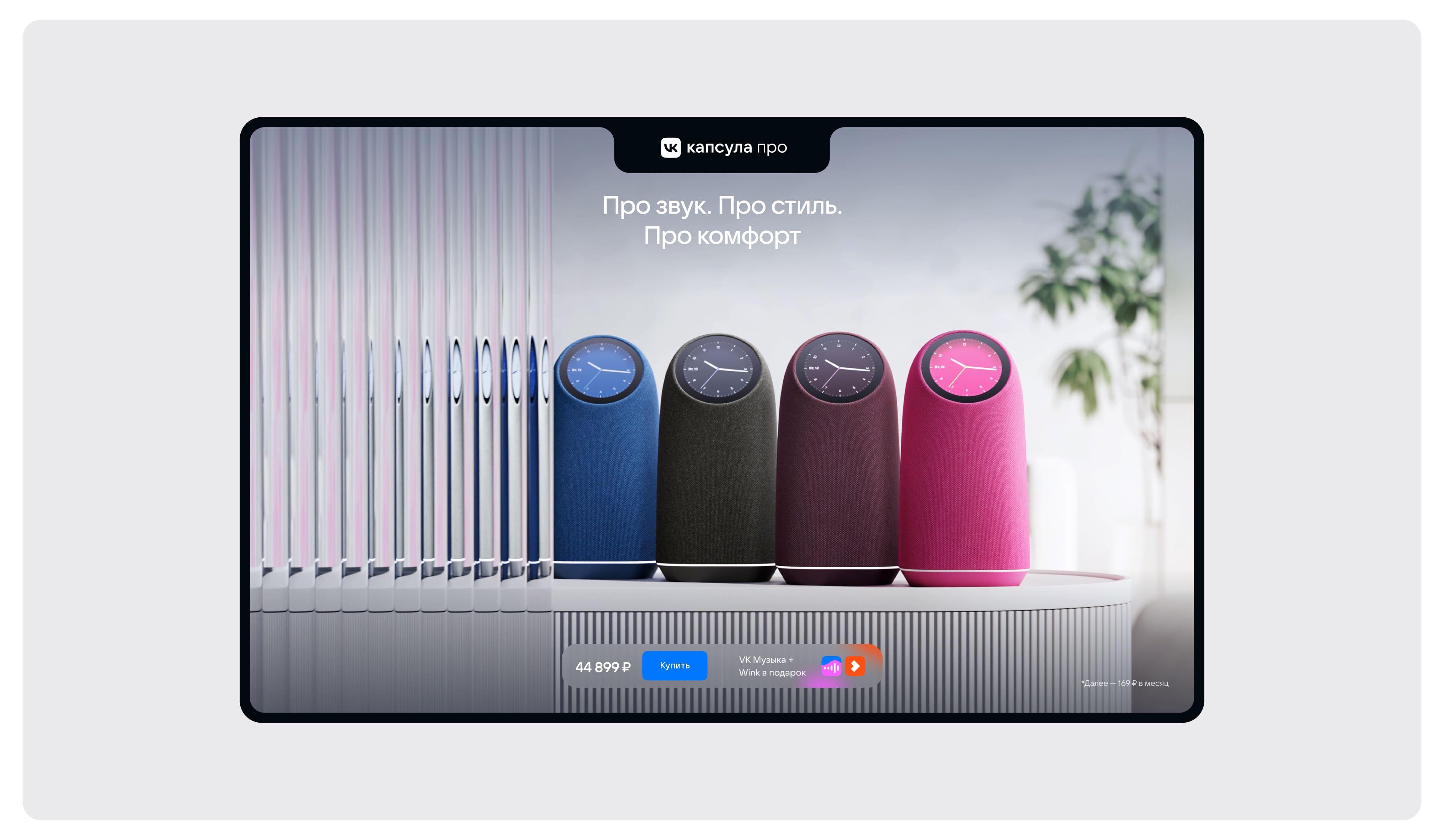
In the course of the project, the vision of the speaker’s positioning underwent changes, and with it the design of the landing page.
We went from presenting the VK capsule in light minimalist interiors to a more colorful and even fantasy story.
Result
The design of the landing page turned out to be distinctive and identical to the style of the flagship VK speaker. We managed to showcase the distinctive features of the device, while maintaining the ease of navigation in a single smooth narrative.


