Simple
Unpretentious and without compound words
An online store with a focus on care and comfort. Creating a brand platform and digital identity, designing service UX solutions
Special Kudos. Best Innovation. UI design. UX design.
Honorable Mention
Best Federal District website
1st place. Best online store design
2nd place. Online retail store

When we started working on the concept of the website, we approached the company with a proposal to create a new identity together. To do this, we discussed how the brand wanted to position itself in the digital space and what ideas it wanted to convey. Then we analyzed the expectations of the target audience and compared them with the values of the company. From this a new identity was born, which now had to be reflected in the visual aspect.


Simple
Unpretentious and without compound words
Unobtrusive
No intrusive sales pitches
Proactive
Speaks from a position of partnership, ready to suggest solutions, support in times of change
We were driven by the idea of simplicity and convenience of the user experience at all stages, from searching and selecting the right interior element to making a purchase. It was important to create a sense of trust in the customer, which the brand could meet in the course of further interaction.


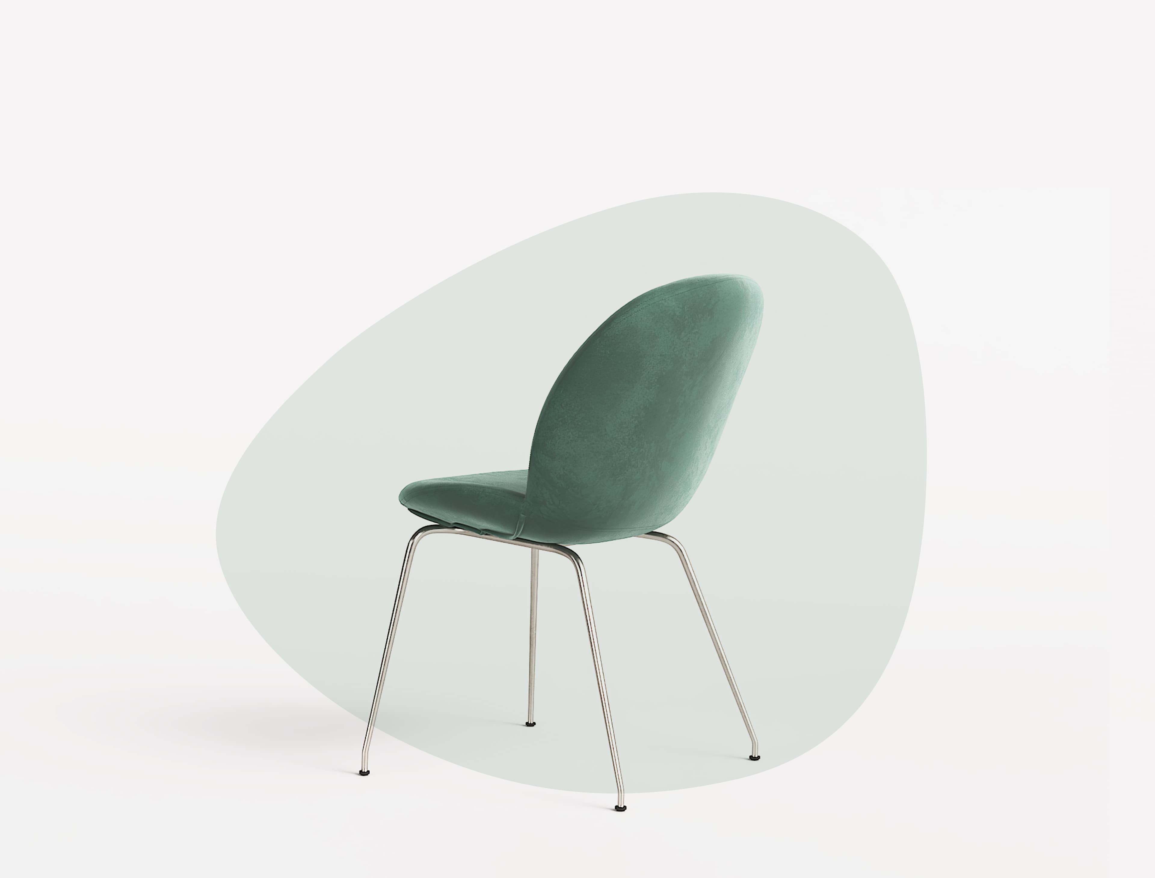
Looking for ways to implement the main design ideas, we turned to the products of the online store. Inspired by curves of furniture and a play of light, abstract shapes look stylish and do not clutter the interface.
In a perfectly laid out interface you can find any page in a few clicks. This is exactly the point from which we derived in the design phase. It was important to consider how a user navigates through the page in search of necessary information, and to make this path as intuitive as possible.
So, instead of a separate page for the shopping cart, we developed a modal window in the upper right corner to search for purchases more conveniently. We also implemented a non-standard scrolling scheme in the product cards. The left side of the screen with the photos of the furniture is dynamic, while the right side remains static to provide uninterrupted access to the product's features and description.

While working on the project we tried to satisfy the user’s demand for detailed information about the products as much as possible. So we got the idea to depart from our commonplace product presentation on the website and show the products from a whole new perspective in a broader context and in more detail. These ideas are embodied in the catalog.
On the one hand, we wanted to solve the problem of the perception complexity of furniture in the interior. Interactive 3D models allowed the user to see the actual size of the chosen item and imagine how it would look in place. For the same purpose, we have added a Sets section to the website, which offers options for good matches and facilitates the search for the ideal setting.
On the other hand, the designed 3D models combined with animation literally bring the customer closer to the object, giving him a chance to feel the quality of the material.
The result is a concise but stylish story with an emphasis on the user’s emotional experience. The visual component is a direct continuation of the brand identity embodied in the slogan “it’s not the things that matter, but the emotions that come from using them”.


